HOME | DD
 leukos01 — uhh.. not sure yet

Published: 2009-04-14 20:02:24 +0000 UTC; Views: 176; Favourites: 2; Downloads: 5
Redirect to original
Description
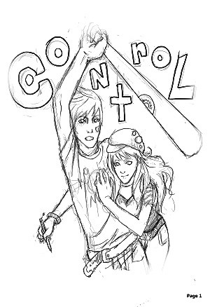
this is my original character Leukos (aka nathan thompson)im redoing the pic "and then there was four" and im not sure what style to do it in. this is the first box and i cant decided whether to do it in just black and white with a color thrown in (right) or in halftones with the color for the highlights (left) right now im leaning towards the halftone one, but if you cant stand it just tell me
sorry for the crap backround, i promise it wont be there in the finished pic
~~~~
oh sorry about the pic being small too, this is only gonna be one piece of the pic, the finished one will be bigger
Related content


Comments: 2

I was trying to think of good critique to give you (hence the long time before I commented). The only thing I can suggest is to give your lines a little more value and maybe sharpen them up (look into using the pen tool?), and maybe ad a second lighter tone to the face to give it more depth. Although I think if you experimented by putting the image to the right over top of the one to the left (or vise versa)and fiddled with layer settings (idk what to call them, multiply/overlay/screen/hard light etc...) then you may create some interesting results. But I really like the composition of the piece, and his glasses. Oh, uh idk if you wanted to try this...but if you angled the stripes in the background to go from the top right to the bottom left (idk why i just didn't say diagonally) you may create something even more dynamic. But idk, thats all I have to critique/comment on. So good Job! And sorry about the long comment >_> I think I rambled on too much...
👍: 0 ⏩: 0

i think both of them look super neat, but i think i like the left one a little more?
C:
👍: 0 ⏩: 0