HOME | DD
 LeXXe — Reflective models
Published: 2010-03-08 20:08:04 +0000 UTC; Views: 2551; Favourites: 28; Downloads: 0
Redirect to original
Description
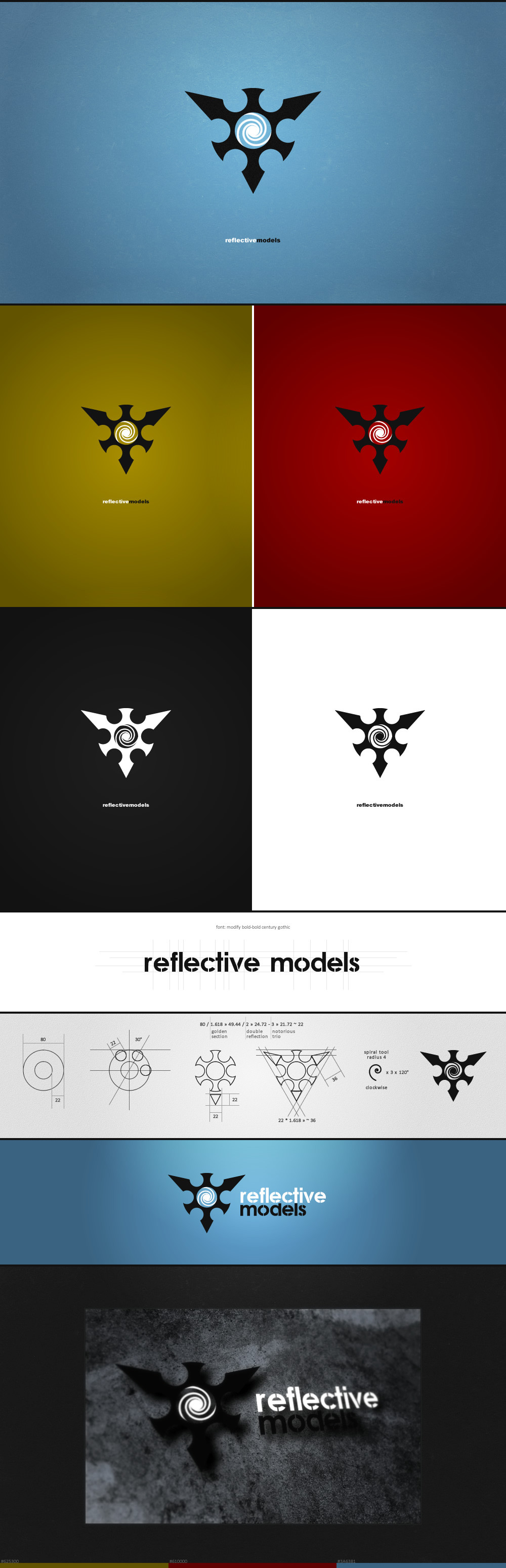
music band "Reflective models"i was invited to the group (keyboard), of course found my application of ability - new logo
Related content


Comments: 31


very nice presentation / background. a + if its done in fireworks too  (Smile)")
👍: 0 ⏩: 0

you are welcome dude, i was looking for inspiration as i am designing my own logo you can see my card in my profile but not quite happy with it. you did awesome job
👍: 0 ⏩: 0


логотип
👍: 0 ⏩: 0


congrats,very good..
(i would go with something else instead of a spiral, but really gives impression..)
looks better in monochrome...
👍: 0 ⏩: 1

haha - colour me embarrassed. i saw the link now
 (Wink) - ;)")
👍: 0 ⏩: 1
music is very raw, what color you stunned? blue?
i don't know why they are drawn in blue, i think red is more appropriate. in this case the majority opinion played a role
 - :D")
👍: 0 ⏩: 1
haha - love the music. sent the link to a few friends as well. i liked the monochrome 3D version at the bottom. definitely not red, red's a bit of a cliché with industrial/metal bands
👍: 0 ⏩: 0


Why the upper Spike is smaller than the two on top?
👍: 0 ⏩: 1
it gives aggression logo. This conclusion came in the collective mind
👍: 0 ⏩: 0