HOME | DD
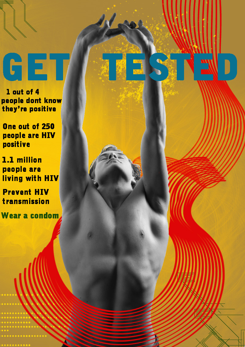
 LezzieLexi2QT2BSTR8 — Get Tested Ad
Published: 2010-03-29 09:56:51 +0000 UTC; Views: 1607; Favourites: 25; Downloads: 33
Redirect to original
Description
Once again, messing with brushes.Oddly enough, this was inspired by a completely different-looking poster on the wall of the GLC set in Season 4 of Queer As Folk.
Female Ad: [link]
EDIT 3/29/10: Changed text from vertical to horizontal.
Male model stock:
Brushes downloaded from: [link]
Related content


Comments: 8

I like it a lot. Would you consider doing variation with minority subjects? Infection rate tend to be high in those communities because many still believe it's a white gay male disease.
👍: 0 ⏩: 1

Sure. Can you give me a few minorities to use so I can look up stats?
I do know that most people think it's a white male disease. I would have used a minority for this, but I saw this model and it was perfect for the image in my head. I should probably also do one with a female...
👍: 0 ⏩: 1
I'm not very tech savvy. I have a rough draft of a story I worked on with stats for the African American community. Send me your email and I'll forwarded to you.
mine:rosebud11463@yahoo.com
👍: 0 ⏩: 1
lexicat3@comcast.net
Thanks!
Which means I need to find a good stock photo of someone African American. Which means I need to look somewhere other than DA, since they seem to have nothing.
👍: 0 ⏩: 0


If you're up for critique:
Excluding the detail text it's really well done, the contrast, form and colours all work well. The Banner part fits in well.
But the detail text really gets me. My advice is to 1) Never use vertical text this way because it's difficult to read and may be read in the wrong direction. Use sideways text instead. 2) Use a font closer to the title font - the one used here doesn't work. 3) Put all detail text in the same colour or colour fade; the black or the green would work best here.
However, I must reiterate that other than the detail text the poster is pretty much perfect. Really good job!
👍: 0 ⏩: 1
Thank you! I will take your advice. I wasnt entirely sure if the vertical text worked either, so I saved an unflattened copy so I could edit it.
👍: 0 ⏩: 1
Oh, no problem. Good to know I could help.
 (Smile)")
👍: 0 ⏩: 0