HOME | DD
 LiamRSharp — Design for major new character in Cap Stone v.2

Published: 2014-02-28 21:41:46 +0000 UTC; Views: 7052; Favourites: 231; Downloads: 149
Redirect to original
Description
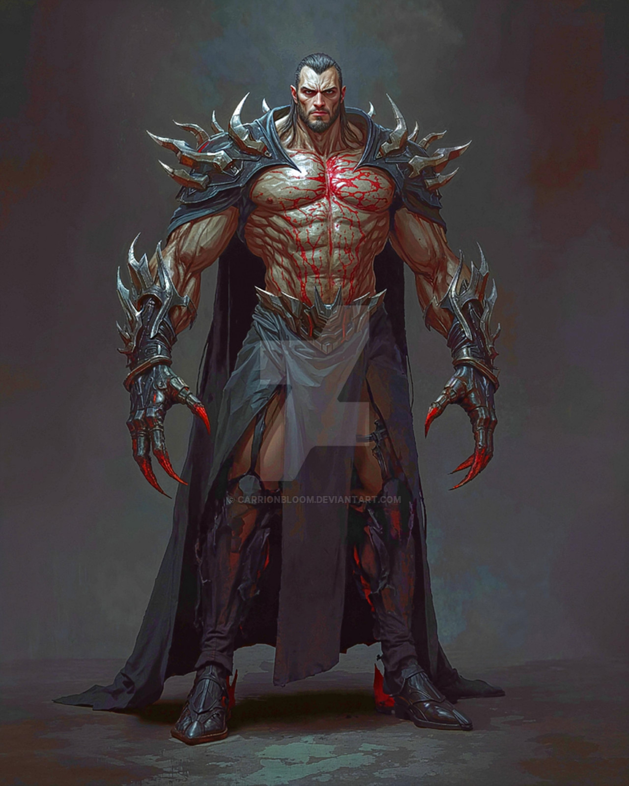
After much deliberation I decided to loose the horns altogether for this new character. You can trace the progress if you check out my FB page, but basically no matter how I configured the horns the immediate response has been 'Death's Head II!!!' I think I finally have a look that is still badass, but more sleek AND practical. Capes and horns = not good in a rumble!Related content


Comments: 63


Yes, ditching the horns is better, but the guy feels a bit bland to me now. Losing his horns made me lose attention on his gloriously detailed face and focussed it on his arm.
I don't know it that's the purpose, but here are my ideas to make the readers focus their attantion on his face again.
- spikes along his jaw
- a third eye on his forehead or some marking at the same place with a popping color
- expose his spinal cord a bit and let the tips prostrude a bit
- placing one very wide row of scales along the center of his helmet
- increasing the size of his eyebrow ridge
I don't know know if you would use or HELL even like my ideas, but anyway keep up the good work!
👍: 0 ⏩: 1

Thanks for the cool feedback! Some of the points you make don't fit with the 'nature' of the character, but I love the spine idea - you'd see it more if he was in profile.
In the end I'm trying to make it tough but practical, so too many bits sticking off it would be a real headache to draw after a few times, and also would impede battle. It's a delicate balance!
 (Smile)")
👍: 0 ⏩: 1
yeah true true. If you would draw certain markings or spikes, scales, etc. over and over you would go ballistic ")
excited when we'll see him appearing!
👍: 0 ⏩: 1
I made that mistake when I designed Death's Head II in 1991... he had all these pads and armour... I blew it all off him in the first issue and after that I had him change his gear every issue...
Thanks for the kind words!
👍: 0 ⏩: 1
Thank you. I often remind myself that I shouldn't go super-high-detailed when making characters for my own (would-be) comics.
Keep on rocking.
👍: 0 ⏩: 0


This is totally the way to go. Bad Assery.
👍: 0 ⏩: 1
Thanks, that's what I hoped!
👍: 0 ⏩: 0

<= Prev |