HOME | DD
 LiDiL — greentea site design
Published: 2009-01-30 06:29:04 +0000 UTC; Views: 3431; Favourites: 22; Downloads: 201
Redirect to original
Description
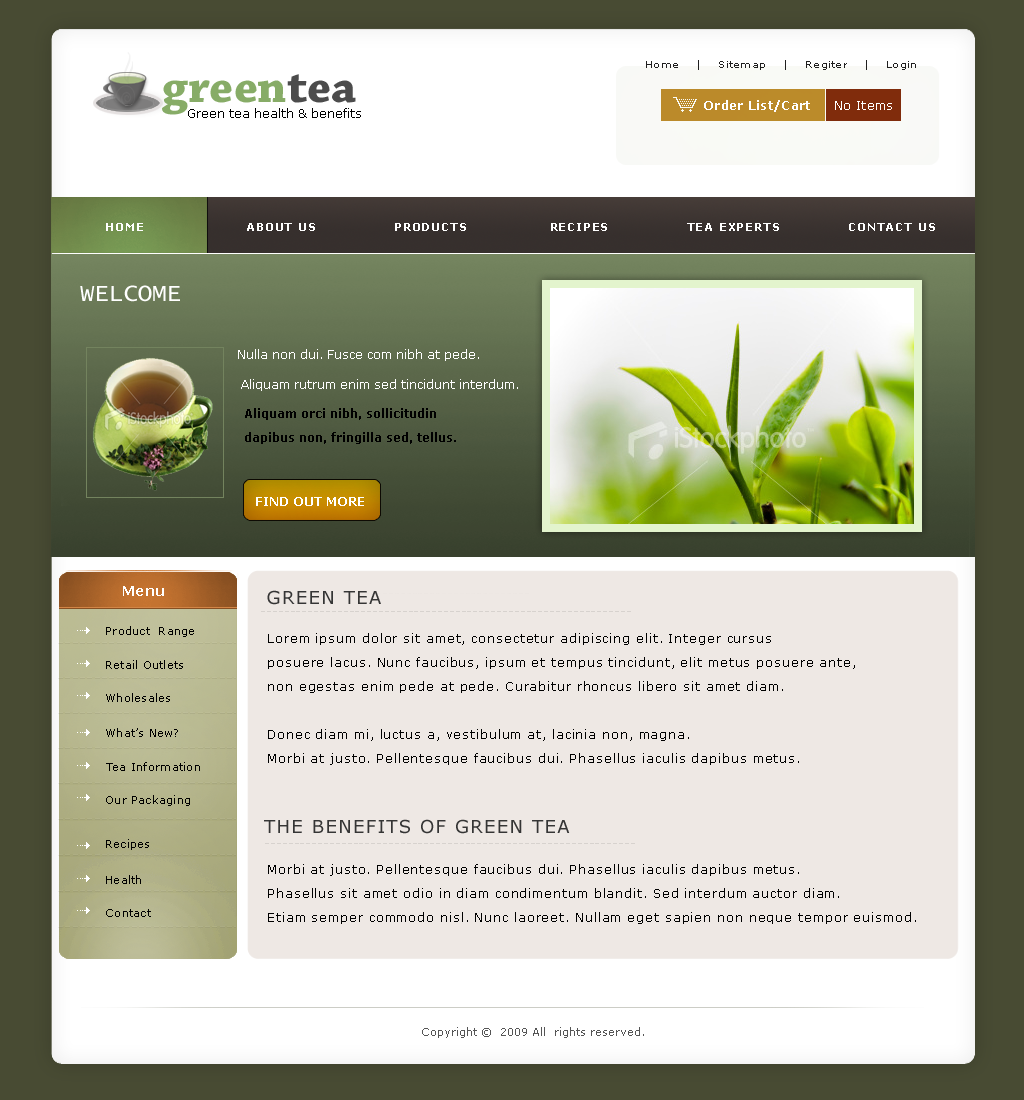
thought I'd design a layout for the logo so here goes.enjoy.
Related content


Comments: 24
YellowPixel [2009-02-25 00:11:36 +0000 UTC]
I really love this Idil! MashaAllah!
I do have one comment, if you dont mind, that i noticed on a couple of your layouts, this would probably fix itself in the coded version anyway but it's good to be aware of it.
Spacing and alignment of objects on the page, for example the logo i would push down a bit so it is horizontally aligned better with your little menu/cart box to the right.
The plant photo i'd also align the right edge with the menu/cart box.
Some other text elements too, just pay attention to how things are aligned in relation to the other objects on your page.
I'd also pad the content box a bit more on the top, push the text down a bit.
That's not a major concern with the mock up, and otherwise, i can't find fault. Bravo!

👍: 0 ⏩: 1

thanks Em. yeah I don't pay much attention to align when I'm designing I probably should though. I'll fix em
👍: 0 ⏩: 1
YellowPixel In reply to LiDiL [2009-02-28 19:21:38 +0000 UTC]
YW 

👍: 0 ⏩: 0


very nice template lidil, getting better at this!
👍: 0 ⏩: 1
thanks. so are you, with your planet works I mean.
👍: 0 ⏩: 0

Beautiful design and good choice of colours. It would be much better when cleartype is enabled, not such a fan of aliased fonts. It is always a good thing to check how it looks on non-cleartype system.
👍: 0 ⏩: 1
thanks for oyur comment.
what system are you on? and how does it look on your end?
👍: 0 ⏩: 1
My comment is not based on your design. While designing it is better to use not-rendered fonts like you did. So that you see how it looks on systems where cleartype is not enabled. But when you publish the page as HTML it will be rendered with cleartype (when the user is using Vista, IE7, MacOS etc.). The font rendering would be much better then.
So basically nothing to add  (Smile)")
👍: 0 ⏩: 1

Nice work, only a few comments.
I believe when you keep the site in the same colors as the logo then it would be great, now there are to many colors.
Just if you want keep the 3 colors of the logo there very good.
Best Regards,
Hein
👍: 0 ⏩: 1
thanks Hein, I took your advice and changed the colours around a bit. hope it looks better.
thanks for the

👍: 0 ⏩: 1
Yes, its much better now. good job and I'm looking forward to see you're next design
 (Wink)")
👍: 0 ⏩: 1
thank you. now I'll have to start on my next design hehe
")
👍: 0 ⏩: 0


