HOME | DD
 Liettore — MY NAME IS NOT CANADA
#arcana #temperance #canadahetalia #hetaliaaxispowers #aphaxispowershetalia #hetaliacanada #dreamtalia
Published: 2016-05-17 01:52:45 +0000 UTC; Views: 1671; Favourites: 63; Downloads: 3
Redirect to original
Description
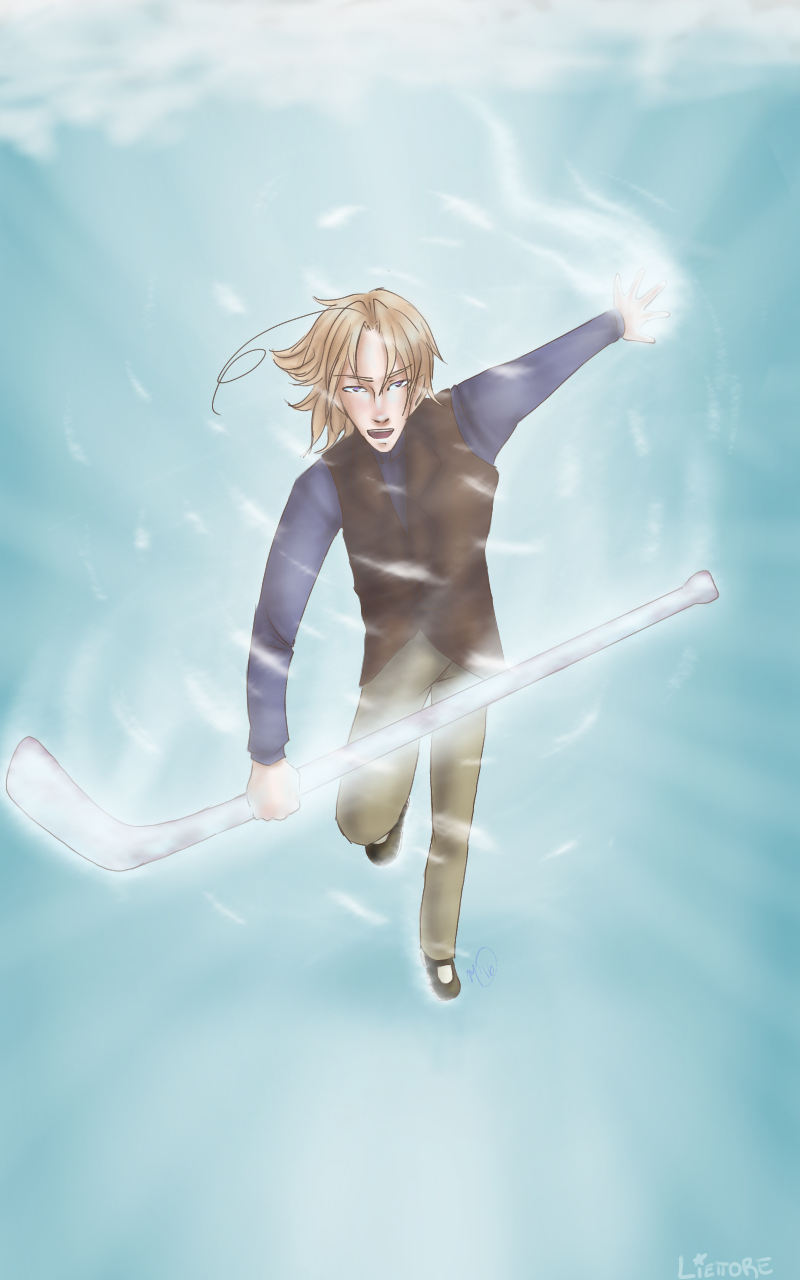
dreamtalia-official.deviantart… DREAMTALIA FANS, PLEASE CHECK THIS OUT, SPREAD THE WORD, AND HELP IF YOU CAN!!!Treat this as a redraw of
AAAAAAAHHHH Tempy Tempy Tempy Tempy
I love this boy so much aaaaaaaaaa
So, action shot! Not something you often see from me! Because I suck at them. XD
Critique the hell out of this.
Hetalia © Owner
Dreamtalia © KyoKyo866
Art © Liettore
Related content


Comments: 21

Overall

Vision

Technique
Impact
Okay, lemme say first and foremost, I know nothing about Dreamtalia, so uuUH... |D
But this is amazing, I gotta say, the colors are very nice and you've managed to capture some motion in this piece. The blue is so nice, it's elegant, but bright enough to give a piercing feel that adds to the dynamicism of this piece.
The first things that jump out at me that could use some work are his arms. His right arm (the one holding the hockey stick) feels too casual. I feel like you could've brought his fist dramatically toward the foreground to give him more of a...I'm not sure what I'm thinking of, but more of a "firm" or "strong" pose. It also would've made the piece more powerful not in a conceptual way, but more of a literal physical way. Bear with me, my mind is in shambles right now.
I'm getting the hint that you were trying to make his left arm brought further back, but it kind of looks more like he's holding it outward. Don't worry though, even I have trouble with this kind of dynamic perspective, so it's something we both need to practice. XD Also, the hand kind of looks a little stubbed. I'm no expert on hands, so I can't really explain really well what could've been done better. The fingers feel like they aren't angled correctly. It feels like his palm is angled more toward the ground while his fingers stick straight up, but this is something I struggle with greatly and I'm still trying to figure out how to make it look better myself, so this thought is a work in process. My last thought on his arm and hand area is the hockey stick. This is probably a super nitpicky thought, and clearly is something even I would overlook while drawing, but I feel like having the bottom of the hockey stick pointed outward would be awkward to hold. It would feel more natural if it were held so that the blade was inward, but I do appreciate that you have him holding closer to the blade than to the center, so it's all good!
Next, I would have to say, the hair is gorgeous. It's so flowey and it's nicely highlighted. Maybe a few snowflakes in his hair would add to the ambiance, but I never got to drawing snow actually ON characters until a year or two ago. XD One thing I do notice that you do often is the foreheads are a little too tall. Either that, or the hairline is just too high up. Maybe if you brought it down a third. Other than that, his face is very well structured. Maybe a tad too narrow, but that's my opinion and I don't feel like it needs to be widened to look better.
I gotta say, I can tell you tried hard making the torso and I gotta credit you for it. It's almost there. e.deviantart.net/emoticons/b/b… " width="15" height="15" alt="
")
e.deviantart.net/emoticons/a/a… " width="19" height="19" alt="

I really like his legs. They're well done~ I can see that you tried to make his thigh more pointed toward the viewer judging by your lines. If you'd brought his knee up a little more, it would've been great. Maybe add a fold in the pants on the inside of his knee to make it less...I'm not sure what exactly I'm thinking of, but I hope you get my gist. His left leg feels a little out of place, maybe just a little too far out? I feel like his foot would also be farther back. Maybe it would help to keep in mind those perspective models where all of the lines meet in one place would help. I know it helps me.
But anyway, he still looks great! Everything I pointed out isn't so jarring to the point of altering the power of the piece dramatically. The effects are wonderful, I love the swirling snow and the wisps. One final thing I want to point out is that I like how you did the hockey stick in the older one. It looks very icy. I don't know anything about the hockey stick in terms of Dreamtalia, but I like that it looks like it's made out of ice in the old one. I personally would recommend concentrating the white toward the centers of the hockeystick, and darker shades around the outside to make it look like it's holding some mystical power inside of it. I don't really have an example of what I'm thinking off of the top of my head, but maybe if you look for an image of my Dream Caster with his wooden staff and look at the ball, that's what I'm talking about.
ANYWAY, this has gone on long enough, omg-- Overall, I feel like this piece isn't as dynamic as it could be, but as you said, you don't do action shots a lot, so this is a good step! Everything's intended in the right direction, it could just use some shifting. This is a wonderful piece and I'm proud to see you taking bold steps like this. qwq
👍: 0 ⏩: 0

A TRUE MASTERPEICE, TRULY AMAZING!! i LOVE IT!!
👍: 0 ⏩: 1

Wow, thank you so much... that means a lot!! ^^
👍: 0 ⏩: 1
You're very welcome!! I REALLY love it!
👍: 0 ⏩: 0


Holy sh-t the perspective is gooood
Is this about the Dreamtalia v3.0
👍: 0 ⏩: 1
Thanks so much!!! The perspective was hard.
Ha, well, that was part of the inspiration. XD
👍: 0 ⏩: 0
*dies*
Thank you so much!!!!
I'm glad it turned out... XD

👍: 0 ⏩: 1

youre very welcome!!
the turn out really is nice! youve made a lot of progress -- great job!~

👍: 0 ⏩: 0


Thank you so much, love
👍: 0 ⏩: 1

OMG improvement~ ;w; I will write a critique when I'm done cooking pot stickers if you want me to==
👍: 0 ⏩: 1
YAAASSS TwT
hhhhhh I would love that |D
👍: 0 ⏩: 1
ALSO THIS HAS INSPIRED ME TO DRAW, YOU HAVE INSPIRED ME TO DRAW FRIEND 8D But I'm lazy--
It's dooone~ ;w;
👍: 0 ⏩: 1
OMG YES FRIEND I SHALL NOW MOTIVATE YOU
*ahem*
*gets Shia Labeouf on*
DO IT! JUST DO IT!
I'm tired omg
HHHHHHH THANK YOU SO MUCH FRIEND <3
👍: 0 ⏩: 1
OMg
hHHH you too? XD Omg you're welcome |DD
👍: 0 ⏩: 0