HOME | DD
 LifesDestiny — Unique Introduction

Published: 2009-05-26 02:21:15 +0000 UTC; Views: 979; Favourites: 18; Downloads: 45
Redirect to original
Description
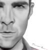
1. Introduction of my 100 themes challenge.Well this is my first proper photo-manipulation in over a year now. It's been hard getting back into the swing of things.
I had a clear idea of what I wanted but the more I played around with it the worse it got. I hate the paint spots but didn't realize I had flattened them till after I decided I didn't want them so they have to stay. Took 6 hour+ so I am not playing around with it anymore. If I'm still not happy with it in a day or two I might update it.
----------
Q. But how does it relate to a "unique introduction"?
A. Well you usually shake someone's hand when you meet them for the first time. I had intension's of making them shake hands but it was quite hard to manipulate that so I went with what there is. They are both in irregular positions and yet they mix well with each other, making it a unique introduction to what ever you take away from the picture. Wither it be closeness or friendship or even just flexibility. It all depends on the viewer.
----------
Stock Used :
Background
[link] by `thespook
[link] by ~kiso-myruso-stock
Men Models
[link] by ~b-e-c-k-y-stock
[link] by ~Johnny-Yong
I give *100ThemesChallenge full permission to place this artwork in their gallery.
Related content


Comments: 17

this is a great piece of work, cleaver "image stitching". Its also got a very good commercial look to it, i.e could see it advertising a product or cause.
its just very cool !!
👍: 0 ⏩: 0

this is interesting and looks good, but try to adjust the lightning/contrast and the levels of the stock pictures better, this way your manipulations looks more authentic
 (Smile)")
👍: 0 ⏩: 1

Thanks for the tip. I did change the contrast but I need to know how to manipulate lighting a little better because when I did edit the contrast there was shadows where I didn't want them.
👍: 0 ⏩: 1
try to use the curves or create a new layer, set it to "soft light" and paint with black or white on it
👍: 0 ⏩: 1
Thanks very much for the tip! I'll definitly keep that in mind. I don't use photoshop so there isn't much tutorials for fireworks when it comes to small detail enhancements.
👍: 0 ⏩: 0


I'm quite terrible at stocks, but this looks amazing. I love the movements, and how the text doesn't damage the composition!
👍: 0 ⏩: 1
Aw thanks very much. I wasn't sure it turned out as I had imagined, but it's seems to be liked.
👍: 0 ⏩: 0


You did far better with the manip than I could have done and I love the idea!
👍: 0 ⏩: 1
Aw thanks very much, your lovely comment is much appreciated.
👍: 0 ⏩: 1

👍: 0 ⏩: 0
Haha I don't know how you managed to find stock to make them look so perfectly balanced and conected ")
👍: 0 ⏩: 1
Well I actually had to change the stock it self, especially the one named "matrix". His arm was too much over to the left so had to cut and paste to move it where it is. Thanks very much.
👍: 0 ⏩: 0