HOME | DD
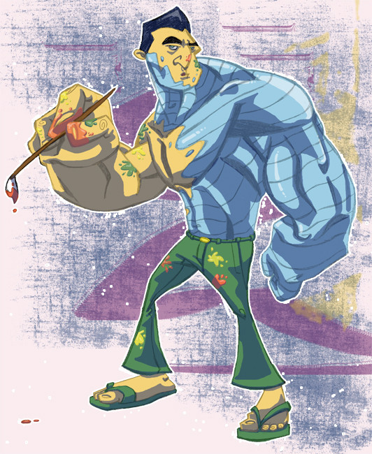
 LightBombMike — Gentle Giant
Published: 2005-02-09 17:08:39 +0000 UTC; Views: 2623; Favourites: 45; Downloads: 277
Redirect to original
Description
Sooo, after the last couple of pieces I did, which, while decent, had glaring problems with them, I wanted to do a piece I could be happy about. Not that this is perfect, but I feel it is a lot better than my past few deviations.I looooove Collosus... he is awesome. The thing that always gets me though, is that when people draw him, he always looks angry. Which, while he does have a temper, he is actually an artist at heart, more content to paint and write than fight. I tried to get that here, the moment he has to put down what he wants to do, to once again put the bad guys in their place.
This is also pretty acurate of my life right now... everytime I get into a drawing or Maya, I get pulled away to do a much more noble cause. We both do what we have to, to help our family... me my brothers, him his sister. You drop it for family... it is just what you do.
:EDIT: Added those paint splotches... and the highlight in his hair.
So him and I seem to have quite a lot in common... minus his cool ability to wreck shop.
Hope ya like!
Related content


Comments: 84


OK... Anybody who doesn't wanna speak the truth outta the pool. Dickhead here with my latest crit. Drawing nice... issuses? YES
1. One of his arms is wrong. It's your choice which on, but lets just say his meatl arm is too short. If he put the atm holding the brush down it would be on the ground.
2. I agrre with Jalil on the legs. it's the right one. it nears to be ducked back towards his body. and why does his leg taper into something thet should be a knee, but isn't.
3. I think an easel might be nice to give the picture something more. I read your description and thoughts on the pic before i looked at it and it was sch nice description of an artist balancing life and work and then all the big fella has is a drippy paiting brush. A big landscape or an abstract might have said alot.
4. Monk showed you what a colorist can do. Try it some time. You know how to do it. Give it a shot some time. I think the coloring you did looks great on this piece, but i know you want more.
5. Try a storytelling pose with the blue creepy crawler
Peace up Cub Scout
👍: 0 ⏩: 1

1. Word.
2. Style thang... I wanted to taper his leg to contrast his bulging legs, and I liked tapering them in the middle... you don't... that's cool... I like em though.
3. Yeah, I though about that... but ran out of paper... easy enough to add for sure.
4. Yeah, I liked the colors on this, since I got rid of the black... this works for me. Coloring like that takes a lot more time and energy than I am willing to devote, at least until I get a wacom...
5. Already on it! Thumbnailed it out already... and not only is it telling a story, he is reading one as well... a two fer as it were.
Thanks Scout Leader!
👍: 0 ⏩: 0

Awesome job, man ... right down to the flip-flops ... Colossus in FLIP-FLOPS ... gotta love it! I agree with the lower body weight issue, btw, but don't change a thing if it detracts from the flip-flops ... I just typed "flip-flops" THREE times (well, FOUR if ya count the one in quotes) while critiquing a Colossus piece ... this truly is a glorious day. One more time: Vive la Flip-Flops!
👍: 0 ⏩: 1
hahahaha... never knew that the flops were gonna go over so hot... casual wear for a casual guy.
👍: 0 ⏩: 0

Mike man...no doubt this is hot. I really think this is one of your best peices. The shading on the metal is super nice, the only thing maybe ic ould think of is that it would have been nice to see just a few highlights on his flesh half. Like a lighter tone than your base color. Other than that..its hot..definately a fav. Nice work bud.
👍: 0 ⏩: 1
yeah... I was thinkin about more tones, but I decided to keep it light, and let the metal have the chance to shine... make it a little extra reflective than everything else
I actually think I channeled a bit of you with this man... big guys are kina your thing, and those forearms are total hafners... so big thanks on that ya wee sexy man you!
👍: 0 ⏩: 1
hey o!!! haha yea you know i like the big guys....what? anyway...im glad ya did the channelin thats awesome, the big forearms i always feel give the character a lil somethin you know. Definately a nice job man.
👍: 0 ⏩: 0

You shoudl draw Ittlyana in there too! Well maybe not...anyways dude this is a sweet drawing! I love Collossus and you have done a great job in portrayin him! His upper body looks solid( get it solid ehhhh) i woudl liek to see some more highlights for shineyness, BUT the highlights you do have are workin! The BG is workin for me, I really like how it was done ( i don't really know how it was done but its cool!) I like his expression, but i woudl almost like to see him more peaceful even if his bufft seasons 3 -6 just got smashed in the BG...But all in all a sweet piece my friend! I woke up on the comment and crit side of the bed this mornin! damn you've got me wantin to darw the x-men now....
👍: 0 ⏩: 1
I was trying to go for that "NOT AGAIN!" look, like all he wanted was a moments peace... but it came out wrong... not enough roll in the eyes.
Yeah, I watched X2 with my bro bros yesterday, and it got me in the kick to do em.
👍: 0 ⏩: 1
haha cool cool, yeah i've actually had the theme of x2 in my head for liek 2 days now, for no apparent reason, ahh well maybe i should watch it too!
👍: 0 ⏩: 0

Nicely done  (Smile)")
")
👍: 0 ⏩: 1
thanks man...
yeah, I was goin for his biceps small, forarms BIG... and made the flexors the dominant muscle group... but since that isn't the most normal... I think it abstracts them too much. But something I should be more cautious of in the future if it doesn't read well.
👍: 0 ⏩: 0

Love the X-men thing you got going here, you realise you have to do Nightcrawler, he's so cool with POOF and POH and the SPISH!
👍: 0 ⏩: 1
oh yeah... he is next on the list... I have never been able to get him right before... so I am determined to this time.
👍: 0 ⏩: 1
I know what you mean he always dissapears before i can draw him (Bu-Dum-Cssh) okay okay bad joke but may the force be with you on this one, cant wait to see it!
👍: 0 ⏩: 0

i love the paintjob u did on coll...
the background is pretty neat, but almost distracting from him... maybe filter it down a bit or somethin.. but all in all, very sharp
👍: 0 ⏩: 2
i dunno man,, do like a fade from the middle on out... an anti-fade... if that's possible
👍: 0 ⏩: 1
ahhh .... right... worth a shot
👍: 0 ⏩: 0
yeah... I could try to tone it down... I meant for it to be fairly chaotic, like an alarm is blaring, or something is crashing... butttt... if it distracts too much, then BAD!
👍: 0 ⏩: 0

I'm liking this.....very nice coloring...the metal and the paint have the same quality...i'm not sure if you intended that but it works great. the pose itself feels a little stiff to me, not enough weight in his legs. While the upper body has a lot of character, the lower feels like it was just placed there. Other than that nice work...
👍: 0 ⏩: 1
"Don't know if I intended that"... hahaha... please... every once in awhile I know what I am doing.
Yeah... I think adding some paint splatters to the pants would help add some character to them... won't fix the weight... but ya can't win them all!
👍: 0 ⏩: 1
that actually would help a lot....no matter what, it's one of your best pieces even though the issue...up there with the Hawkeye for me...
👍: 0 ⏩: 1
well, thanks man... I'm pretty pleased myself... after Hen rips it apart, and gives me a few more things to edit, I'll add em then.
👍: 0 ⏩: 1
lol.....can't wait to see what the "Crew's Dickhead" (I'm liking this...lol..) has to say..
👍: 0 ⏩: 0

Awesome man. I love how the metal and skin meet like two puddles of paint. Very fitting for the theme of the piece. Nice work!
👍: 0 ⏩: 1
definetly what I was goin for. Thanks man!
👍: 0 ⏩: 0

he's cool.. Your drawings have gotten very beefy lately XD ...I like his flip-flops and the expression on his face
👍: 0 ⏩: 1
yeah... beefy superheroes... if I do Nightcralwer, which would be my next one in the line of X-men, he will be lean and mean.
👍: 0 ⏩: 1

you should totally do nightcrawler!
👍: 0 ⏩: 1
he should be up today... I'm thinkin he is lookin pretty cool!
👍: 0 ⏩: 0
<= Prev |