HOME | DD
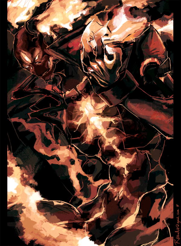
 lightning-seal — Blazblue -Altered Mind WIP-

#blazblue #jinkisaragi
Published: 2013-03-25 00:08:10 +0000 UTC; Views: 1797; Favourites: 57; Downloads: 25
Redirect to original
Description
More incomplete stuff.This is sort of old and is actually based on an image of mine that I am actually too embarrassed to even link here.
Related content


Comments: 13

Cant wait to see it finished *u* How long do these drawings take you, if you mind me asking? o:
👍: 0 ⏩: 1

Thanks!!
The time it takes me varies. Like this piece I had been working on on and off through the month of December but it was based on a picture that I drew a long time ago so saying that it took me one month to get here would be slightly inaccurate. My sketches on average usually take from a day up to a week. The bigger pieces range from that week to months upon months of time. These two pieces took me about two months each >> [link] [link] . But these two took me less than a day>> [link] [link] So it really really varies but I think my motivation, my life and the timing of the piece tend to dictate how long they end up taking.

👍: 0 ⏩: 1
Wow thats incredible, up to two months o.o It shows though, your work is really detailed :'DD!
👍: 0 ⏩: 0

Anytime, my friend!
👍: 0 ⏩: 0

I have to admit i was a little confused by the bottom part of this drawing. Only after looking at it for a while did i figure out that the composition is far better if it starts at the bottom and goes up, instead of starting at Jin and then the bottom. With that in mind this has a lot of potential, but I'm afraid its almost at its peak when it comes to detail so be cautious if you're gonna add any more.
Excellent work so far.
👍: 0 ⏩: 0

Love all the upward movement in this one, that combined with the shadow/light distribution with all the black at the bottom of the canvas really gives it a solid, weighted feel without being too heavy.. like a balloon weighted by a rock (for lack of a more eloquent description...)
👍: 0 ⏩: 0

I like how you expressed the action in this one. The color combination is a bit odd but they match very well somehow. I cant wait to see the finished version!
👍: 0 ⏩: 0

Even for being incomplete, this looks amazing! I love the variety of colors you use for light and shadow, and how everything is very shape driven.
👍: 0 ⏩: 0

Looks really nice so far. It's seems lighter than your usual stuff.
 (Smile)")
👍: 0 ⏩: 1
I agree with you. Usually I try to build my pictures from dark to light. With this one, the white background threw me off big time. When I do start with the darker colors it makes the overall mood and tone of the images dark since the foundation the whole image is built on darkness and I prefer to draw in the lights than draw in the shadows. This one is sort of a mix though. On his catsuit thing I drew from black to white but everywhere else is weird.
👍: 0 ⏩: 1
It looks interesting so far!!
👍: 0 ⏩: 0