HOME | DD
 lilpixie — Lilly Pixie

Published: 2003-10-17 21:49:18 +0000 UTC; Views: 1144; Favourites: 12; Downloads: 269
Redirect to original
Description
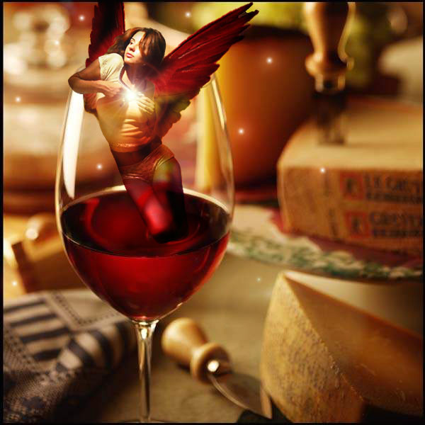
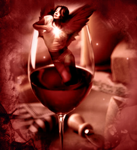
Another little pixie (Smile)") I couldn't decide which one I liked better, so I posted both this one and a greyscale version. Which one do you like better?
I couldn't decide which one I liked better, so I posted both this one and a greyscale version. Which one do you like better?EDIT: I messed around again with this thing, and I like it so much better

 Thanks to `darkgoth for the pixie, ~ critter for the the butterfly wings, and to ~resurgere for the flowers!
Related content


Comments: 49

Typically agreeing with everything already said. It's a marvelous piece of art...worthy of praise at the least.
👍: 0 ⏩: 1


wow thats really amazing!, the colours are so strong and vibrant yet work perfectly together, and the model you seleced is very pixie like
Well done!
👍: 0 ⏩: 1


thanks dear, yer too kind! what do you hate about it??? If you have the time, gimme some ideas to fix it plz...
👍: 0 ⏩: 1
o.0 what you rolf'n at missy?!
Hate?.... i dont hate much but, i dont like using other peoples stuff for a manip, their talent aid's too much in the effectivness of the piece, u know what i mean? using otheres stuff too much is just like doing a cover of an old song. I think its better to take inspiration.
You could take a pic of urself to be the lil pixie, then its more like urs, lol... Go on
Having said all that ur stuffs pretty class so....
👍: 0 ⏩: 1
Yeah, but I wanted to see what I could do with good pics. I did do my own manips but I took em all down... they were all blah!
👍: 0 ⏩: 0


a true feast for the eyes, just love the colours playing with each other.
+fav no doubt
👍: 0 ⏩: 1


Wicked, sexy, imaginative, creative, alluring, reealistic, very fairy... pixie wonder! I LOVE THIS!

👍: 0 ⏩: 1

Oh my gods, that is droolful. Wow, it really is pretty... I think i might cry
~X~
👍: 0 ⏩: 1
Oh thanks so much! You should really go check out the original pics, the girl was taken off the roof of a building in New York by yours truly. The pic is just stunning! And :iconresurger: has some amazing stock.
👍: 0 ⏩: 0

i like both, color and greyscale.one captures the life (color) the other (grey) captures the moment and simplicity of life. the little quiet moments we all should enjoy.
👍: 0 ⏩: 1
I really like the way you think! Thanks for dropping by so soon, I'm honoured


👍: 0 ⏩: 0

Awesome image. I really like the concept and the colors. The images are blended nicely and the framing is kick ass. Great job
👍: 0 ⏩: 1
You're the only one so far that actually likes the frame! Thank you!!
👍: 0 ⏩: 0
So sexy, I'm almost blushing! Teeheehee! Actually, this is really pretty! I like it a bit more than that b& w version, but that one's very pretty as well. This has a great sense of naughty fun about it... I liek that a lot!
👍: 0 ⏩: 1


")
👍: 0 ⏩: 1

ohhh, that is nice. Beautiful colors. I love the close upness of it. Very pretty. The only thing I think is a bit off is the pixies clothes, seem a bit weird for a pixie....but pixies can be weird..so who knows. Very cool
👍: 0 ⏩: 0

yeah i really like the detail in the pic, but she looks like she's out of place a little bit. i think it's just the coloring, but it looks very nice
👍: 0 ⏩: 1
Thank you for the constructive advice hun, I'll keep it in mind~
👍: 0 ⏩: 0

gorgeously bright and wonderfully fluttery butterfly wings on ya faerie........really special i think i have to add to my favs....hope ya dont mind

👍: 0 ⏩: 1
Why would I mind? Hee! Thanx~
👍: 0 ⏩: 1
love the wings....im a butter cat i furcadia and i love your work
👍: 0 ⏩: 0

")


👍: 0 ⏩: 0

equally beautiful i'm at odds but i'll still say B&W
")
👍: 0 ⏩: 0


Ha! Intresting! It shows the info on what cam u took the pict on ")
wait... this can't be real...
👍: 0 ⏩: 1
Yeah, I dunno where that came from or how to get rid of it... 
👍: 0 ⏩: 0

another masterpiece!!! well done...i 
 (Wink)")
👍: 0 ⏩: 0

ooh colour version IS nicer ..... but maybe a hand retint of the b/w version could be even more interesting!
👍: 0 ⏩: 0

lovely colours and i like the framing... but the wings do seem kinda off, push em a lil bit back and up abit.
overall i still love it
👍: 0 ⏩: 1
Great! Thanks for the advice! I would love to hear what you think of it now that I moved the wings!
👍: 0 ⏩: 0

tis prettily done... the wings should be a bit more on the shoulder blades...
👍: 0 ⏩: 0

beautiful.. you really have came on so much since i first noticed your work
well done
👍: 0 ⏩: 0

Wonderful clarity and contrast
👍: 0 ⏩: 1
Thank you for the sweet comment... you said the framing could be better? I've been messing around with styles and such, any suggestions?
👍: 0 ⏩: 1
maybe taking out the inverted line around the left and bottom, it's not bad or anything, i'm just wondering
👍: 0 ⏩: 1
Cool cool! Those are some great things to keep in mind when I do my next manip! Thanks so much!
👍: 0 ⏩: 0