HOME | DD
 Lilyas — CSS Journal Design for Ida

#css #fairy #green #ida #journal #larsen #layout #mizzdraconia #journallayout #fairygreen #cssfairy #greenjournal
Published: 2006-11-10 06:31:56 +0000 UTC; Views: 10439; Favourites: 49; Downloads: 63
Redirect to original
Description
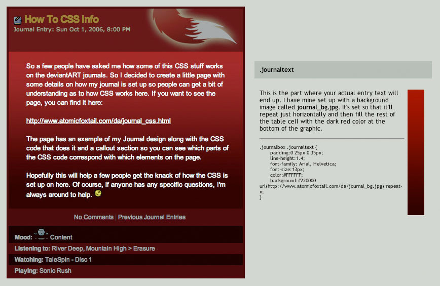
So this is what my new journal design looks like. I made this after request from my friend Ida *mizzdraconia . With some little changings it will also applied on her stock account and her E-Magazine *Future-Art-Magazine . Since this is still a work in progress I can't show you this design in action.I hope you like this work, Ida!
Update: Life version can now be seen here: [link]

Related content


Comments: 133

hätt ich ja gerne..aber link geht nich
"...Please check the URL for proper spelling and capitalization"... ????
")
👍: 0 ⏩: 1

[link]
Ah, ich weiß, was passiert ist! Ich habe, wie sich das gehört, einen Punkt nach dem Link gemacht, weil der Satz zu Ende war. Und der wurde dem Link "angehängt". Das mochte der nich. So wie der Link jetzt aussieht, müsste das Bild erscheinen.
👍: 0 ⏩: 1
ohh...ja, das iss wirklich seltsam..hmm???
👍: 0 ⏩: 1
Vielleicht sind wir ja jetzt so was wie eine magische Triade!

👍: 0 ⏩: 1
hehehe...hey, cool  (Wink)")
👍: 0 ⏩: 0

I love it! 
Though I am not with AAI anymore, so would it be difficult to remove that button?

👍: 0 ⏩: 1
Of course not. I hit the delete button and done. Anything else instead? What do you think about melonlogic's comment? He made some suggestions.
👍: 0 ⏩: 1
great!
Hmm.. I kinda like this one, but can you try and upload one with his suggestions? Just so I can compare?
I am so happy you are doin this dear 

👍: 0 ⏩: 1
And you are fine with the little picture box in the header? We'll see if I can make different versions. Should be no problem. I want to make three layouts anyway for your three accounts. I think they should fit each other!
👍: 0 ⏩: 1
yeah I love the box  (Smile)")
Oh and could I have the coding for this one, so I can put it on my journal right away?
I can always replace it later for the altered version if I like that better

👍: 0 ⏩: 1
Dear, the code is not finished yet. You will get it immediately when I have it, ok? The code itself does not need very long, it's the testing phase when I have to check for little devilish details.
👍: 0 ⏩: 1
Ohh okay no prob
👍: 0 ⏩: 1

I really like this color combination, it works well top too bottom, excellent job. Has a stellar feel too it, well conveyed.
Technically the black "Welcome too......" does not fit color or style wise.
I think the header graphic is top notch and should be left alone.
An option would be to take the text on the header " ida larsen" along with the text color and effect and switch it out with the black text/font.
I think the square box in the header also does not fit the free flow of the design at all.
I would love to see that beautiful header stand on its own, I believe it very well can.
again superb job overall.
👍: 0 ⏩: 1
Thanks for your great comment, Nik! It's very good I have posted this before I got it coded so I can still improve some things. I will definitely think about the little picture box in the header. Whether I change the outfit or I move it or I even remove it. Let's see what Ida thinks. Any suggestions what still could be added in the text area?
I appreciate your opinion, thanks again!
👍: 0 ⏩: 1
Personally, I would remove it, I took it out in photoshop and it looks better without it.
Text area? you mean the black text? Does not matter as long as it is not black. What you did for her name in the header is what i would use instead of the black text will look nice there and fit with the subtle theme.
I bet she is jumping for joy over this. Excellent.
👍: 0 ⏩: 1
Yeah, right. But you know, this it the journal title and this thing shows up automatically. All it can have is different color, size, font and text decoration. No special effects.
Text area = journal content. I only added these double lines on the sides. To me it looks good but maybe it could have some more.
👍: 0 ⏩: 1
Go with the same text color as you did for Ida W Larsen.
Journal box: Could be wider looks a tad squished. Personally I dont like the glow around the section headers (Latest News, my portfolio....) I think the button highlights them good. Might want to make the buttons a tad smaller too, it might work itself out if you widen the actual journal body enclosure.
👍: 0 ⏩: 1
Aha, alright. Ok then. I will go and try out some of your tips........
👍: 0 ⏩: 1
Looks like you got a winner either way, again i think you did an excellent job. Very clean and equisite. Good color, good feel.
👍: 0 ⏩: 1


👍: 0 ⏩: 1


Interesting design
not my color but very interesting
👍: 0 ⏩: 1
Mine either but you know these colours fit so perfectly to the DA page! ")
👍: 0 ⏩: 1
I didn't even think about that...
not that I like those either
you are welcome
👍: 0 ⏩: 1

I think i commented again instead of replied, should be at the bottom.
👍: 0 ⏩: 1
<= Prev |