HOME | DD
 Lilyas — FAM Logo
#fam #future #logo #magazine #artmagazine #futureart
Published: 2006-11-27 05:16:28 +0000 UTC; Views: 14017; Favourites: 79; Downloads: 659
Redirect to original
Description
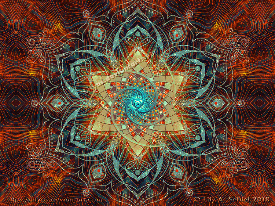
This is a logo I made especially for *Future-Art-Magazine .It's all done in Photoshop.
I used some brushes from ~Luizalenora
Related content


Comments: 126

")
👍: 0 ⏩: 1


Fantastic design and logo, Lily! Just superb!
👍: 0 ⏩: 1


👍: 0 ⏩: 1

hey dear, I placed this in my scraps to use in the news articles etc [link]
hope you don't mind? I suppose thats what you made it for?


👍: 0 ⏩: 1
Oh, no problem, that's fine with me. It was made for you, sweetie! 
 (Wink)")
👍: 0 ⏩: 1
Oh but I did.. check the link again?
Or do you mean in the future news articles?
👍: 0 ⏩: 1

oh okay I'll do that in the future
👍: 0 ⏩: 1


👍: 0 ⏩: 1
Oh, that's so wonderful that you see it this way! I was wondering if it fits or not. But Ida likes it, too, and so I am happy!
👍: 0 ⏩: 1


thanx so much my dear friend
👍: 0 ⏩: 1
Ok, that's good. Have you seen it in action in my journal? I didn't place it in the header because I would have to change some things to fit it.
👍: 0 ⏩: 1
yes and it looks absolutely stunning!!
Just send the coding to me when you finished it  (Smile)")
👍: 0 ⏩: 1
The code IS finished. The only question is how would you like to apply this logo: As I did it or as it is in the mizzdraconia design. See my other comment in your journal.
👍: 0 ⏩: 0

O.o I really like this. It has a pretty blue theme to it and the design is just awesome. It looks like a pearl is in the middle surrounded by....eh....curls. XD I don't know what to call them, but great work.
=o= I didn't notice you had a new avi until now. lol It's hypnotizing. @.@
👍: 0 ⏩: 1
New avi? I never used another one. I only changed versions of it. And since DA switched to DAv5 I should do some other changings on the background for a better appearance.
Yeah, a pearl surrounded by curls. But if you look closer you should see the token "FAM".
Thanks for commenting, sweetie!
👍: 0 ⏩: 1
Oh... XD 
Your welcome. ^^
👍: 0 ⏩: 0

WOW. And that's all PhotoShop? Fantastic job.
Before I read the Description, I was thinking it was a 3D app.
👍: 0 ⏩: 1
That's one of the fantastic things in PS. I f you know how you can generate many real looking 3D effects without 3D software. Thank you so much for your comment!
👍: 0 ⏩: 0


Splendid design, my dear! One of the best logos ive ever seen!
👍: 0 ⏩: 1
No, really? It's not made in the typical logo style and so I think most people wouldn't like to use it for adequate purposes. It was a playful artistic experiment. I don't even know yet if Ida from FAM likes it.
Anyway thanks a lot, my dear!
👍: 0 ⏩: 0


Insane good!!! Those words from you, my friend.
👍: 0 ⏩: 0

This is gorgeous! Loved this one!
Great job!
👍: 0 ⏩: 1
Oh, thanks! You are a brush maker!
👍: 0 ⏩: 1
I know it was a nice idea... but it took me months XP (I'm a lazy girl XP... my projects always take long to be finished)
but one thing I can assure ^^ my eyes got quite accurate after "cutting and cropping" (and headaches were quite present too... I will never do that again...)
👍: 0 ⏩: 1
Aww! 
👍: 0 ⏩: 1
Nyah that's true ^^ but sometimes I just wished that people would go around my gallerie more times... you know, I'm a drawer actually... brush making was just something passenger... XP
I can assure you, if you are capable of doing this fantastic logo, you can manage to do a brushset as utile as mine ^^ you can bet it!
👍: 0 ⏩: 1

I think it's quite nice. The silver bevel on the inside looks like Photoshop's bevel and emboss using the "chisel hard" setting in the dialog - which gives it that rough edging when using some of the more crazy gloss contours. Changing to 'smooth' will help. Also, if you create the image at some insane resolution (like 4800x4800 pixels) - when you reduce the image size later on will give you a smoother look, too.
👍: 0 ⏩: 1
Yeah, the rough edging was a problem though I wanted it a bit looking like rough silver. I changed this but now this effect is completely lost. Anyway at least there is more smoothness now. Thanks for helping me to make some improvements, Nathan!
👍: 0 ⏩: 1
I think it looks better. If you desire a blend (just a little bit of rough) - do a layer like you had the first time. Then create a blank layer just underneath of it. Click on the layer with the effects and press CTRL-E (merge layer down). The layer becomes a paint layer rather than a layer with editable layer blending effects. You can drag this layer above the smoother rendition and blend it or reduce its opacity. That way, you get the best of both worlds.
👍: 0 ⏩: 1
Thanks, Nathan. I tried your tip and indeed it worked better with the rough edges to blend the layers. It seems sometimes it's a lot of on and off before you get a decent result.
👍: 0 ⏩: 0

hmm ..... to be honest it lacks polish , the bevel is too much , the colours on the border are bit garish , the font you made looks good , but the font border style does not.
the bg img underlay is cool , but yea only little things make this good imo ...
still if they is happy it's all good.
👍: 0 ⏩: 1
You always help me so much to see my mistakes. You don't know how much I appreciate this. Thank you very much, mate! Though I don't know if it is really better now!

👍: 0 ⏩: 1
much better girl , now simply adjust the border of the entire logo , to have it as an inside stroke , instead of an outside stroke, then it should be perfect.
👍: 0 ⏩: 1
I am not sure what you mean but at least I changed something on the outside border. Thanks, my friend!
👍: 0 ⏩: 1
stroke is one of the blending options found for a layer style , out side stroke , means the line will be wider , inside means the oppisite , all i was saying is make the outside border around the logo thinner.
👍: 0 ⏩: 1
Now I see. But you know, actually there is no stroke applied. I tell you what styles I used for the font thingie:
First layer (on top):
- Inner Shadow
- Outer Glow
- Inner Glow
- Bevel and Emboss
- Gradient Overlay
Second layer:
- Outer Glow
- Bevel and Emboss
Third layer:
- Outer Glow
- Bevel and Emboss
- Drop Shadow
That's it. Hope you can get it all!
👍: 0 ⏩: 1
Basiclly if you got no stroke turned on , then one of the other areas is acting as a stroke , eg : Outer glow , simply look it over and and shrink it a bit , or simply draw a whole new THINNER boarder altogether , it is looking good but girl , this is simply if you really want to be a perfectionist like me..lol
👍: 0 ⏩: 1
Ok, I see what you mean now. Believe me I AM a fucking perfectionist! I guess you already know. I think I'm going to leave this design alone anyway since my friend loved it as it is. She already applied it in journals and news, he he. But your great helpful tips and comments are always appreciated, my friend! Don't stop it!
👍: 0 ⏩: 1
will do , i neevr stop , like that annoying energizer bunny ... going ... and going .. and going ... and ......................................
👍: 0 ⏩: 1
| Next =>