HOME | DD
 Lilyas — FAM Logo
#fam #future #logo #magazine #artmagazine #futureart
Published: 2006-11-27 05:16:28 +0000 UTC; Views: 14015; Favourites: 79; Downloads: 659
Redirect to original
Description
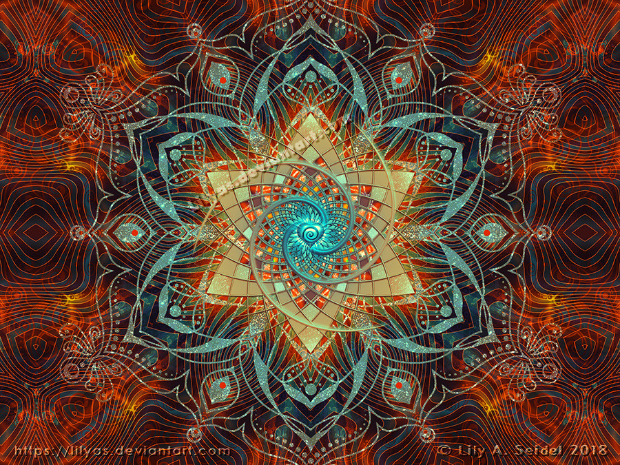
This is a logo I made especially for *Future-Art-Magazine .It's all done in Photoshop.
I used some brushes from ~Luizalenora
Related content


Comments: 126


")


Wonderful lighting and colour scheme.
Crisp and clean.
All little parts are well done
only criticism I could offer would be the plant makes it a little bit busy, however its a good piece of work.
👍: 0 ⏩: 1

Yeah, you are right, the background makes it busy. Maybe I will do some little changings later on it. Thank you for commenting.
👍: 0 ⏩: 0

koooooooollll! ")
👍: 0 ⏩: 1

your welcome! im just about to upload my art that i done at school and they are too mug to upload ahd hat to take photos of them... i dont know what catagory they would go in! lol there Batic!  (Smile)")
👍: 0 ⏩: 0

You never stop to amaze me dear, wonderful
I wish I knew mose in PS


👍: 0 ⏩: 1
Thanks, Nina. I appreciate your nice words.

👍: 0 ⏩: 1
My deepest pleasure my sweet friend

👍: 0 ⏩: 0

hahah you put the tattoo behind the letters XDDDD, its ok that way you can see it so much, great job with this piece ^^
👍: 0 ⏩: 1
Tattoo? I didn't used a tattoo. Only some brushes. Thanks for the comment.
👍: 0 ⏩: 0

sehr schön gemacht...bin mir nur nich sicher mit dem Hintergrund....er iss super,keine Frage...aber grade deshalb lenkt er zu sehr ab und man erkennt das Logo nich so richtig......
vielleicht liege ich auch falsch...auf jeden Fall ist es schön !!!
👍: 0 ⏩: 1
Nein, du hast Recht. Aber kennst mich ja, ich mag es verspielt. Und ohne den Hintergrund sieht es für mich ein wenig fade aus. Aber es soll auch mehr ein Kunstwerk sein als ein echtes Logo. Es soll dem Betrachter erst nach genauerem Hinschauen auffallen, dass da "FAM" steht.
Hab die kleine Version mal in mein Journal integriert. Mit Hover, wow!
👍: 0 ⏩: 0


Very nice! Great blend of colours. Very nice Glass effect.

👍: 0 ⏩: 1


You kick ass!!. Nice logo. You have a gift for the graphic stuff.
👍: 0 ⏩: 1
Wow, thanks for this nice compliment! And for the fav, too! D
👍: 0 ⏩: 0
<= Prev |