HOME | DD
 Lilyas — Sun-Seeker CSS FINAL
#blue #elegant #glassy #green #orange #shiny #sunny #yellow #bluegreen #orangeblue #yelloworange #sunnyyellow
Published: 2007-11-01 04:56:48 +0000 UTC; Views: 6322; Favourites: 64; Downloads: 0
Redirect to original
Description
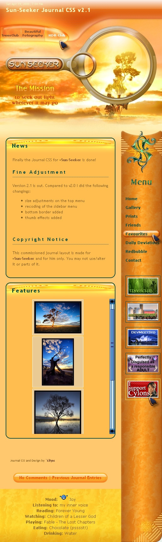
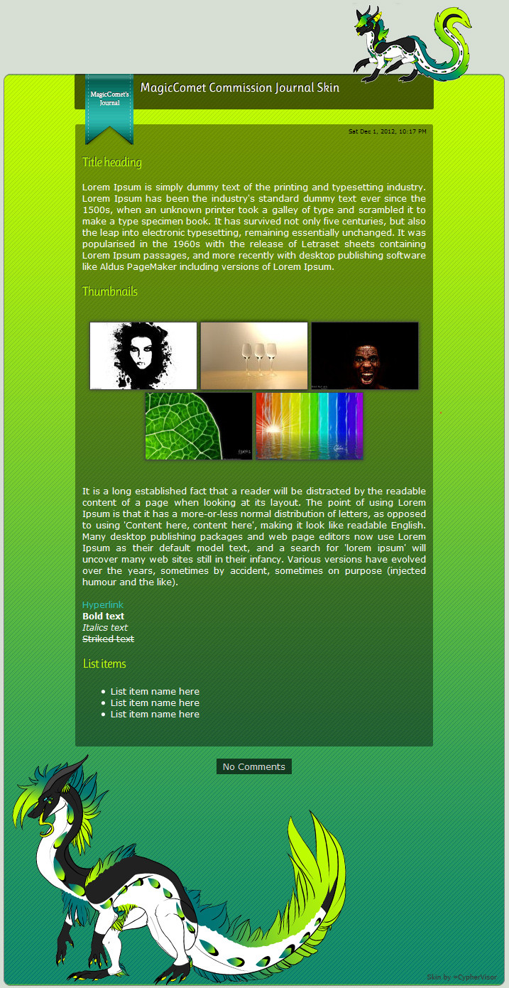
The final version of =Sun-Seeker 's journal!
Live journal: [link]
1. Edit: Updated with version 2.0 of this CSS.
2. Edit: Version 2.1
- size adjustments on the top menu
- recoding of the sidebar menu
- bottom border added
- thumb effects added
..............................................................................................
© C o p y r i g h t N o t i c e:
This commissioned journal layout is made for =Sun-Seeker and for him only. You cannot use the graphics or the code without written permission!
Related content


Comments: 168

LOL 

👍: 0 ⏩: 1

Oh I know he loves it.. he very proudly sent it to me to look at
")
👍: 0 ⏩: 1
Oh, he did?
👍: 0 ⏩: 1

Oky, now I think this is one stunning layout honestly, but I think the right side bar is good only but not great like the rest and it can look better than that  (Smile)")
👍: 0 ⏩: 1
Please, suggest away! I already racked my brain on that whole thing and am not completely satisfied yet.
👍: 0 ⏩: 1
Thank you for allowing me to advice
You have made a great design, I only see the right menu not in the same quality. It is a bit empty in compare with the rest.
I suggest to add some details even a pattern at background, but the pattern should not be very clear so it doesn't confuse the buttons type.
I suggest to make the green shape at top a bit smaller in size, because it has a triangular structure at it's bottom half, and such kind of symbols is very strong because it has 3 narrow angles, and the problem of narrow angel is that attract the eye to them from distance. ( that's why the stop sign has a triangular shape btw ) so in webdesign in general the use of triangles should be with small ones not as big. especially it has other 2 beside it.
.In regards of typography: titles are going like the following:
The mission / or The Mission.
Menu type doesn't looks proportional, I also would make the size of the type smaller and rise the space between letter. TY
I prefer the brown or wood texture instead of the green color with aqua lighting plastic martial texture because they doesn't mix.
👍: 0 ⏩: 2

Thanks for the comments re design.... I can't see past the exterior. How about gunmetal or bronze instead of the aqua? Like the font on the handle and the column is better defined. Agree the MISSION font is not quite right. Good on you lily and Go Yellow! hehheh
👍: 0 ⏩: 1
Your are Welcome!
Depends on the martial texture You have. And If You will build it from scratch, or will use a picture too. While I think Your suggestions are interesting, I would recommend to try making them all and select the best out of them. Mission can have the same green color of the menu and other buttons at right. And yes lily is my CSS hero lol
👍: 0 ⏩: 0
I am not currently working on this design but I definitely thank you for your advise and will think of it again when I go on with the work! Thank you, my friend! I truly appreciate your input.
👍: 0 ⏩: 1
You are more than welcome
👍: 0 ⏩: 0


good work
👍: 0 ⏩: 1
 (Wink)")

Oh my goodness, this is absolutely gorgeous!! 
👍: 0 ⏩: 1
<= Prev |