HOME | DD
 Linuron — Technon

Published: 2010-02-23 08:07:57 +0000 UTC; Views: 756; Favourites: 17; Downloads: 107
Redirect to original
Description
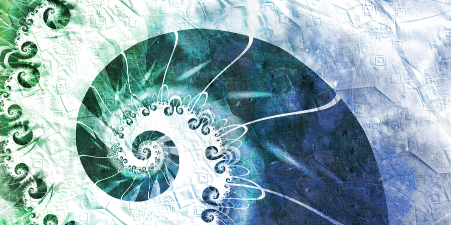
Crappy title but anyway.......... - :D")
Just messing with the Julian and Rectangle variations in Apophysis.
Resolution:
3266 x 2048
Enjoy!
*Can be used as a wallpaper if you wish, but it doesn't really matter
Related content


Comments: 17


Okay, So. what i do love about this image is it's unussuality. the half-circle shape on the middle-top left of the image is a really interesting spot in this image because it creates unsymetrical felling to the image (altough the image itself is not a symetrical without the half-circle). Also, the crop plugin (?) you use here is very effective to give another sparky feeling to the image.
something that imho can be improved is the weighting. i think, if the you tweak the weighting more, the image will look more solid.
Overall, i love this image. It's so unussual and so much to see on it.
 (Smile)")
👍: 0 ⏩: 1

Wow, thank you for this awesome critique!
This one was done when I was first getting into Apophysis, and I didn't know about plug-ins back then (or how to use them for that matter
Again, thank you Randa
👍: 0 ⏩: 0


Something different. Different is always good. Also the hues of green and blue reminds me from summer, what I'm greatly waiting for now. I would appreciate a little improved contrast though.
👍: 0 ⏩: 1
Thank you for the comment buddy
A little more contrast? Like, as in brighter colours?
👍: 0 ⏩: 1
Contrast = stronger colours
The black & white & colors all get stronger
👍: 0 ⏩: 1
Ok, I'll take your feedback into account.
👍: 0 ⏩: 0


