HOME | DD
 liqachu — What A Difference bl
Published: 2002-09-30 20:23:32 +0000 UTC; Views: 1735; Favourites: 8; Downloads: 359
Redirect to original
Description
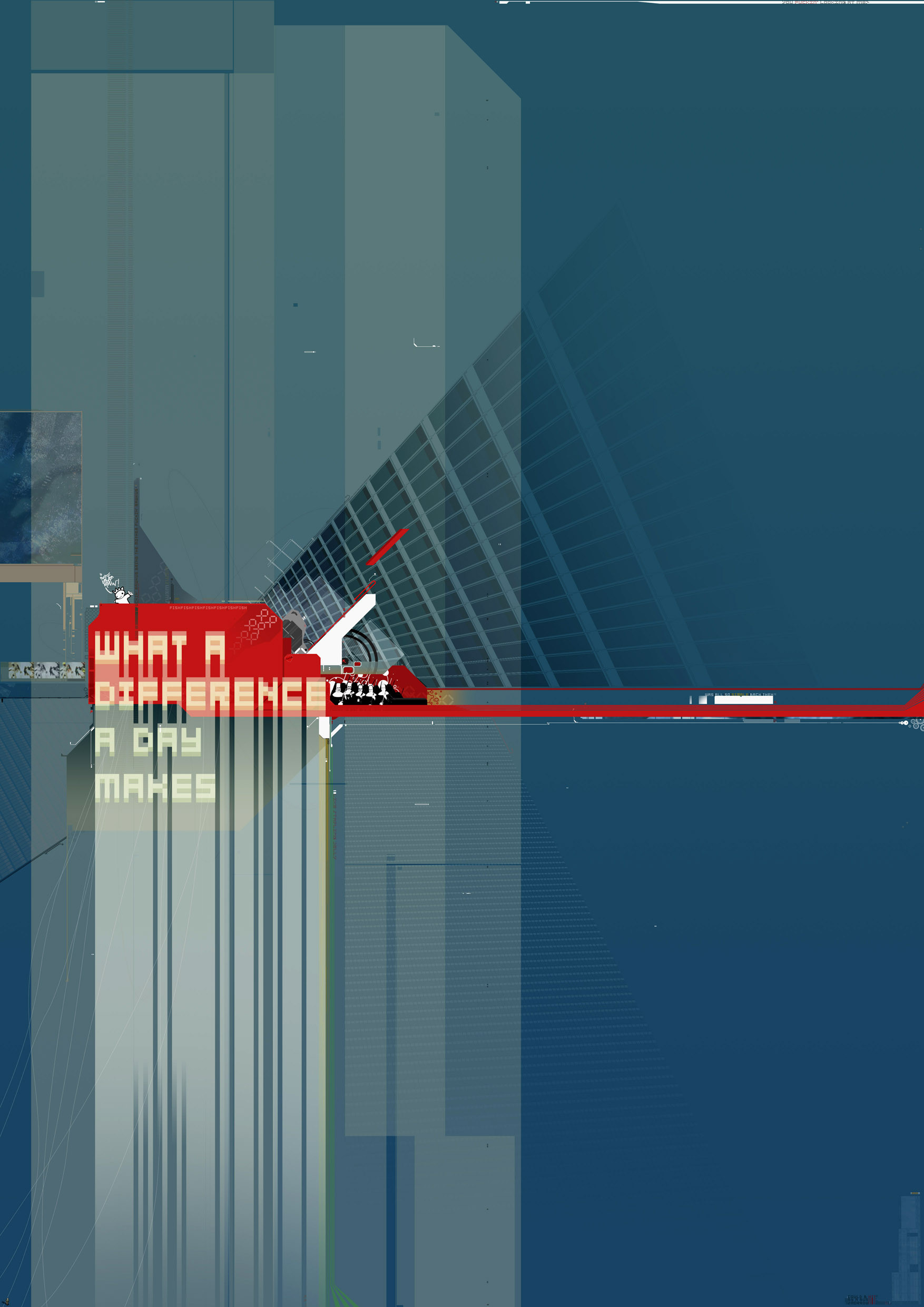
like [link] , but bluei like the way it brings out reds
c.c welcome as ever
Related content


Comments: 11

Looks great, the prespective is very nice. and the colours work, even though
they are so different.
👍: 0 ⏩: 0

Beautiful huge piece of work! I love the puppet-string-like flow lines you've got going in the borrom left. Another great piece of design!!!!

👍: 0 ⏩: 0

I dont always write the nicest comments, or theyre just a tad short. I got the wall version of this. Its dope, I loved the nuns in there.
👍: 0 ⏩: 0


you can't comprehend how much i love your style..
this is excellent, but the font could better on the "what a difference.." phrase
keep it up.
thought about doing a wall ever?
wanna collab? hit me up...
👍: 0 ⏩: 0


Yes the colour work is awsome - and your design too. Its just great
👍: 0 ⏩: 0

i like the contrasting colours, and the perspective, but something about the typography used on "what a difference a day makes" really mucks with what i'm looking at. other than that, very nice job, great two dimensional elements and as always your eye for placement is something i envy.
👍: 0 ⏩: 0


