HOME | DD
 LiquidFaeStudios — Pretty Little Thing comparison

Published: 2012-05-05 01:56:40 +0000 UTC; Views: 1330; Favourites: 17; Downloads: 0
Redirect to original
Description
Please - if you like this painting please also favorite the actual deviation!")
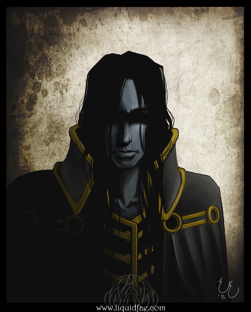
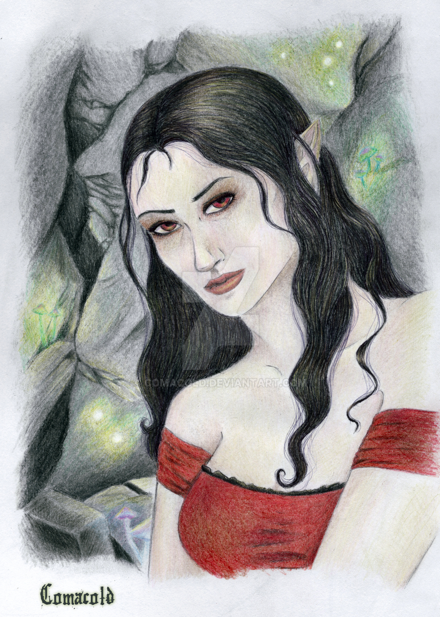
So - It's not like the first one is really old or anything. but I *trulymadlydeeply* hated the way her face came out when i painted it. It really doesnt look all that bad in the drawing... but hell when i painted it she went wonky.
I also redesigned his horns shortly after the original, and took the oprotunity to fix a few other quirks. Mainly, i flipped the composition because it felt just... more *right* this way. I think you get a stronger sense of her looking up at him, and the feeling of powerlessness one would without a doubt feel in that position.
I am *much* happier with her face, though i could sit and nit pick all day.
Here are both full size versions
Related content


Comments: 10

srsly do eet nao. LOL (i got stuck myself on 4) because i went for actual changes rather than "well the paint is smoother here" LOL but i definitly found FOUR.... >.>
👍: 0 ⏩: 1
but do they count?!?! list em >.>
👍: 0 ⏩: 1

Umm... horns, the angle of her face, the pattern on her top, one yellow line on his sleeve (small detail but still XD) and YOUR SIGNATURE
👍: 0 ⏩: 2
>.> I have 5 now. HAHAHAHAHA. <.<;
👍: 0 ⏩: 0
PFFFFT signature doesnt cout >.> but all the others do and those were mine as well XD
👍: 0 ⏩: 1