HOME | DD
 liquidshaneo — Falling Like Me

Published: 2004-07-05 00:38:08 +0000 UTC; Views: 1409; Favourites: 35; Downloads: 194
Redirect to original
Description
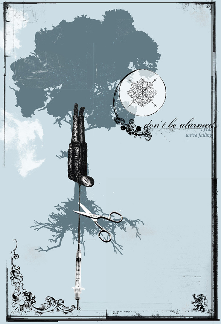
These next few submissions are from a possible book i may be putting out, havent decided yet... all photos are mine.. the pages are stock, any poetry or prose is mine as well....Related content


Comments: 19


I love the power of this piece and how it hits me like a brick in the gut.
👍: 0 ⏩: 0

")

great structured photo/(page)!! Would love to see this book come true! Good luck, and work hard I get it
like how you form from various sources such as poetry and photos a new piece
 (Smile)")
👍: 0 ⏩: 0

i almost really really liked it. but now i just really like it. oh well.
👍: 0 ⏩: 0

your art always seems to leave me with a lack of words. It's absoloutly incredible.
👍: 0 ⏩: 0


wow...I love seeing your style progress....I wasn't expecting this...wonderful....the flow...the subject.
👍: 0 ⏩: 1

i never like using myself as a model, unattractivness sucks.... thank you so much for the compliment
👍: 0 ⏩: 0


I like the stained look of the paper, and how the text looks, very creative!

👍: 0 ⏩: 0


oh my god i love it
This is so sad.. great idea and great done!


👍: 0 ⏩: 0


These new ones so far would make an awesome book. I would buy it if I had money...
👍: 0 ⏩: 0
This is great. These new ones so far would make an awesome book.
👍: 0 ⏩: 0

Really good...technicalities, though, I think the rope should have been blurred a little bit more to create more emphasis...it seems to stand out a little too much, but if that was the intended effect you were going for, ignore me.
I like the monochrome+sepia colourscheme, it seems to go with the archaic feel of the image.
Good words & word placement too.
👍: 0 ⏩: 0