HOME | DD
 LirycaAllson — Hatred and Fear [Redraw, With Speedpaint]

#undertale #undertale_game #undertalefanart #undertale_au #glitchtale #glitchtalefanart #glitchtale_betty #glitchtaleseason2 #glitchtale_au #glitchtale_season_2
Published: 2018-07-22 10:47:27 +0000 UTC; Views: 2289; Favourites: 33; Downloads: 10
Redirect to original
Description
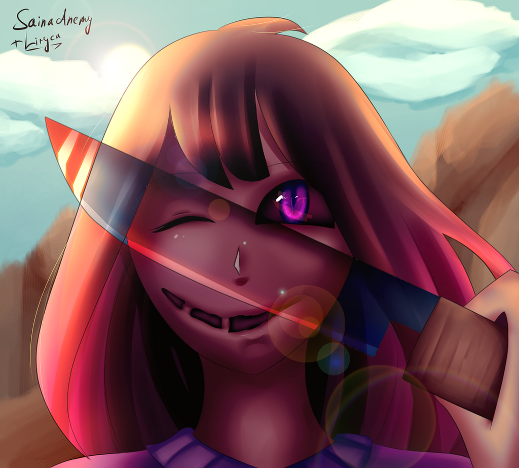
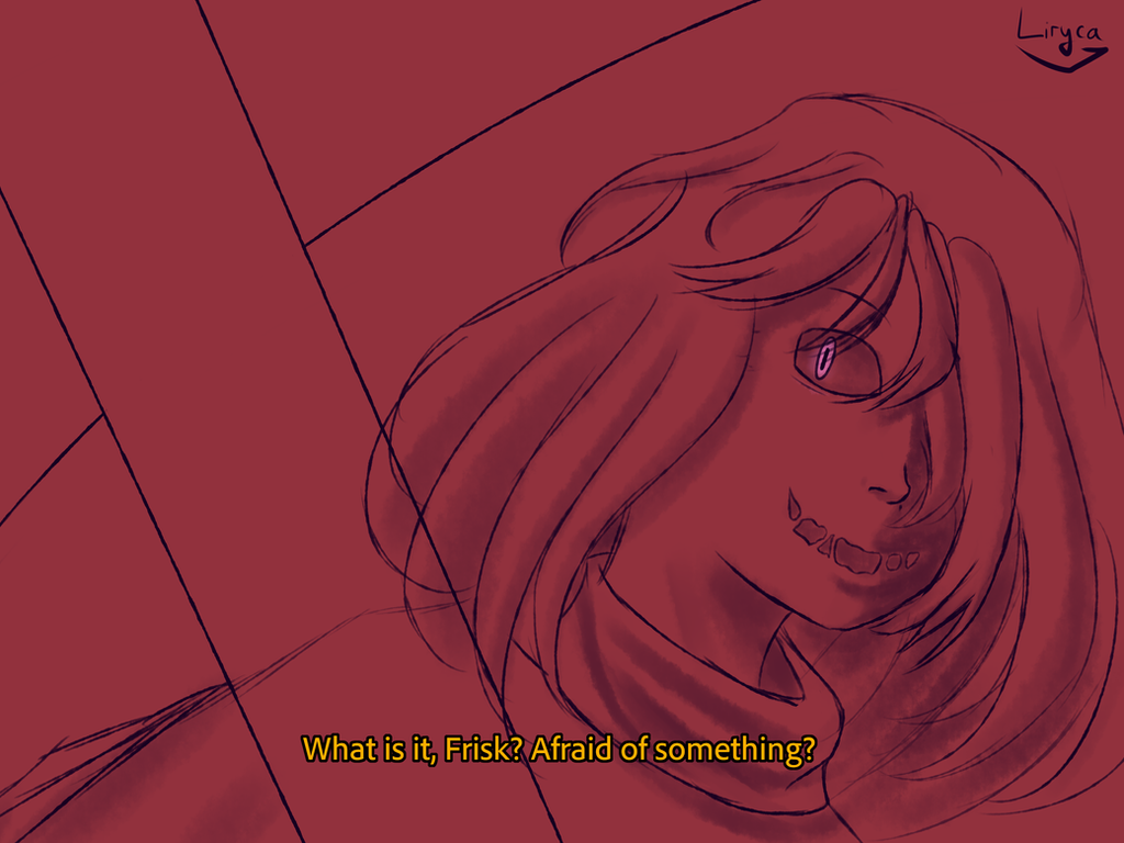
glitchtale by CamilaAnims (notice me senpai)old version: sta.sh/0mo1m4833q6
comparison: sta.sh/01pstrzvof80
speedpaint: youtu.be/Jz-vikjTXV4
rather than just showing off improvement in general i decided to try and remember what i was going for and accomplish it
__
checklist:
pose other than "existing here" - kinda check, since it's more relaxed and stuff
detailed hair - check (well, by my past standards anyway)
shade folds so they would look like folds - well, fuck. (haha jk it's a good result considering that i had no idea what was i doing)
__
here're my past complains about this (literally 4 days since submitting) (btw 2nd person bc i wanted someone to be angry at):
you're drawing the hair, not the hair texture
the scythe looks like crap, use vectors
there should be perspective. there is no perspective. CHOOSE A FRICKING VANISHING POINT AND DO THE PERSPECTIVE ACCORDING TO IT THE SKIRT THE HEAD THE ARM EVERYTHING SHOULD BE SMALLER TO THE LEFT AND BIGGER TO THE RIGHT
SPEAKING ABOUT THE RIGHT. THE LIGHTING ON THE HAND IS CRAP. DID SHE DIE? (yes)
the right sleeve levitates above the hand. wow antigravity
the skirt looks like crap. simply like crap.
learn how to bend legs and ADD THEM TO THE INITIAL SKETCH FULLY
the face needs more evenly-spread shadows
the nose doesn't look that great. maybe it needs a shadow behind it, maybe not, you decide
the colors are too bright. if i wanted something to this effect, i'd pour vinegar into my eyes, not look at this color palette
bend the bg. it'll be cooler that way
let's use camila's technique, you know, THE CREATOR OF GLITCHTALE, for the scythe
didn't fully erase some of unneeded light on the left
the right side of the face should be darker. for the feel
and maybe the bg too. like, hate, wooo, creepy
the lineart is crap
Related content


Comments: 10

Very nice ^^ I like the colour pallette and how you shade, it looks great ^^
👍: 0 ⏩: 1

thanks! my coloring have gone a long way since the old version.
👍: 0 ⏩: 1
You're welcome ^^ You've improved a looooot !
👍: 0 ⏩: 0

i read the full description
dude chill
you're being WAYYYYYYY too harsh on yourself
like dude
its not that bad
let me just list things that i think you did well on:
-the cololur pallete is actually pretty good, it doesnt burn your eyes and its not too saturated/bright
-the hair is fine, the way your shaded it gave it a texture which would fit the style you're going for
-the lighting is pretty ok too
- and the lineart is also good
-still many more things but the comment would be too long
the only things i think should be changed to make the art piece better is too give the left hand fingers, blend the lighting on the folds, keep the colour of the shines on the scythe consistent, add a darker atomsphere, make the hair more of a rose than a pink and remove one of the signitures
the things you listed in the description are so minor, you're just over analysing
👍: 0 ⏩: 1
thanks? I mean you're the third person telling me to stop being so harsh on myself this week, so ._.
hmm
i think at the time i was angry that it was considered better than my other stuff
don't remember what was I thinking back in October but i'm guessing that i just wanted to claim it was bad so ppl would move on from comparing my other drawings to it
with time, i kinda moved on and my reaction changed from "IT'S THE WORST THING EVER AND I DESERVE HAVING BOTH MY ARMS BROKEN FOR EVER CREATING IT" to "I didn't know where was I going with it, but it's... uh... okay? I mean, if you don't stare too hard at it, it's kinda nice"
tbh I don't think there's a single thing in my gallery that I didn't at least dislike
also the second signature is here bc of some nostalgic value, since, well, it was the first signature I used when I got a graphic tablet
👍: 0 ⏩: 1
fun fact: if you take a pendulum, mark one side "it's great" and the other "it's awful" and then swing it, you'll have an accurate representation of my opinion on any of my drawings
seriously why am i like this
👍: 0 ⏩: 1

thanks! I def have a lot of unfinished stuff either way, so I will
👍: 0 ⏩: 0