HOME | DD
 logan-bp — sonic - another style
Published: 2005-05-16 00:41:56 +0000 UTC; Views: 322; Favourites: 11; Downloads: 41
Redirect to original
Description
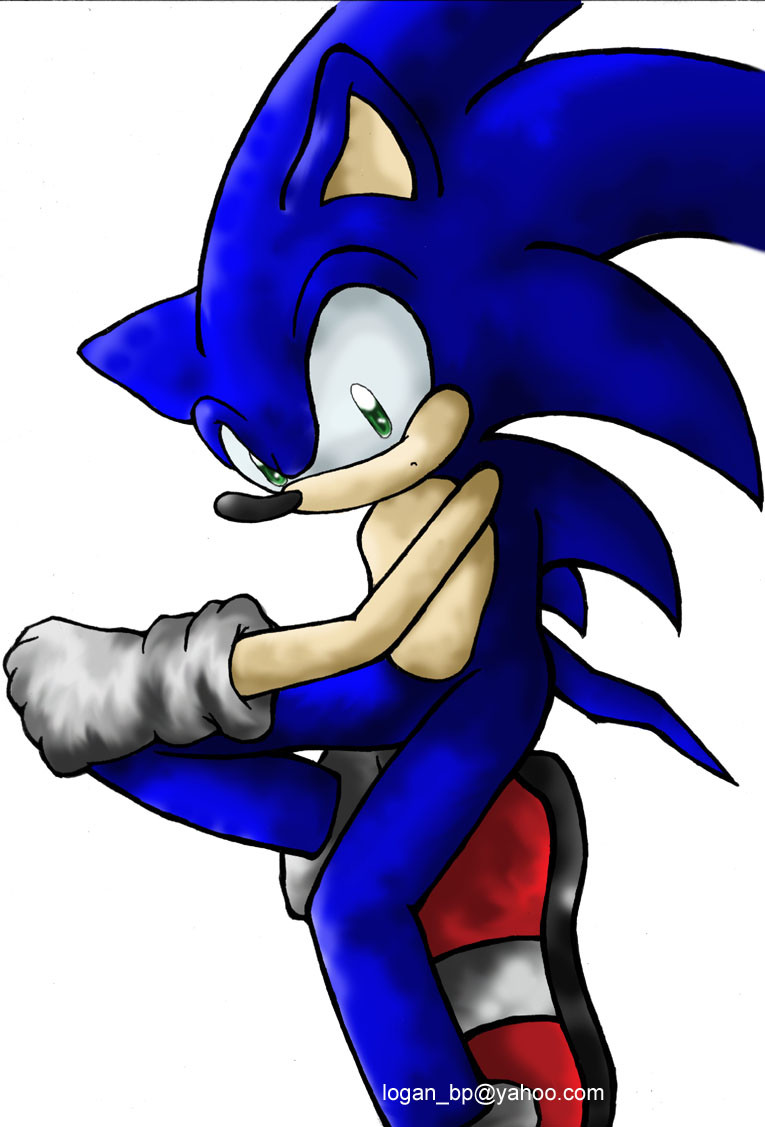
well, I changed my style for sonic for the comic project thing, decided to make him look different, just posting it here to let you people see.I really have a weird cg'ing style now o.o
Related content


Comments: 11

That's a great pic ^___^
His pose is really awsome!
Plus I love the way you shade =o
So amazing job ^^
👍: 0 ⏩: 0

 (Smile)")

looks alright to me, but to be honest, I feel that you put just a little too much shading on the gloves O_o; other than that, Soniku looks just fine xD
👍: 0 ⏩: 0


In my opinion, I liked the original Sonic style Sega had. It would have been nice if they had just make it more crisp but that was their descision.
I wouldn't say your cg'ing style is wierd. It's different. Most cg'ing is done with solids, yours style has a lot more defintion. He seems like he's been in a fight slightly covered with dust. The light source is definite, it takes a look at the picture as a whole but that's usually a good thing. The colors are very good as well.
Question: Did you have a hard time trying to get the head right? It fits but it also seems like it was moved to fit there. No necks might it difficult to draw a character and you very well drawing Sonic.
The only thing that doesn't fit is his top two spikes. They seem a little long and oddly placed. The sonic Advance sprites should help in trying to get those to fit better. But this is your drawing and you were aiming for something different (had to reread description before making a mistake about that...).
Good job on this. Again nice color and design still is Sonic. Good luck with your project.
👍: 0 ⏩: 1

problem are basicly the spikes, i had a rough time trying to figure this up, drawing his face like that still really artificial to me ^_^;
👍: 0 ⏩: 1
I like your quote... especially since that's how my memory works, badly. Random.
It still came out good though, all this is practice which can only help you get better.
👍: 0 ⏩: 0

o estilo tah um pouco diferente mas mto legal! vc coloriu mto bem tb! ^^
👍: 0 ⏩: 0

Very cool!
I like the sort of "cloudy" shading style on him. That looks really good. You always color his eyes so nicely, too. They always look so bright! =]
👍: 0 ⏩: 0
