HOME | DD
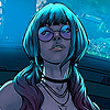 logicfun — Darksiders color

Published: 2011-10-16 10:01:25 +0000 UTC; Views: 12032; Favourites: 295; Downloads: 342
Redirect to original
Description
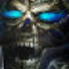
Pencil by [link]Digital ink and color with photoshop
My facebook : Laurent Logicfun
My new Website : [link]
Related content


Comments: 23

Overall


Vision
Originality
Technique
Impact
Here are the positives and negatives:
Positive:
-Great texture on War and Ruin. You attempted to stay true to the art style of the game and I commend you for that.
-You have maintained proportionality throughout most of your image.
-There is a sense of motion on the picture, even though it's not very well expressed, War's cloak fabric creates nice dynamic and is further assisted by Ruin's fur.
Negatives:
-Biggest negative is the lack of background. Just stuffin out orange dust doesn't cut it.
-Another bad thing is how the picture looks unfinished, I can't distinguish if War is riding Ruin or does the horse stand beside him. Or maybe even someone cut off Ruin's head. There are no clear indications on what is going on.
-The sword is too small, even though I put proportionality as a positive, that is the one item in the drawing that is poorly done.
-It is also hard to see where does War's leg begin and where does it end. If I recall correctly the yellow skull is where his knee is, and the other one covers his whole leg.
Things to improve upon:
-Honestly, get a backdrop there. I dunno something like a ruined city, or hellfire or anything except orange dust.
-Make the image bigger and don't cut it off like you did here. Draw the full body of the horse and the rider.
-Make the sword bigger and don't bend it like it's bent here, it's also a good idea to add a runic inscription to it and some kinda glow (like when the sword changes in the game when you put different runes in it).
P.S.: I get a feeling that you were fired up when you started doing this but then god lazy and just smacked the orange dust there to cover things up.
👍: 0 ⏩: 0


 (Smile)")

love how there's what looks like a drunk smiley on it because the mouth is so close to the next set of eyes, still a good piece though, nice work.
👍: 0 ⏩: 1

Damn dude i love this,i'm playing the game now.

👍: 0 ⏩: 1

Thanks,never play this game,but love the design of the charadesign
👍: 0 ⏩: 1
You should play its awesome!Your welcome.
👍: 0 ⏩: 0


 (Wink)")

Awesome work, for a minute there i thought he was arthus for warcraft... But dude seriously AWESOME
👍: 0 ⏩: 1