HOME | DD
 logiqdesign — Logiq Concept v2

Published: 2010-10-24 02:46:26 +0000 UTC; Views: 3220; Favourites: 30; Downloads: 93
Redirect to original
Description
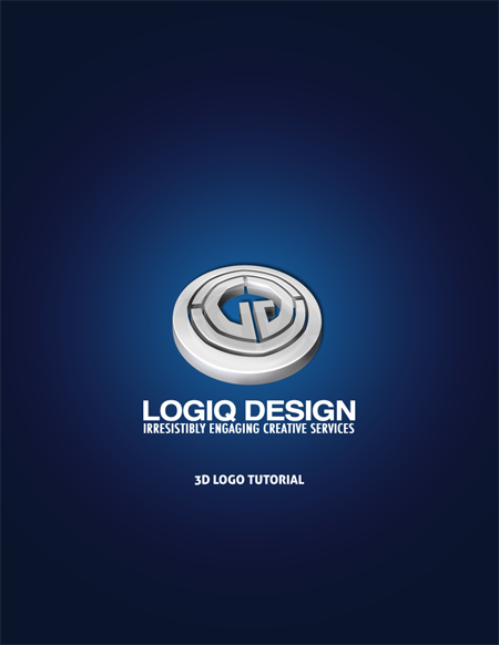
Another variation of the Logiq logo. This time using a much more suitable, somewhat custom type.Related content
Comments: 13

The G doesn't quite blend with the rest of the letters (O & Q being more "perfect circles"), besides that it's pretty awesome! Any chance of seeing it in one color?
👍: 0 ⏩: 1

Thanks for the comment. I'll work on the G a little bit and see what I can come up with. And sure, I'll upload a solid color version soon.
👍: 0 ⏩: 1

No problem! It's not a big thing at all, the G just looks like it's squeezed there, in just a bit too tiny space for it. Looking forward to see what you do with the solid colour, had to watch you just to ensure I don't miss anything! ;D
👍: 0 ⏩: 0


