HOME | DD
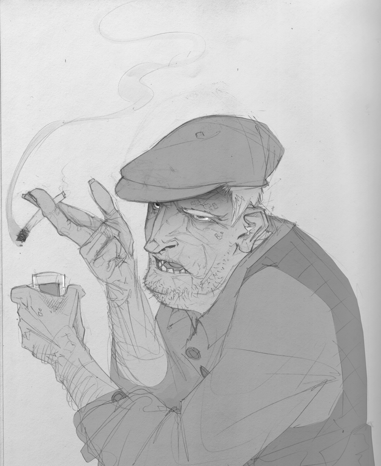
 loish — old timer

Published: 2008-03-11 23:52:59 +0000 UTC; Views: 53785; Favourites: 597; Downloads: 1387
Redirect to original
Description
i saw an opportunity to knock my I.D off of my recently submitted deviations and i TOOK IT! YEAH!seriously when are they going to give you an option to hide the ID so that you don't have the same picture on your front page twice?
this is a picture from my sketch blog .
drawn in photoshop 7 with a tablet.
Related content


Comments: 97

I love the stylization of the face. Awesome job.
👍: 0 ⏩: 0

 (Smile)")


awesome rendition! he looks real yet fantastical. You really like the sea green background, huh? ^^
👍: 0 ⏩: 0


lol it reminds me of a chess nightmare for some reason, but i like it :d
👍: 0 ⏩: 0

Your style is Really nice
great job with the color, with the overall picture
👍: 0 ⏩: 0


XD...You should draw the character I have as my avatar. I have more pictures of her in my gallery. I'd love to see how she'd look in your style.

👍: 0 ⏩: 1


my grandpa has a hat like that.
I really love the texture and the style in which you painted this. C:
👍: 0 ⏩: 0

I love the texture you create in your colouring.
👍: 0 ⏩: 0


Haha, I wonder the same thing. ")
👍: 0 ⏩: 0

wooow :0 that's insanely creative. I can't draw older people in the least. Nice colours and use of textures
👍: 0 ⏩: 0

To prevent having a double image on my profile I don't create a new deviation for each new ID. I just update the old one.
👍: 0 ⏩: 0


aww! reminds me of my grandpa! ")
👍: 0 ⏩: 0

I love this! I saw it on your website too (I think).
And yeah, ID's are annoying in the way that you have to upload them to the gallery. You can't even put them in scaps. D= I love the painterly look to your artwork. Is that purely because of the texture overlay? Or is it a combination of the brushes you use and the texture?
👍: 0 ⏩: 1

i don't think that i used a texture overlay for this one. the texture just comes from the painting style :]
👍: 0 ⏩: 1

I love this! I really love all your work. Your color scheme and your overall style it's just so eyegrabbing and unique. 
Your art is some of the main pictures that I get excited about when I see your new stuff in my watch list.

👍: 0 ⏩: 0


I really love your range. A lot of artists stick to one style or have one subject they draw over and over, but you really show a wide spectrum of talent. I enjoy everything you do, whether the subject is a young girl, an old man, an animal... it's all so lovely!
👍: 0 ⏩: 0

Some bitch stole your name on blogspot and she posts photos of herself killing mice? I can't believe it.
👍: 0 ⏩: 0

I hate that too... I normally only ever post an ID when I have another 4 Deviations to post with it so I can knock it off.... or I wait till it's off the front page before I set it as my current ID
great study btw, he's got a lot of character, and as ususal, your use of colour is great
👍: 0 ⏩: 1


Loving the texture and shading here. The little details make this really interesting to look at, too - especially in the wrinkling around the eyes and mouth. He really does give off the feeling of being somehow strangely familiar, but the way he's caricatured balances out the familiarity of him. And the brushwork really adds to the shading a great deal.
👍: 0 ⏩: 0

That looks amazing, especially the skin, though I think the eyes could do with a bit more sparkle...
👍: 0 ⏩: 0

Amazing! I always love the colors you use, and your overall style.
But on the id thing couldn't you just scrap it untill you submit more then un scrap it so it shows up in your gallery?
👍: 0 ⏩: 1
this is a technique i have not yet considered.
👍: 0 ⏩: 0

Ha ha, very cool - love the colours and brush work!!
He reminds me a little of prince charles XD

👍: 0 ⏩: 0


He looks famiar enough that I feel like I know him, but distorted enought that I don't.
Great colors!
👍: 0 ⏩: 0


I love those colors and his expressions. His face looks amazing. I love the details.
👍: 0 ⏩: 0


Amazing details and colors. This is so well presented.
👍: 0 ⏩: 0

