HOME | DD
 LordOfPastries — :.Final Challenge.:

Published: 2008-09-27 22:09:04 +0000 UTC; Views: 1299; Favourites: 24; Downloads: 17
Redirect to original
Description
EDIT: OHMYGAWD FANART OF THE WEEK GUYS ON STARMEN.NET. MONDAY, MARCH 09th, 2009. I CONQUERED.SWEET JESUS. I GAVE IT A NEW TITLE. NOT MUCH BETTER BUT BLAH
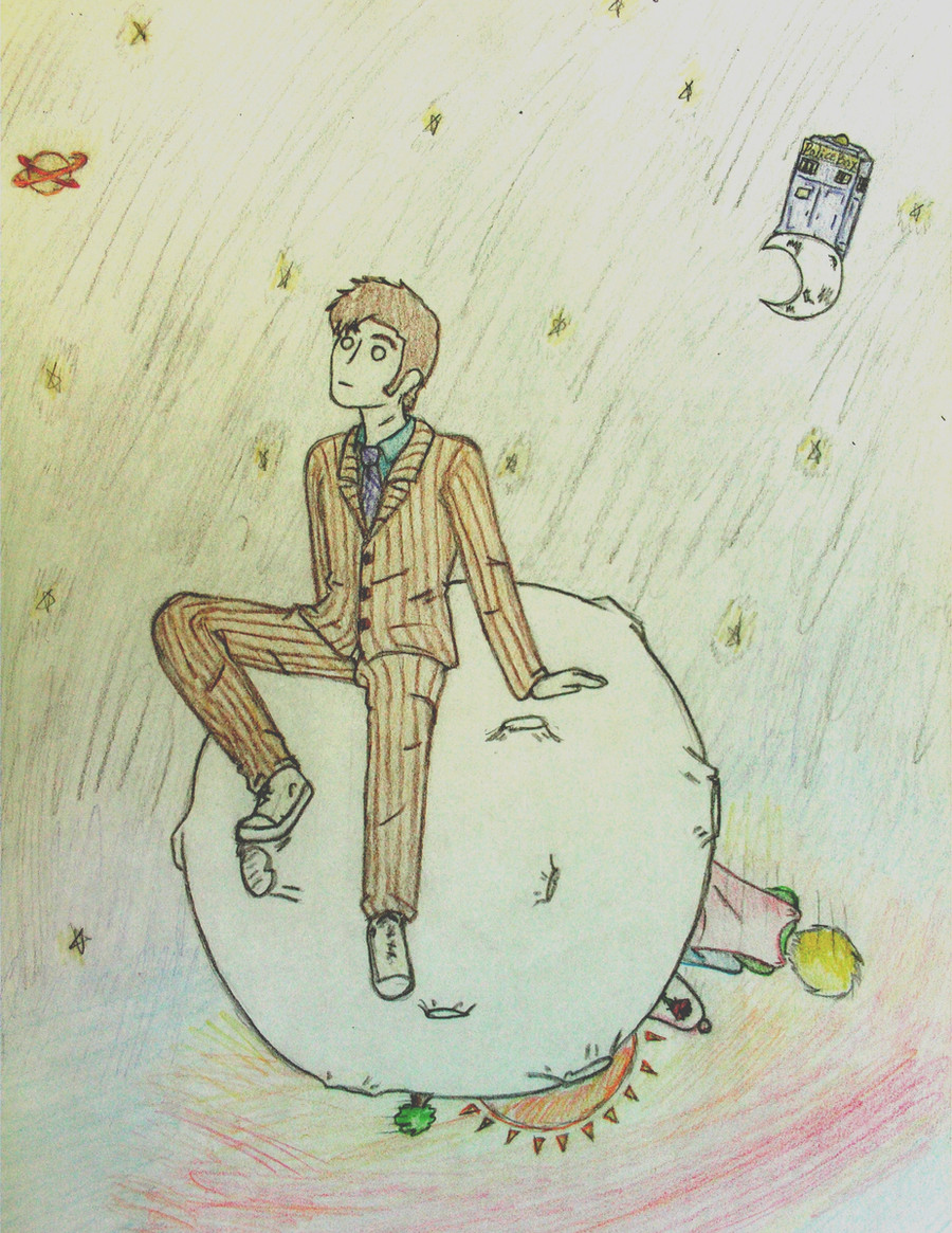
akasfejejsdka I was SO proud of this when I started it, and a LOT a LOOOT of rl friends seemed to like it. Now that its done and scanned I'm not so proud of it....
is the image size too big?
lol pokey/porky
I ACCEPT CRITIQUE. BUT NOT IF IT IS FOR INACCURACY 8U I HAVE NEVER FINISHED THE GAME. PARDON ME. PLUS I AM COLORBLIND
Tools used: card stock paper, #2 pencil for lineart, prismacolors for coloring, Photoshop for slight resizing
Time Taken: 8 hours. I'm serious.
Inspiration: well seeing as how I am at the VERY end of EarthBound, and Fobbies are Borange just ended...it came to me.
Self evaluation:


Art (c)
Pokey/Porky/fatass (c) Nintendo, Itoi
IF YOU FAVORITED THIS PLEASE COMMENT AND TELL WHY
ANY CLUB HAS PERMISSION TO SUBMIT THIS
Related content


Comments: 70

thanks a lot for your comments, yeah I bet I got the mech wrong
I can't complain about your comments, because you're a BEAST. Favoriting all my stuff AND commenting, honestly that's awesome, thanks <3
👍: 0 ⏩: 1

I was wrong, actually - it's gray. XD -headdesk- I just hadn't remembered that it was gray! XD
But no problem! :3 I just looove your work so much! >w< And your avatar = HILARIOUS. Magypsies RAWK, c'mon!
And you're welcome~<3
👍: 0 ⏩: 1
xDDD okay okay stop confusing yourself xD
people like my avatar a lot
but I think they like my name and webcam more.
👍: 0 ⏩: 1
Yeah, I won't! >w<
Yep, of course they do. o3o And LoP is an AWESOME name. ...Your webcam? -goes to look-
👍: 0 ⏩: 0

i got to say i love the draw technique you use for this artwork its very original and cool
👍: 0 ⏩: 1
no problem
Earthbound rulez maybe someday i make a clay character of Pokey or Giygas
👍: 0 ⏩: 1

I absolutely adore the giant Ness fac eon the Devil Machine. It's basicly what nightmares are made of, and that makes it awesome.
👍: 0 ⏩: 1


")

>_> ... for some reason, when I saw this, this phrase came to mind... although... it falls out of reason for more reasons than one.
"Fapping to Pokey"
... but I didn't say that. No I didn't... well... I did now, didn't I?... I'm a horrible person...
ANYWAY. Your art is still awesome. What's new?
👍: 0 ⏩: 1
and you favorited this 8D thanks so much!
👍: 0 ⏩: 1
Huh? *looks up* Huh. I guess I forget to fav... a lot. Guess I must be jaded... and arrogant. Sorry about that, then.
👍: 0 ⏩: 0


 (Smile)")
wow thanks a ton
👍: 0 ⏩: 0

very nice work, you really captured the whole atmosphere in the end of earthbound. very creepy and all. good work!
👍: 0 ⏩: 1
yeah I know, creepy ness face: awesome 8U
👍: 0 ⏩: 0


Fuuuudge, I heart the strokes on the spidah-bot. You're pretty kickass with Prismas.
👍: 0 ⏩: 1
I use prismas? *shot*
thanks~
👍: 0 ⏩: 0

Yowza, that's good. The Ness face creeps me out. Also, I like Pokey's smile. It sort of encompasses his attitude of the moment.
👍: 0 ⏩: 1
He's all like
"I'm better than you, betch"
👍: 0 ⏩: 1

I can give CRITIQUE?!!!
Well first off I gotta say I really love this.
You said you were unhappy with it, so my question to you is: Did your scanner cut the quality?
I tinkered with the image in one of my programs in order to restore color that may have been lost during the scan and here's what I got: [link]
But really, this picture is great- huge and dynamic! Your colors are wonderful. And o_O Ness won't be leaving my head anytime soon! It's amazing how he looks like a total creep sitting on a cushy pillow!
Your dynamics work so well because you've really got a direction going on. The tentacles slide downwards towards the audience, with Porky's robot clinging ominously on them. You even established a direction with the tentacles at the side (They seem to plateau into a straight line there), so that makes the experience all the more real for the audience.
Now I'mma do a critique.
#1, it's very important to consider overall shapes, especially when drawing a large and complex picture. One issue is the circle and dome shapes you utilized. The circle surrounding Ness' face is a little oblong and uneven and the shield dome on Porky's spider mech isn't shaped roundedly. With Ness' face, it reduces the impact of the fact that he's looking at us, and that should be a very strong impact in this pic. And even though you got the highlight spot-on on the spider mech, the unroundedness of the dome throws off the audience.
Speaking of shapes, check out the black-ish body of the spider mech, and look at each of its sides- it's right (our left) side is drawn up a little bit compared to its other side, which is a little lower down, and thereby we process the spider mech's body as uneven.
The important thing to do is to take a step back from a picture while you're drawing it. Instead of focusing on each area from start to finish, take a few minutes every so often to see the picture overall. Is this shape correct, and does it correlate with that other shape? Try very hard to actively consider how you NEED to make your figures.
Lastly, I'll consider the way you do lines to create shading/effect. It's a really wonderful skill that you've picked up, and overall you did an amazing job. But just as you need to consider the composition and proper shape of other objects, you must consider the dimension of each object so that you're sure that you're puting your lines in the right direction.
Straight lines racing across the top of a surface, like you did with the tentacles, establishes the top, flat portion of the tentacles. But you must also consider that the tentacles are rounded, so there's a chance that you'd want to put the lines in a few different directions to show dimension (Like, curve the lines towards the bottom for example). But that's totally your call, as they already look fantastic.
Also, I wanna bring up where you're shading the tentacles underneath the spider mech. When you darkened those areas, you went in a totally different direction with your colored pencil with the dark area as opposed to the lighter area. This actually dissociates the darker part of the tentacle from the lighter part, even though they're the same thing. It would be ideal to go in the same direction with the lines in the lighter area so that the darker area "blends in" and looks more natural.
Also going back to the shield dome on Porky's spider mech! This is really difficult to understand and master, but look at the blue shading you used for the dome. It's direction is essentially: curved at the mech's right (our left), then move straight until the end of the page (at our right). However, the blue shading should actually curve up at our right, because the object does indeed go on to create a full circle. So the impact of the curved blue lines should be present at the back, as well!
Once again, wonderful work! Totally appeasing to the eyes and overall not that awkward! Just learning to master proper shape for objects and learning to control your shading will help you out!
I hope I didn't talk too much! ><;

👍: 0 ⏩: 1
actually I DID lose a little color, but not THAT much xD I think the scanner did decent.
you talk too much
8U I don't know whether to be proud or annoyed at myself atm
Your comments are always so big, you should be a scientist
👍: 0 ⏩: 1
Oh okay, I was just wondering if scanner quality had anything to do with it...
Yeah I know I talk too much. D= I try to utilize as much good information as possible, though.
You should be proud, not annoyed. Well, you're always going to commit mistakes that you'll need to learn from, but here's how it is: you've completed this picture, it's effectively in the past. You improved by leaps and bounds in several aspects, and for that you should be proud. But focusing on your negative emotion (annoyance) won't get anything done now, what with the picture completed and all. In the end, it's just better to be positive about your work than negative. <3 And you really did a good job. I couldn't believe how good this was when I saw it in my messages! XP
No I'm really, really sorry that I write so much. ")
👍: 0 ⏩: 1
fff thanks, I kind of overreacted for a bit, but I got over it xDDD
Then you could be a talk show host
👍: 0 ⏩: 1
Yeah, I just wanted you to know that me talking so much didn't mean that your picture was flawed, it just meant that I... talk too much. Like you said. And I nitpick and describe both the good and the bad, sooo...
I don't know I'm nervous around people.
How about I just be a dumb internet geeky kid who types too much?
👍: 0 ⏩: 1
lololol I don't know anyone who types nearly as much as you.
cut back or else you would get carpal tunnel
👍: 0 ⏩: 1
I mean, as long as I helped you with all of my typing, it's fine.
But I'm already okay with getting carpal tunnel. Both my parents have it and I do even more typing than them.
👍: 0 ⏩: 1
haha yeah you helped
you need prosthetic (sp) limbs
👍: 0 ⏩: 1
I'd rather have one of your admirers rather than prosthetic limbs. XP
Actually, there's a yoga/pilates move that I practice which aims to stave off carpal tunnel.
👍: 0 ⏩: 0
| Next =>