HOME | DD
 lordolof — something that used to be red

Published: 2004-08-08 15:15:41 +0000 UTC; Views: 1204; Favourites: 21; Downloads: 387
Redirect to original
Description
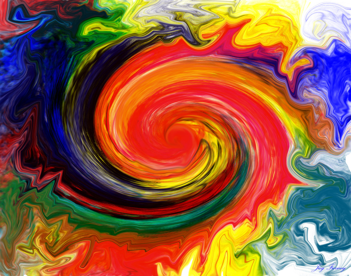
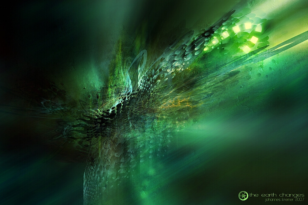
~pawn + ~lordolof = truewe made.
Related content


Comments: 24

Oh this is great, it's like that white whip just struck something and sent lots of molten metal flying around ^^
I'm gonna fav+ this one, it's so great.
👍: 0 ⏩: 0

love the render, great brushing and lighting but the 2d down the side doesn't look as nice.. still favourite
👍: 0 ⏩: 0

awesome work as ever from you two, well done
Keep up the good work!
👍: 0 ⏩: 0

shit va najs d000d! ")
 (Smile)")
👍: 0 ⏩: 0

sssssjuuuuuuuuuuuuuuuuuuuukk!!
fy fan va nice den va
!!!
AMAGAD
satt å gapa i minst en timme
+fav
👍: 0 ⏩: 1

hahaha och vi jobbade minst en timme
👍: 0 ⏩: 0

hehe, good name ")
👍: 0 ⏩: 0

great piece
the render is very nice and the lighting is awesome!
👍: 0 ⏩: 0


oh i dont like the font on the bottom
👍: 0 ⏩: 0

again kickass work
Great depth and i really like the lighting
i'm not so sure about the 2d on the leftside.
nice work both of you
👍: 0 ⏩: 0


owned
im too tired to explain so ill have teh 
👍: 0 ⏩: 0

wow, really nice colors and lightning work boys - GJ both of ya!!!
👍: 0 ⏩: 0

Looks good, I like the renders and brushing is good too. I personally think that the big white line should have left out, it does contributes to the depth but without it the depth would still have been better.
annyways, good piece overall. Well done you two
👍: 0 ⏩: 0

