HOME | DD
 lorrainemd — How She Held Up
Published: 2003-07-20 21:42:39 +0000 UTC; Views: 2585; Favourites: 29; Downloads: 816
Redirect to original
Description
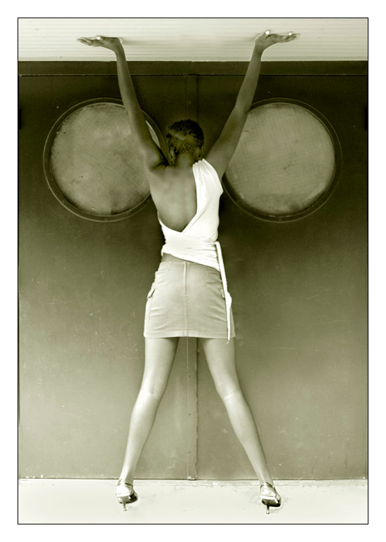
I wanted to reduce the human form into shapes and gradients....contrasts and forms....Inspiration: the concept of a female Atlas.
Model: Melanie
Related content


Comments: 44

amazing..but y did u submit it as a scrap...this so much better than to be outted there...its an amazing concept..well done..!!
👍: 0 ⏩: 0


wow it turns me on i dont mean in a let me get to the bathroom with my lotion type of way either this is nice
👍: 0 ⏩: 0

")

i wanted to note how she is like a female Atlas, then I read your description, and it was in there, that that was the concept you had in mind, exactly. so congrats, it came through for me perfectly.
")
👍: 0 ⏩: 0


 (Smile)")

a female atlas... two globed entrance, ah the symbolism.
👍: 0 ⏩: 0

Beautiful, simply and perfectly expressed (I am sorry that I called you "man" last comment too Lorraine, I guess that I thought that such wonderful images of females would be made by a man: weak I know.)
👍: 0 ⏩: 0

i love the idea of this...there's some really great shapes in this..
👍: 0 ⏩: 0

liked the mix with the geometric forms. you really did what you wanted. Great work. And her body shape helps a lot.
👍: 0 ⏩: 0

There are very few artists whose oppinion I give a F*CK about, but I have to agree with
I would have moved the left arm in a bit, and the shirt is a bit disracting given that her skin has such a bronze tone to it. Her left foot is a bit light, which is not too disimilar to what Marcy said.
I like the overexposed feel to the feet though. It gives the feeling that she is standing on a light table.
Lorraine, baby....this is hot shit. Very Vogue. Very chic. Very high fashion, just the sort of thing that you are going for. I love this. I really do.
As far as the shirt goes, if this was a fashion shoot, the shirt/blouse/top would be what the designer wanted, so it's really a moot point.
So Marcy and you gonna do a gallery??? Let me know, I'm in. I will the investors. lol.
Good to see your stepping it up once again.
J
👍: 0 ⏩: 0

wow.
gerat coloring, and perspective. the nagle is superb, the pose is sexy, very sexy and the clothes is amazing, too
👍: 0 ⏩: 0


The colours really caught my eye!
Very good colours and excellent gradient on the background!
The model you used is beatiful and her pose is great.
But all this has already been said, so I'll just leave it at that!
Good photo!
👍: 0 ⏩: 0

its a great pose for the shot!... i like how you have played with the contrast... The feet needs to be a little darker!... but overall i like it! Great capture!
👍: 0 ⏩: 0


beautiful colour tone ...
beautiful model....
well this has to go down as a for me offcourse, I htink you did well with this, well done
👍: 0 ⏩: 0

Everything that I thought of the pic has already been said. Very nice work.
+fav
👍: 0 ⏩: 0

i think enough has been said about the beauty of the shot, and indeed, it is a great capture. the one thing that irks me a little bit is that her ankles look really uncomfortable at that angle and in those heels as for firelite's little rant, this is deviantart, where amateurs get the chance to mix with and learn from great artists. it has to be expected that not all of us have the means to give a little Gardner's art critique! good job, lorraine
👍: 0 ⏩: 0

something about this one ... i like it! the compostition is great i htink the shirt makes it for me
👍: 0 ⏩: 0

Imagination motivated by inspiration...Like it.
I love how she looks so big, like if she could hold the whole world in her arms.
Great job.
👍: 0 ⏩: 0

Very well done!
Impressive composition...clever use of visual elements.
The pose is totally dynamic.
Tres bien!
👍: 0 ⏩: 0

Well you did it again Lorraine!! Congrats- this is beautiful. The tones are scrumptious. I love how the colors fade to a lighter shade near the "bottom". Love the concept.
👍: 0 ⏩: 0

i like this a lot. i think i'd gone for complete symmetry a bit more though. move the left (viewer's left) arm in a tad to make the circles appear the same in shape that is seen. and the shirt - keeping it solid or simple in line. i think the balance/symmetry is the strongest point of this composition with regard to your described goal and those two thigns distract me a bit.
the viewers left foot is a bit light but overall the tonal changes seem really even great great doors and fabulous model
always reaching you are...
👍: 0 ⏩: 0


needs a little bit more burnin on the feet...and ida preferred blue-green tones (i know, iknow, people think of the globe/world as blue, but i saw bluegreen!)...
so lorraine. how about... you come here to chicago. even for a week. and then we find me a job. then we find an abandoned warehouse...or a funny storefront very near a trendy area but not in it...then we open a gallery that is only for artists who have never been in a real show (we wont count coffee shop shows cause we wont get as many applicants i fwe do)... and act all hoity toity in a funny way and have good openings... then... we become famous (maybe)... and we expand the culture of an area ! yay!
👍: 0 ⏩: 0

nice job, i like the pose and color. although the thought of a female atlas is slightly discerning
👍: 0 ⏩: 0

I really love the concept. You executed it very well.
The tones and shapes are wonderful.
Great work.
👍: 0 ⏩: 0

I don't know much (read, nothing) about photography, but i have you in my devwatch for a good reason, your beautiful photographs; this one is no exception. I want a print!!
👍: 0 ⏩: 0

Triangles and circles. White to Grey. I like it alot. In fact i love it for the simplicity that you intended for it. You have achieved exactly that and that in itself is what makes up a good photographer. You teach me so much with your photos you dont even know.
👍: 0 ⏩: 0

WHat is it with people who dont read more into the artist?... I wish people knew more about the style and background of the artist they comment on, but it will never happen...
Lorraine... you have done it again, you mixed your incredible sence of location, with a beautiful pose. colors are excelent, the texture is really amazing, i feel this sence of softness from the doors, just because of the way the shot was taken, i assume they are metal, but the angle and color, and light all come together so well the whole image almost feels like velvet...
great work...
-m
👍: 0 ⏩: 0


i like how you got it to be symetric this is really cool
👍: 0 ⏩: 0

The colors REALLY got my attention. Very originol and I love that. Keep up the great work, im going to FAV this.
👍: 0 ⏩: 0

great choice for the background and you captured some great shading. Good work.
👍: 0 ⏩: 0

Great!
Im not sure if she is on her hands or standing up... mybe both?
👍: 0 ⏩: 0

