HOME | DD
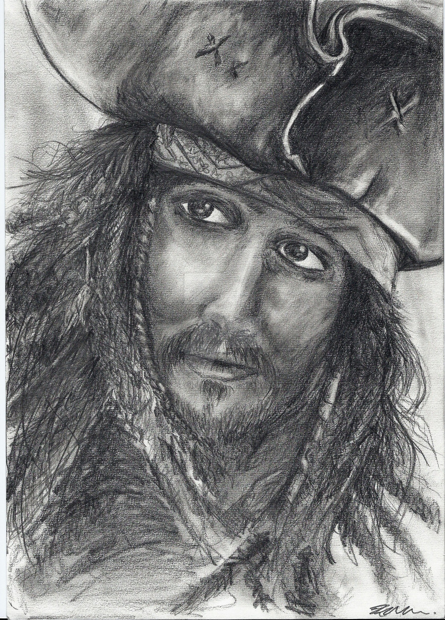
 lostinstinct — Captain Jack Sparrow.
Published: 2009-12-27 00:02:19 +0000 UTC; Views: 4204; Favourites: 17; Downloads: 0
Redirect to original
Description
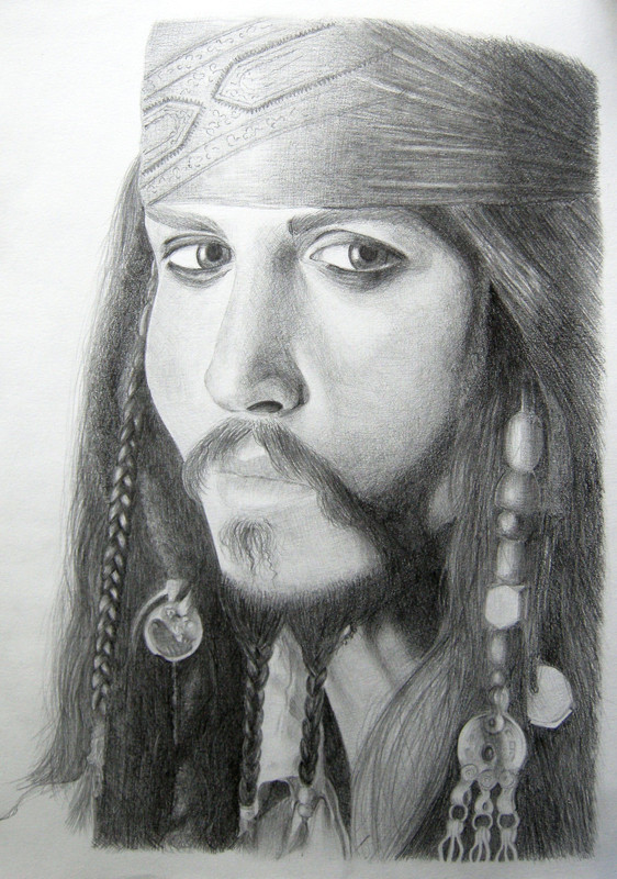
AAAAARGHH! -.- I really, really need a working scanner. ;_;Anyways...yaah. I'm pretty proud of this...kinda. |: I just hate his left eye. And the left side of his hair; which actually has a lot more detail than is visible on the photo. >.< Quite like the hat. ;]
Comments much appreciated ~
Captain Jack Sparrow (c) of Disney.
Character played by Johnny Depp.
Picture (c) to me.
EDIT: Looking at this...his head is a much worse shape than I thought. And his eyes are much more wonkey. Agahaghag!! I hate it. ;_;
FULL VIEW, PLEASE!
EDIT: Scanned.
~ I know the eyes are wonky...but has anyone got any tips on how to get them slightly more even, in size, or angled slightly better? it seems to be the same problem on most of my portraits. The eyes are never equal.
~ Is the shading okay? Do any parts need more/less shading?
~ Any more problems/comments/things that could be improved? Your comments are really helpful. :3
Related content


Comments: 111

Thankyou. I really appreciate you taking the time to write a critique. [:
Yeah. I think I probably spent a lot more time focusing on shading, than I did making sure the anatomy was right. I will defiantly try drawing out some guidelines before I start next time. Hopefully spending a little time mapping out the face will make a big difference to the finished. Thanks for the suggestion.
I will defiantly take a look at the book you suggested. Thankyou.
Thanks again for your crit. I will try to take on board everything you’ve mentioned, and keep practicing.
👍: 0 ⏩: 1

No problem  (Smile)")
There's also a lot of great tutorials on DA: this is a great place to absorb information and inspiration.
Keep practicing and don't feel downhearted if you don't see improvement right away: one of my old life drawing teachers always used to tell us "You will do 10,000 terrible drawings before you do a great one." I think I'm still working on those 10k myself
")
👍: 0 ⏩: 0


Originality
Technique
Since you asked for help on how to fix the eye proportions, I'll offer you what I know. I apologize in advance because I'm a bit tough and I talk a lot... e.deviantart.net/emoticons/b/b… " width="15" height="15" alt="
")
Basically, the main problem with the eyes is that they are at a different angle from the rest of the face. This is a very basic problem that unfortunately detracts from the rest of the image's quality. This can be fixed, however, by studying facial proportions and anatomy.
- First of all, imagine horizontal lines going through the eyes, nose, and lips in this picture. The lines should be parallel. However, you will notice that the line going through the eyes would be at an angle to the nose and lips. The eyes are tilted too much in this picture, so the angle looks exaggerated. Also, the nose and lips are also at different angles to each other in this pic, although this is a lot less noticeable. Even though the head is at an angle, the facial features should be still parallel to each other.
- Also, look at the bone structure. The eyes should be lined up with the brow/cheekbones, the cheekbones should line up with the jawline, etc. The eye sockets in the skull are located directly above the cheekbones, so the eyeballs should fit into the sockets. Because Jack's right eye is too high, it does not properly fit into the eye socket. Similarly, the lips should line up with the jaws and chin. Even if the face is tilted to the side or viewed from 3/4 perspective, the features should line up with the bones.
- In order to set up facial features properly, try drawing guidelines before you sketch each feature. I used to think this step was unnecessary, but it really does help me line things up. Regardless of whether I'm drawing anime or realism, I guidelines to position the eyes. Eyes are particularly hard because you have to line them up with each other as well as the rest of the face. I also recommend drawing a horizontal line to set up the jawline and a vertical line in the middle of the face. This will help line up the nose and mouth.
- Finally, as you draw, try periodically holding up your drawing to the mirror. I've found that I get so focused on how my drawing looks from the front that I forget to view it from other angles. Even if your work seems perfect from the front, looking at it in reverse can point out hidden flaws in anatomy and proportion. By checking your work regularly, you can catch mistakes before it's too late to fix them. Alternatively, you can hold your drawing up to a light and looking at it from the back.
That said, I really love your rough but realistic drawing style. It really brings out Jack Sparrow's character. You capture a wide variety of textures beautifully. Also, I can tell that you have a lot of skill when it comes to drawing each individual part of the face.
However, I do think that you need to review basic anatomy so that you can align the face properly. Remember to take the skull structure into account when you're drawing and remember that the features are parallel regardless of the angle. Try drawing out guidelines and a rough "map" to where each feature goes before you start adding detail, and check your work as you go. Once you get your anatomy fixed, your drawings have the potential to look great.
And by the way, I used to dive into detail without figuring out where things go. I would spend a lot of time making each feature perfect just to realize that an eye was too high or the lips were too far to the left. It was. So. Frustrating. Ugh. I'm still working on anatomy, and it's hard, but not impossible. I really hope my tips are useful and that you aren't too intimidated by my wordiness. Good luck. e.deviantart.net/emoticons/b/b… " width="15" height="15" alt="
👍: 0 ⏩: 1
Thankyou so much for stopping and taking the time to write a critique. I really, really appreciate it.
- I see what you mean. I knew there was something to do with the angles, but I wouldn’t have thought about it that way. We have studied that kind of technique, but I never thought to apply it here. I shall try drawing out the basic lines before i start next time, so i have something to work from. Hopefully that will help to fix the problem of keeping the lines parallel.
- Ah..so it isn’t just the eye which are out...it’s the whole face? It’s just some parts are more obvious. I can see now you have pointed it out. That makes sense. Thanks. [:
- These are all really handy tips. Thankyou. I think the idea of holding it up to a mirror/light is very good. I do tend to get caught up in how it looks from exactly position I’ve been drawing from.
- Thankyou again. You’re tips are really helpful. I love getting proper critiques which get right to the point without tip-toeing around the facts. And I totally agree about the detail. I have worked a lot on detailing the features of the face; but not had much experience putting the whole face together, or working on facial anatomy. I definitely have a lot to practice. I’m sure your advice will help no-end, though. Much appreciated ~
👍: 0 ⏩: 1
You are quite welcome. ^_^
👍: 0 ⏩: 0


Originality
Wow my first critic e.deviantart.net/emoticons/l/l… " width="19" height="19" alt="

Hoaki, so ..
First of all, the shading is amazing. I would say if someone were to look at this for the first time, the focal point- or the most eye catching area of the picture- would deffinatly be his hat. The angle it is in makes it look 3Dish ( might just be me though ) and his hair is overall very very detailed. Also , I love how you put what looks like a shine to his cheeks to make it look just like the movie.
Now I do have one little problem,
His eyes seem to be at different angles and slightly looking different directions. His right eye looks a bit larger then the left which is more detailed. But you can hardly tell~ I mess up on the eyes ALL the time it takes a lot of practice and paitence.
Amazing art overall ! love it ~e.deviantart.net/emoticons/s/s… " width="15" height="15" alt="
👍: 0 ⏩: 1
Thankyou so much for your critique. It's also the first I've ever recieved ~ <33
I agree with your comment about the eyes aswell. They are defiantly one of the most complex features on the face, and the angles have been annoying me for a while, lol. I shall keep practicing.
Thankyou again. [:
👍: 0 ⏩: 1
You are most welcome~ :Aww:
👍: 0 ⏩: 0

This is a really nice drawing, i especially love the shading and detail on the hat. I read that you know about the wonky eyes, how about rotating the image until the face is kinda straight and then levelling the eyes up. Also i think the eyes may be slightly too close together maybe this is because the bridge of the nose is too thin? hope this helps. other than that fab drawing and brilliant shading!
👍: 0 ⏩: 0

Overall, this is a very strong drawing, however, in order to improve, you could make the eyes and nose more proportional. the distance between the eyes is roughly the width of an eye, and the nose is roughly double the length of an eye; however, in order to really capture the appearance of the character, you would have to really focus on the reference picture and think about what makes the person's facial features different from the average profile ( for example, some people have wider or narrower eyes, when drawing eyes, also think about how much of the iris and pupils you can see; its different for everyone). to keep everything in proportion, I suggest you use a ruler and measure from the reference picture; e.g. measuring the width and lengths of the eyes, nose, lips etc. don't start shading until you are 100% positive that you have the outlines correct; it saves you from a lot of trouble later on.
the shading in the drawing is wounderfull and the it is very rick in detail
hope this helped
👍: 0 ⏩: 0

oh its very nice
tke a look..
[link]
")
👍: 0 ⏩: 0

I love Johnny Depp, but this drawing doesnt give him justice.
I don't know for how long you have been drawing but I don't like giving this advice, but it was something that also helped me in the search for the perfect drawing, that I'm still trying to do ;b
My teacher of drawing told me once that, in the begining, if you dont get the anatomy very well, you should that the drawing and a print of the ref and go to a window and draw the main guide lines.
It helps you get the anatomy just right ;D
And that will also solve the eye problem.
I really like the shading, it's very good ;D
And the hair and the mustache look very well
;D
Despite some not so good things, you are on the right path to be a very good drawer ;D
👍: 0 ⏩: 0

Thankyouu ~ <3
I really appreciate your comment :]
👍: 0 ⏩: 1

You've made the shading very good! Ok, I've got a good advice with the eyes - When I make that kinda portraits, I often place the picture I'm using as a reference under the white paper I'm going to draw on and place it on the window (it has to be day) and then I do the outline - where the nose, eyes, mouth, eyebrows are and the shape of the face. That would help to get rid of the wonky eyes, as you call them
-----
Feedback connected with #GimmeFeedback
👍: 0 ⏩: 1
Thankyou for your comment. I really appreciate it, and I'll definately have a go. [:
👍: 0 ⏩: 1
It's nice giving feedback to someone who appreciates it, I'm glad you did and I hope it can elp you a bit! ^^
👍: 0 ⏩: 0

This is good work but as you said, could be better. I suggest you buy this book on ebay. It might help you. It sure has helped me! It's "How to Draw Lifelike Portraits from Photographs" by Lee Hammond. [link]
👍: 0 ⏩: 1
Thanks for your comment. I'll go take a look! [:
👍: 0 ⏩: 1

Hey there! I just read your comments and I do have to say that you are really working those values. Great job with that.
As for the eyes, they are somewhat disproportionate to the view. This is a 3/4 profile view and Jack's left eye should be smaller...as in, angled. The eye looks as if it's drawn in a full front view but just tilted at an angle. That's probably why you think it looks wonky.
A very easy way to fix this...is to draw out a grid system on the face. Like the oblong shape of the head, then sort of a curved line across the face to show where the eyes should be placed. This will help keep them at that correct angle and also keep them at a correct distance.
Also, a line down the middle will help with the nose as well.
Not sure if that makes any sense...one of these days I'll post a tutorial on head/profile proportions and how to achieve the correct measurements every time!
👍: 0 ⏩: 1
Thankyou for your comment.
I'll definatly try some of the stuff you suggested, and see if I can improve a little. [:
👍: 0 ⏩: 1
Glad you appreciate my humble thoughts!! I'm most positive that you'll improve!
👍: 0 ⏩: 0

#GimmeFeedback
I applaud your patience with the hat. I wouldn't have done such a nice job with it, I'm sure. My advice is to made the face shading a little smoother, i.e. blend in the dark and light parts a bit. You seem to have received a lot of advice on the correction of proportion so I won't touch on that.
As for his hair and moustache, I'd suggest making the strands a little neater, going in the same direction, and then only adding a few stray ones here and there.
👍: 0 ⏩: 1
Thanks for the advice. I'll keep it in mind. [:
👍: 0 ⏩: 0

Amazing drawing of yours! Its really looks like
Captain Sparrow. 
The shaddowing is pretty good,composition,
measures are good too.
I think you could just make his eyes a little
bit blacker,darker around his eyes,cause that
kinda eyes he got.
And I think his right eye is a little
downcast,you should draw him a little above,
beacuse it must be siymmetrical.
Awsom work,dude

👍: 0 ⏩: 1
Thanks for the advice. I'll keep it in mind for next time. [:
👍: 0 ⏩: 0

Hi,
I see you have already had lots of advice, but as I have similar problems I thought I would also try to help.
The left eye definately needs to come down, and you could define the features on the more by varying the shading a little more.
What I find helpful is looking at the shapes of the shading on the face and matching them up to the reference pic,if this makes sense.
Hope this helps, and nice work
👍: 0 ⏩: 1
Thanks for the feedback. It's really helpful. I'll see what I can do with the shading. :}
👍: 0 ⏩: 0

You could move the left (our) eye down, just a little bit. Also the eyes are too close one to each other, you should have one eye distance between them usually.
The shading of the face doesn`t look good, you could add more shade on some of the dark spots and more light in the lighted spots.
👍: 0 ⏩: 1
Thanks for the feeback. [:
I'll keep your comments in mind for next time, and see what I can do with the shading.
👍: 0 ⏩: 0

Decent level of contrast, which is usually the biggest thing I see when critiquing a piece. I do like the textures in his hair, feels nice and ratty, but you're right and his eyes are definitely askew. Another thing is that I feel the whites of his eyes are too white, which makes him look a little pop-eyed. Because of the brow extending over and shadowing the eye, we rarely see the sclera as truly white, so you could lower the value there, shading with the thought in mind that the eye is actually round and not flat.
I really dig the looseness of your stroke.
👍: 0 ⏩: 1
Thanks for your comment. I really appreciate the feeback. [:
I'll try change the shading on the eye a little. I definately see what you mean about the eyes looking to bright/flat. I hadn't noticed that before, so I'll see what I can do.
Thanks again.
👍: 0 ⏩: 1

It looks like you've gotten a lot of helpful advice, so I'll see what I can do. The first step would be to mirror/flip the image, so you can spot if anything really needs fixing. It also helps determine if the image is leaning too far onto one side.
For getting the eyes straight, to you remember to have the guidlines or crosshairs when you do the initial sketch? That really helps to keep everything in the right lines that it needs to be in. Also, if you want to check out who are often doing lessons and helpful things on anatomy!
👍: 0 ⏩: 1
Thanks for the advice. I'll keep it in mind for next time. [:
I usually do use guidlines, but I was so determined to get this done, that I actually forgot. I'll definately remember next time. :}
👍: 0 ⏩: 1
Ahhh... I definitely know how it feels to be in a rush!
👍: 0 ⏩: 0

This probably sounds really basic but as you asked for help getting the eyes even...
A good way to think of it is the line of the eyes (say you drew a line through the middle of the eyes) always makes a cross with the base of the nose (where it is on the face). On different angles this cross won't be straight up and down though..
I realize this is pretty wordy, I hope you get what I mean
👍: 0 ⏩: 1
Yeah, I get that. [: I'll try drawing out an outline for the eyes/nose/mouth before I start next time, so I know they're lined up.
Thanks for your feedback. I really appreciate it ~
👍: 0 ⏩: 1

can U use painting such as Photoshop or something? U can created 'help line' in different layer to guide U to fix the eyes. After U make those stright line to managa the eyes position, now its Ur time to sue moving tools to move the eyes. Dont forget clone some part to make it smoothen. Hope it help
👍: 0 ⏩: 1
Thanks for the tips. I'll keep it in mind. [:
👍: 0 ⏩: 0

Well you have already gotten numerous critiques and they are all very good. I can't really add anything further. I do think you did a really good job on this and I can tell you put forth a lot of time and effort. All I can say is keep practicing and you'll improve greatly. You have a lot of potential.
👍: 0 ⏩: 1
Thanks for your comment. I really appreciate it.
I'll definately keep practiccing. :3
👍: 0 ⏩: 0

you can try practicing more the eye drawing out faces just eye to see if you can do better because I really tell you is so difficult to make eye to look the same, but you can do it just practice a little more to see how you do.
👍: 0 ⏩: 1
Thanks for the ideas. I'll try it ~
👍: 0 ⏩: 0

The shading is nice, but there are anatomy errors as you said. You could try to do more fast sketches of Jack Sparrow and other people faces to get a better control od the facial construction, it would help a lot. Your technic is good, try to improve the other part now.
👍: 0 ⏩: 1
Thankyou for your comment. I really appreciate it. [:
I will defiatly try to do more quick sketches, without going into too much detail, to try and improve on anatomy.
👍: 0 ⏩: 1
Keep working and you'll see improvment.
👍: 0 ⏩: 0
| Next =>