HOME | DD
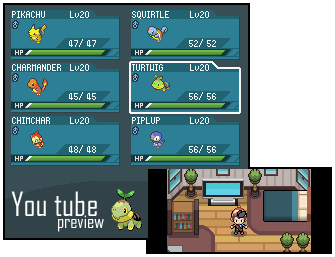
 LostSoulsDev — Yay, a summary screen.

Published: 2013-07-03 06:42:40 +0000 UTC; Views: 2050; Favourites: 27; Downloads: 0
Redirect to original
Description
So, it appears I'm back making my Pokémon game, shame I gave my tiles away XD. Today I present to you, how my summary screen in Pokémon: Lost souls will look like. I'm not going to be adding in ribbons to the game as I'm too lazy to do so XD so for now it's just stats, choose Pokéon and move list for the time being on the buttons. Kind of proud how this has turned out.Related content


Comments: 8


Awesome like always. Like others said the shadow looks off. My only other complaint is that the types are in the wrong order. Poison is Ivysaur's 2nd type
👍: 0 ⏩: 0

Ribbons, eh  (Wink)")
👍: 0 ⏩: 1

Knowing Ryan... Its a quick fix
👍: 0 ⏩: 0

You should adjust the shadow, so it's less circlely.
[link]
So it's more like A, rather than B.
👍: 0 ⏩: 0

Looking good Ryan  (Smile)")
👍: 0 ⏩: 1

I know it looks odd ")
👍: 0 ⏩: 0

")