HOME | DD
 loth — Mantis Bot II

Published: 2004-08-17 11:45:57 +0000 UTC; Views: 46164; Favourites: 362; Downloads: 17722
Redirect to original
Description
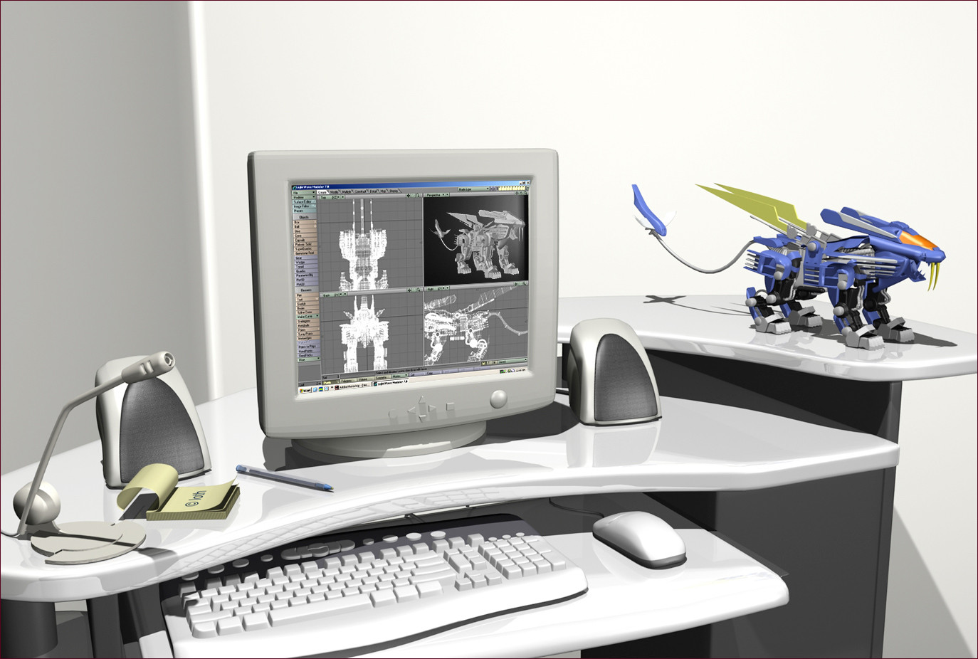
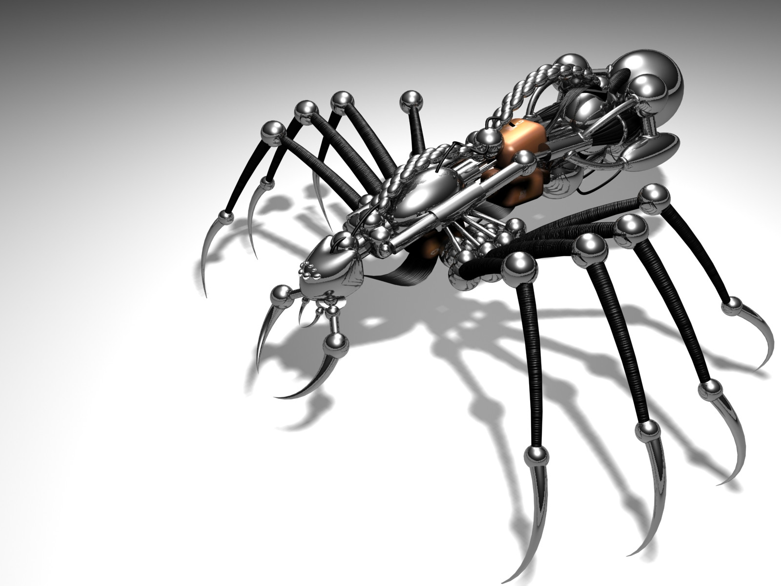
I redid my mantis. Wanted to make it look a bit more dangerous… and the modelling was kinda crappy so I started that from scratch, sticking with the same basic design though.Old version - [link]
All done with LightWave and Photoshop as per usual.
~
Related content


Comments: 199

absolutely beautiful.
the attention to detail, the composition and the colors are all just..perfect.
I have to fav this, i love it!
👍: 0 ⏩: 0

well he does look alot mroe dangerous........very cool color choices to
👍: 0 ⏩: 0

I love it but here is a question for you. Have you tried the other 3d programs like maya and 3dmax or maybe some of the lesser known and if so why do you use lightwave? Im trying to figure out which one to use myself
👍: 0 ⏩: 1

I have tried them... but only briefly.
LightWave is a really strong 3D program. It may not be quite as user-friendly as the others.... but it's got guts, and it was the only one I had available to me at the time. It's took me a fair while to get comfortable using it.... so yeah, I'd rather not change now.
👍: 0 ⏩: 0

I would die for having your "imagination" bro! it's not the modeling/lighting itself that does
it, it's your bad ass sense for concepts
👍: 0 ⏩: 0


wow Amazing modeling job man I really love it. The render couldnt be better either.
👍: 0 ⏩: 0
wow Amazing modeling job man I really love it. The render couldnt be better either.
👍: 0 ⏩: 0


cool-ie-o!!  (Smile)")

👍: 0 ⏩: 0

Verry verry nice !
I like the material...doh! i like everything.
")
👍: 0 ⏩: 0

tight modelling as always. I could copy & paste all of my preious comments on you into this, but I'll just say: very nicely done 8) from now on. very nicely done 8)
👍: 0 ⏩: 0

awesome work m8,
I liked ur previous version and I love this one..
much smoother and much more dangerous..
I love the combination of the cold blue metal with the warm
orange lights and eyes.. the face and the mounth in peticular looks amazing..
lovin' the extreme mechanical look of the legs and body
great job as always, 
👍: 0 ⏩: 0


good work man. specially this good coloured version
👍: 0 ⏩: 0


Yeah, an improvement from the original. I like the orange in his feet. Though I do think the blades/claws at the frount could do with being a little more reflective and "shiny".
👍: 0 ⏩: 0


man, I love it! so cool! Love the design, texturing...all!!
God among insects!
👍: 0 ⏩: 0


")
👍: 0 ⏩: 0

Oh yeah, thats slick, and alot meaner looking. Awsome work as always.
👍: 0 ⏩: 0

The two are very different I think. The reflection should be clearer because the light makes the surface look very glassy, but that's just the way I see it. I like them both very much!

👍: 0 ⏩: 0


wow it looks so real. i wish i could do stuff like that 
👍: 0 ⏩: 0

you should really do some animations man, i have to say i'd love to see them
👍: 0 ⏩: 0


i like it , although i think the blades look too smooth, un-dangerous. perhaps being a bit darker would help?
overall smashing render tho!
👍: 0 ⏩: 0


I like this one better. Looks great, as always.
👍: 0 ⏩: 0

ahhhh, I envy your 3D skills so f***ing much. keep up the awesome work, jeeeeeez...
gem
👍: 0 ⏩: 0

hmm... I liked the old one better... especially the materials... you could have made it looking dangerous by trying a different lighting situation and by adding glow to the eyes or something
👍: 0 ⏩: 1
The materials I used for the old one were pretty plain - I think there was only one... which I used over all the parts. And the model is far inferior. So I really don't see how you prefer it.... maybe it's just the render style and composition.
There is a slight outer-glow around the eye of this one, and the lighting is different to any of my other ground objects, so yeah... not totally sure what're you talking about there either, haha.
👍: 0 ⏩: 2
ok, regarding the modelling and stuff the new one might be better, but I just don't like the look...
the sculpture like look of the older one is very nice in my eyes, because it doesn't have to be a functional robot... just a cool sculpture
👍: 0 ⏩: 1
Okay I can understand that. The two render styles are very different... so it's just a matter of taste I guess.
👍: 0 ⏩: 0
it just looks too generous... the lighting could be more subtle (like just coming from only one side or something)... I also dislike the materials, because they seem like polished plastic... I just liked the old one better
👍: 0 ⏩: 0

damn nice modelling, the haed in particular is outstanding. nice render too, the reflections are great.
i think i prefer the feel of the first one though, minimal and grey.
👍: 0 ⏩: 0

Your every next submission gonna have 100 favs - so I should increase this number
👍: 0 ⏩: 0


nice image bro....
you definate do some cool stuff excellent modeling...
gp
👍: 0 ⏩: 0

Wow Thats is nice. Much better than the first.
👍: 0 ⏩: 0

wow nice styling of the bug, all the tek shitniz looks nice as well
👍: 0 ⏩: 0


Very cool and creative modelling....sweeeeet machine
👍: 0 ⏩: 0


<= Prev |