HOME | DD
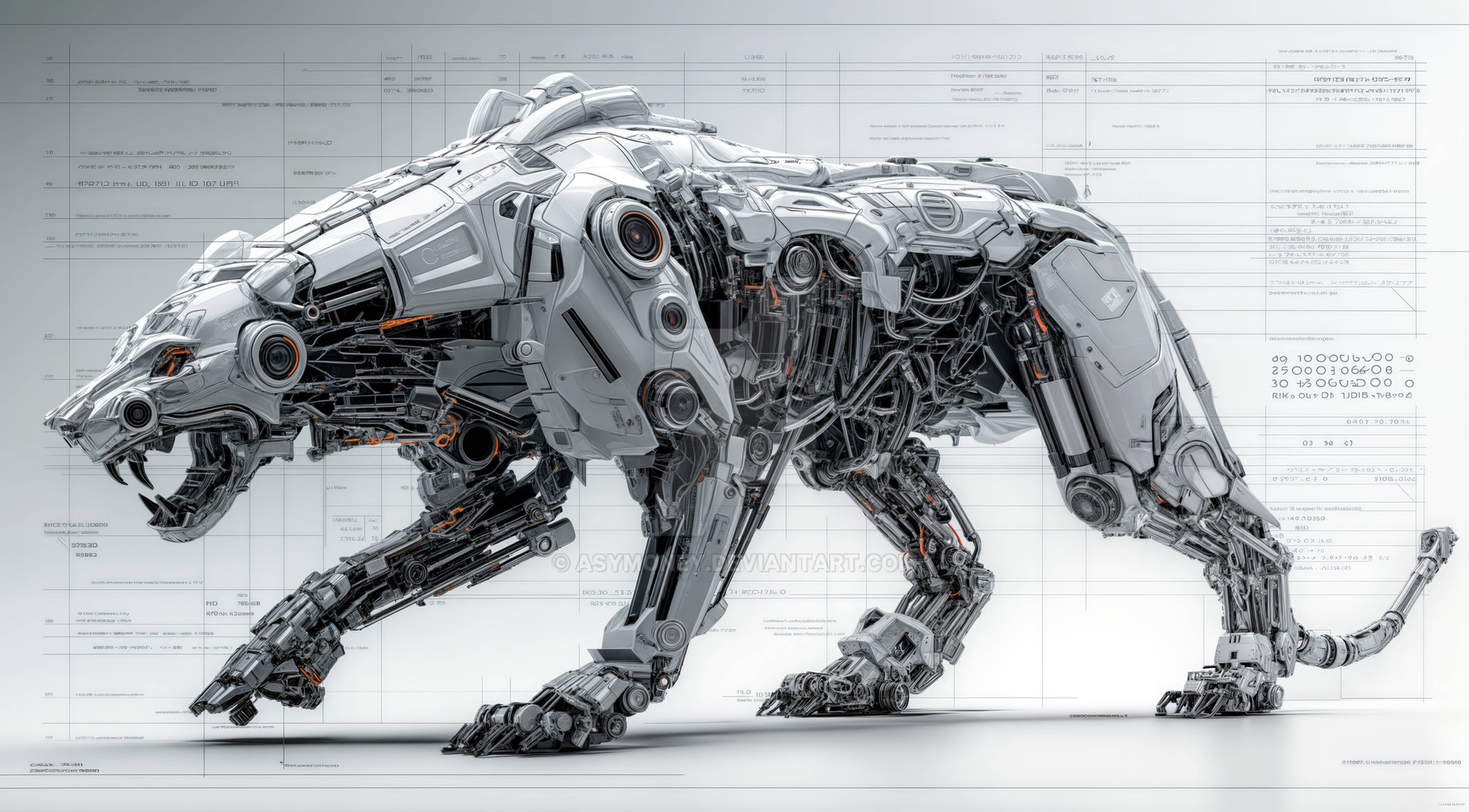
 loth — Mantis Bot II

Published: 2004-08-17 11:45:57 +0000 UTC; Views: 46221; Favourites: 363; Downloads: 17722
Redirect to original
Description
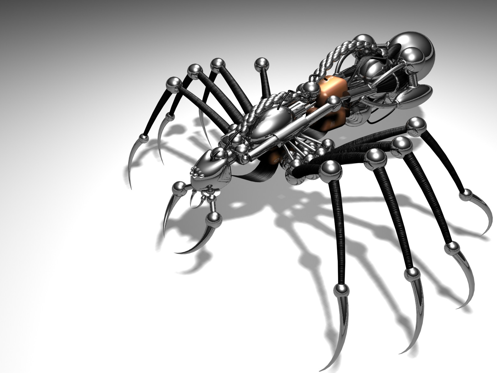
I redid my mantis. Wanted to make it look a bit more dangerous… and the modelling was kinda crappy so I started that from scratch, sticking with the same basic design though.Old version - [link]
All done with LightWave and Photoshop as per usual.
~
Related content


Comments: 199

Lol, alright. Well I used no reference (other than my previous mantis)... so it's just one of those fluky things.
👍: 0 ⏩: 1

funny thing is, the art style is very very similiar to the one the game uses. heh heh.
Don't worry I know it's just a coincedence ")
👍: 0 ⏩: 0

i agree with d-V, and I must say, you gotta work on those blades  (Smile)")
otherwise this is one killer render!
👍: 0 ⏩: 1
Yes I agree with what's been said about the blades. The objects looked sharp enough when I made them..... just didn't come out quite as I expected. I'll consider re-redoing that part.... make them look really razor-sharp if I can
👍: 0 ⏩: 1
that, would be cool and round off (i mean sharpen up) this beast perfectly.
👍: 0 ⏩: 0

Superb. Very nice. Praying mantis always reminds me of something........dangerous. Nice touch with the razor sharp blades. It fits quite splendidly.
👍: 0 ⏩: 0

")


now that is tight! great modeling work! such attention to detail, and i love the reflections and lighting.
👍: 0 ⏩: 0

This is so cool! I thought It was real at first")
Anyway, enough of my rambling...
👍: 0 ⏩: 0


I'd love to see a whole series of insects done like this. Looks awesome, great job.
👍: 0 ⏩: 0

i like the first one more.he has more of a controlled evil to him^_^ anyhooo i would go insane trying to make somthing like that so nice job and congrats
👍: 0 ⏩: 0

this is excellent work! i can't even begin to imagine how you did it. my tools of the trade has always been pencils and papers.
👍: 0 ⏩: 0


Neat mate, really good job. Love the colours you used.
👍: 0 ⏩: 0

Aha.. sums up all my designs really. Functionality isn't such an important factor when I do my pieces. I'm no wanna-be engineer or anything.
👍: 0 ⏩: 0

Your last one kinda looked stoned, lol. This one is nice. I love it. It's awesome....

👍: 0 ⏩: 0

The whole things looks alot better though, not quite so friendly

👍: 0 ⏩: 0


Very nice job. I love the neumatic feel of the legs. Maybe try adding some wire buddles that extend to the legs? Maybe a sort of operational backpark or jetpack attachment on the abdomen...or some satellites or antennas....just some suggestions.
good job
👍: 0 ⏩: 0


definatly an improvment on the last one. i like the use of the reflection map, especially above the eye.
👍: 0 ⏩: 0

wow...wish I had the real version...
great work
👍: 0 ⏩: 0


looks good but if u want more dangerous lookin, you'd need to change the legs and make them more straight and not so wiry wobbly looking, but overall a nice model
👍: 0 ⏩: 0


That is SO hot. I can just hear the wooshy-air sound of the joints as it walks... Mrff. 
👍: 0 ⏩: 0

Dangerously awesome!....... +fav!
👍: 0 ⏩: 0

OWNAGE! love it man your work is the BOMB! big pimpin!
lol in other words u are da man!
love it man great work love the eye.
👍: 0 ⏩: 0

Very nice. I like the structure that it is. Great stuff!
👍: 0 ⏩: 0


Nice work, I had look at the first bot as welll. And if I were tp choose a favpirote I think I might like the white bot a little more. The work you did on the blue bot is beautiful, so slick and sexy, really polished. You should be proud. But the thing I like better about the white bot is that it seems to have more of a personality. The blue one is huge and powerful and capable of serious destruction, but the white one for me seems a bit more cunning, more agile and sinister with the squinty eyes, kind of makes me think of that lizard thing in Monsters Inc. Not to compare your work to the movie but I belive this white bot might have tnat same slimy devious approach to a problem. Either way I really like them both, excelent job....but don't sell your self short on the first posting, it may be different from the second but not any less impressive.
👍: 0 ⏩: 1
Thanks for that. Helps me understand why quite a few people still prefer the older version. I focussed so much of my attention on bettering the technical shite that I overlooked his personality as a character. Not the sharpest tool in the shed... me, baha.
👍: 0 ⏩: 1
Your welcome, that is one thing that is lacking a little on this forum is that every one is full of compliments (which is nice) they say they like something but not always as to why they like it. Glad I could be of service.
👍: 0 ⏩: 0


looks really nice loth, but somehow I like the old one better. This one is much more detailed, though...
👍: 0 ⏩: 0

Now this is true modeling and rendering. Excellent work man! Love how clean everything looks. Simply amazing work.
👍: 0 ⏩: 0

This model is definitely superior in every way. However (comparatively) your previous render had more 'style'. I think what made the previous render more effective was the visibility of the left eye. This might sound stupid but I really think that if the head were to be angled in a way that points more towards the viewer would be really cool, making it less model-focused and more character-focused.
P.S. what HDR map did you use?
👍: 0 ⏩: 1
Alright.. good suggestions. Maybe I'll play around with it a bit more.
I used building probe (Soda Hall) HDR image for this. Can be found here - [link]
👍: 0 ⏩: 0

Your modelling skills are amazing, I love the indents, the colors, the soft, smooth modelling.. excellent work as always Loth.
+fav
👍: 0 ⏩: 0

Buitiful, like always loth. Great job.
👍: 0 ⏩: 0
<= Prev | | Next =>