HOME | DD
 luckynesu — Random Smiling Sasuke
Published: 2010-10-28 05:09:51 +0000 UTC; Views: 1500; Favourites: 30; Downloads: 65
Redirect to original
Description
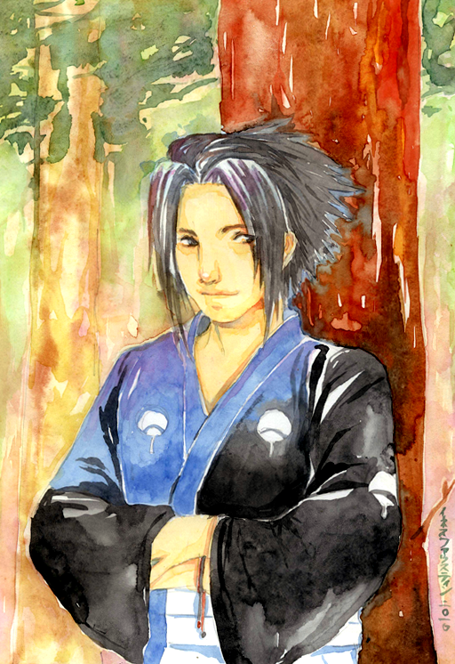
Just want to draw Sasuke in some formal kimono.HELP! i have brightened the contrast in PS. the real picture is not as bright as this. my question is, how to make the color brighter in the original???
here's the original [link]
Sasuke (c) Masashi Kishimoto
 Commission
Related content


Comments: 25

Overall
Vision

Originality
Technique
Impact
I like the painting style you've used here. It's got a sort of sketchy, loose feel without looking sloppy. The overall color scheme works really well and creates a great sense of atmosphere.
For critique:
--someone already mentioned this, but Sasuke's eye (his left, our right), is pushed too far away from the nose.
--as much as I love the colors, I think the skin tone is maybe too close to the tone of the background for the way the composition is set up. You've also got this nice reddish tree that dominates the right half, but there's nothing to balance it in the left half. Adding in some darker green foilage at the middle left or bottom left might help, or darkening the smaller tree on the left (doesn't have to be the same tone as the one Sasuke is leaning against).
--the original scan you linked to does look a bit washed out. I'm guessing this is watercolor, or maybe acrylics mixed with water? If your paints are from a tube, use a bit less water and lay them down thicker in places. If you're mixing paints, then maybe it's the combination of paints that are muting the colors. Or maybe you just need paints with more pigment in them (unfortunately, these are more expensive). I haven't worked with watercolors in ages so I don't have anything specific to suggest here.
👍: 0 ⏩: 1

thanks for the crit! i'll remember it for my next works
👍: 0 ⏩: 0

Overall
Vision
Originality
Technique
Impact
First of all, I love your use of colours; the entire picture gives of an air of a sunny forest. There is a lot of depth in the background, which is very nice, especially since you didn't use that many colours to accomplish this. I also love the way that these colour seem to suggest the moving shadows that you get when the sun shines through the leaved. In short, the background is fabulous.
Against this warm background, the cooler colours you used for Sasuke's clothing and hair really make him stand out. Again the use of shadows is very nicely done. I also like the way his eyes seem to be looking at something that's just outside of the viewer's line of view. The suggestion that he sees something that we don't and will never see gives the smile on Sasuke's face a mysterious air.
I've seen but two things that are slightly off; his left eye (right for the viewer) seems to be too far from his nose. This position is not natural for an eye and therefore looks slightly weird. If this is something you have trouble with, it is said that looking at a mirror image of your picture helps (scan it and mirror it, for example). This will make things like this stick out more.
The other thing I noticed was on his chest, on the left side; the way the kimono is drawn makes it seem like he has a breast there. More straight lines in that area might sort this kind of thing out.
Overall, it's a beautiful picture, and I can't wait to see more of your art.
- Please excuse any ignorance of techniques used for this picture.
👍: 0 ⏩: 0

Be more decisive with your colors, if you lay them out more thicker, you get a stronger color. If you want to work the colors of this watercolor picture better then I suggest you put a layer on top of a layer and with each and every one of your layers, you get a stronger color.
👍: 0 ⏩: 1
mm... any idea where to put stronger color?
👍: 0 ⏩: 1
Wherever you want it to be stronger, e.g. shades, hair, kimono and eyes.
Whatever you want to pop out
 (Wink)")
👍: 0 ⏩: 1
Hm yeah why did i never think of that before@_@ thanks! It's interesting, i'll try it.
👍: 0 ⏩: 1

I love the style of the picture as a whole, the traditional watercolor thing is really nice. 
👍: 0 ⏩: 1
oh... i didn't really think about sasuke's personality when i made this.
thanks for reminding me
👍: 0 ⏩: 0

Yeah i like this picture alot too and agree with most of the other critiques. His chest looks a bit like breasts because you've stardted the shading a bit too high I think, like the dark area starts a bit high and is probably too round. Maybe the line of the kimono starts out too far aswell which makes his chest look raised. Also just noticed his eye is visible above his hair but that's minor ")
👍: 0 ⏩: 1
lol this sasuke's boobs thing is really something to remember through my painting life. thanks for the comment
👍: 0 ⏩: 1
haha, it's not that bad just they look a little plump
👍: 0 ⏩: 0

i think i would of simply make a print quality scan from a drawing, do the things that need to be done in PSh.. and then take that file to photolaboratory for them to print it
as for picture it self.. you realy managed to draw the mood of that person is in.. i think that's cool!.. it's not some soulles creature staring from piece of paper, but an actual being that has a mood and maybe even thoughts
 (Smile)")
👍: 0 ⏩: 1
thank you for your kind words
it is indeed the most impostant thing for me, to put a soul into the paper

👍: 0 ⏩: 0

i really like this.the painting has an interesting look, but the subject could be brought forth more.
👍: 0 ⏩: 1
thank you
hmm any idea how to brought him more?
👍: 0 ⏩: 0

The right eye is too far on the right and the right part of the chest looks like he'd have an actual boob because of the shading. Otherwise, awesome! <3
👍: 0 ⏩: 1
ugh yeah i just realized it0-0
i'll be careful around the eyes and shading.
thank you
👍: 0 ⏩: 0

It's a very nice picture
I would love to give critiquing this a try, but I'm not an artist, so I don't think you'd like that. I hope you find someone soon
👍: 0 ⏩: 1
thank you.
if you have something in mind, just say it
👍: 0 ⏩: 1
I'll try, okay?
*starts writing critique*
👍: 0 ⏩: 0