HOME | DD
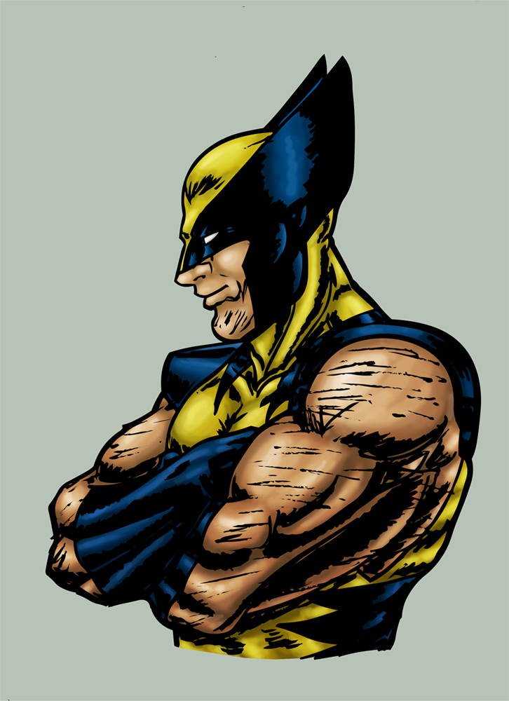
 LukeBatt — Wolverine and Cyclops Coloured

Published: 2005-10-27 12:45:05 +0000 UTC; Views: 2236; Favourites: 31; Downloads: 68
Redirect to original
Description
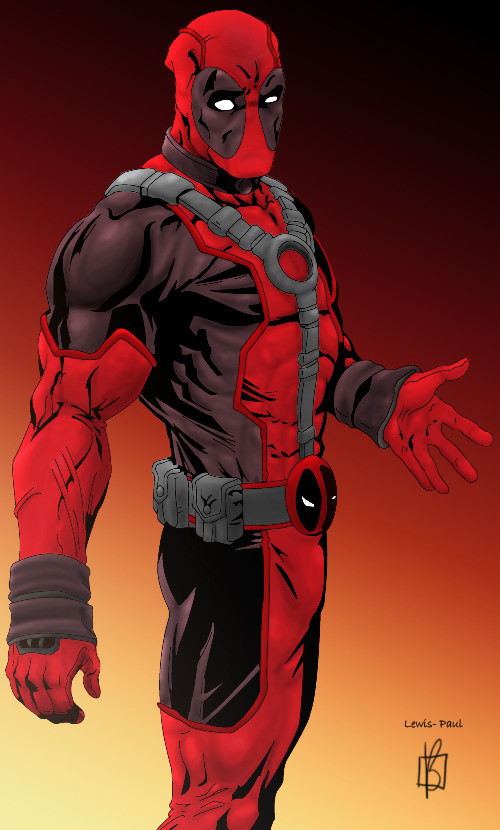
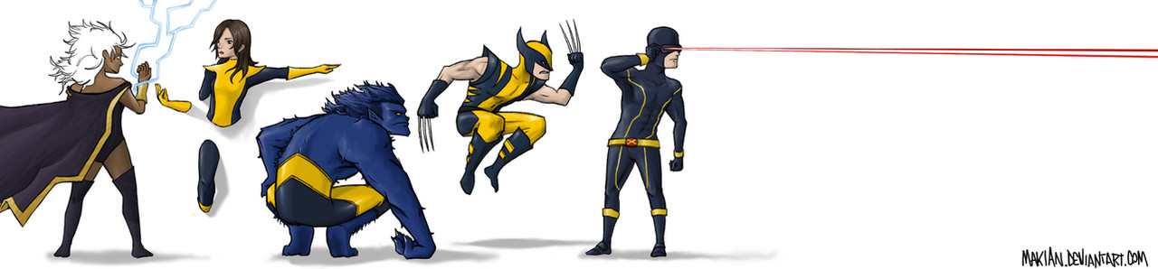
Original inks by Lewis-Paul [link]Colours by Me
UPDATE: Changed a few of the shades a bit, hope it looks a bit better
Related content


Comments: 20

hey looks pretty good. I colored the exact same piece. [link]
👍: 0 ⏩: 0

Wow, this looks great, though I would think Wolverine would be much larger...
👍: 0 ⏩: 1

Heh, well, he is in the background, a little ways behind Cyk, but still, he is a short man
Thanks for the comment, it's really appreciated
I was really proud of how the shading in Logans arm turned out, also, keep in my, only my colours, Lewis-Paul did all the lines for it
 (Smile)")
👍: 0 ⏩: 1
Very nice, I try hard to colour...but then again, I need to improve my line art as well... 
And Nightwing rocks... 
👍: 0 ⏩: 1
The Nightwing series is great, whats happening with OYL is gunna be awesome ")
")
👍: 0 ⏩: 1
OYL?
Top Ten...go read it, it's about a world/city where everyone has some sort of power. Sort of a crime story thing, it's great. Written by Alan Moore...
👍: 0 ⏩: 1
One Year Later - The Entire DC Universe jumps forward 1 year, all story arcs, the Nightwing series looks to breathe new life into the series
Hmmm, may have to see if I can find Top Ten somewhere
👍: 0 ⏩: 0

Nice work, when modeling try using longer stokes instead of short ones... as this helps from looking choppy in areas. Like the choice in lineart.
👍: 0 ⏩: 1
Thanks for the advice. Yeh, :Lewis-Paul: does some nice line art, really talented guy, and his pics are quite good for practicing colouring
👍: 0 ⏩: 0

It looks great man, although my one critique would be with a problem i used to have. Cyclops' skin tone is rather pale, and would look much better being the same tone as Logan's.
Other than that, great job
👍: 0 ⏩: 1
Just made it a little darker
Yeh, when I woke up this morning, I found a few things I didn't like about the colouring, so I spent a bit changing it a tad, whats another 3min
👍: 0 ⏩: 0

thats awesome. some more interesting lighting or coloring would be good though.
👍: 0 ⏩: 1

Heh, I haven't seen Cyclops looking like that in a long time. Of course, I haven't kept up with comics in a good ten years now, but still.
For crits, I think the highlights on Cyclops's lowered arm look a little blurry compared to the rest of him. The highlights on his chest seem a bit sketchy, too--probably due to the circular strokes. Instead of going in circles, try following the contours of his chest. In this case, it would be more of a horizontal stroke with an upward arc.
👍: 0 ⏩: 1
Thanks for the comment.
II may go back and fix up the things that tick me off about it later on, for now thou, it's done. But thanks for giving some crit, I can use that to try work on the next one better.
👍: 0 ⏩: 0

I am liking this very much, but am too tired to offer critique
👍: 0 ⏩: 0

dude that is sick, but i reckon ya yellows should be slightly different on them maybe a brighter yellow on cyc as he has very little of it in the first place
👍: 0 ⏩: 0

Looks nice, although I think it would look even better if you'd make the contrast a bit bigger. (=
👍: 0 ⏩: 1
You mean make it slightly brighter?
👍: 0 ⏩: 1
Sorry, my English is a bit crooked. 
👍: 0 ⏩: 0