HOME | DD
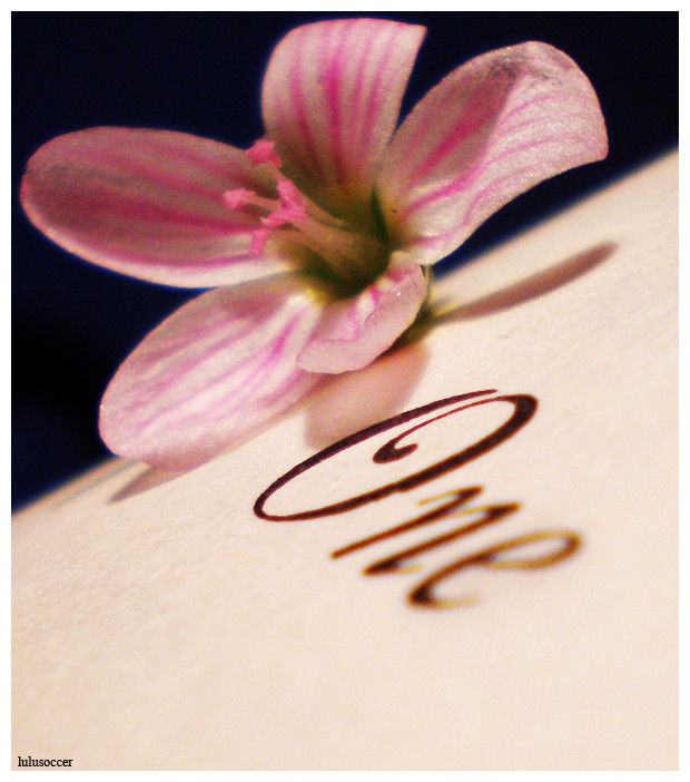
 lulusoccer — One
Published: 2009-04-10 23:45:42 +0000 UTC; Views: 787; Favourites: 31; Downloads: 24
Redirect to original
Description
Everything starts at OneThe flower is real, it was an incredibly tiny flower I found outside, and the One came from an old book I got for free at a library!
Any comments are appreciated!
 (Smile)")
Featured: [link] [link]
Related content


Comments: 44


I like the concept of this photo. 
Nice photograph.

👍: 0 ⏩: 1

Thanks a lot for your comment!! I appreciate your guy's input, and I do agree about the noisyness as well
👍: 0 ⏩: 0

The tiny flower is so pretty and the font of the word one is interesting-looking! And the angle of the photo is really cool. Beautiful photo.
👍: 0 ⏩: 0

I love the contrast between the colors and I like the angle of the picture.
Really nice
👍: 0 ⏩: 1


")


Very cool, I like perspective and the soft colors <3
👍: 0 ⏩: 0
Very cool, I like perspective and the soft colors <3
👍: 0 ⏩: 1

I like this one the best out of the three you posted in the forums.
It's just...good. I likes it. ^^
👍: 0 ⏩: 1

i love it! the pink of flower, the blue/black of the background, the book with "ONE" written on.. ah.. well done
👍: 0 ⏩: 1

I'm not an expert in photography, but I think it would've looked nicer with a better focus in the front too, the letters look blurry and noisy, while having some colours that I think shouldn't be there
But it's a very beautiful flower, it's wondrous how tiny it is 

👍: 0 ⏩: 1
Yea I agree with you about the first comment, However, I have a really crappy camera that I'm using ")
Thanks though for the comment
👍: 0 ⏩: 1
Oh, I see 

👍: 0 ⏩: 0


I really like this one, the flower is one with the text. And I think the style of the text is very awesome.
👍: 0 ⏩: 1
Why thank you ")
👍: 0 ⏩: 1
You´re totally welcome
👍: 0 ⏩: 0

I love the angle and the lighting. Both really enhance the concept. It's a very nice shot, and idea as well.
👍: 0 ⏩: 1
Thank you, I love the angle of this as well!
👍: 0 ⏩: 0


I love the concept, and the perspective is fantastic!
👍: 0 ⏩: 1

How small was the flower? Now you have me curious.
👍: 0 ⏩: 1
If you think of your fingertip, I had it on mine at one point and it didn't cover the whole tip (almost but not quite) (I have pretty small fingers as well)
👍: 0 ⏩: 0

Some of the flower's pigment is comming off on two of the petals. Great idea though
👍: 0 ⏩: 1
Thank you for your comment!! I appreciate it, and I can see now what you mean about the pigment!
👍: 0 ⏩: 0

I really love this. It's very beautiful. Good work!
👍: 0 ⏩: 1

This is a really beautiful picture and so impressive
👍: 0 ⏩: 1