HOME | DD
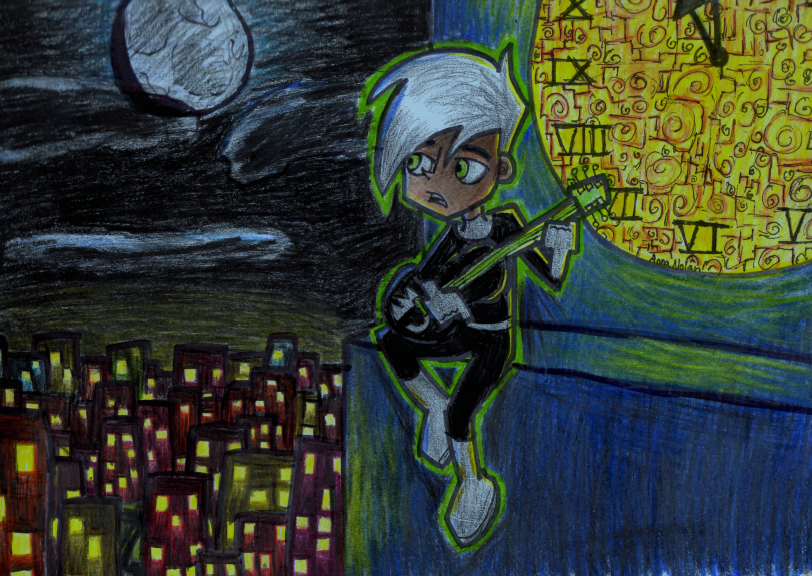
 Luminovia — Watch from the Clocktower
Published: 2013-01-26 21:10:07 +0000 UTC; Views: 531; Favourites: 34; Downloads: 2
Redirect to original
Description
Probably my best traditional piece. *shrug*I'm really proud of that clock there
Related content


Comments: 12

Overall

Originality
Technique

Wow, great job on this! Probably your most impressive work so far.
There aren't any major mistakes in this one, but there are a few little things you could do to make it look better.
The lines should be straight. It's a little thing, but it can change a picture from good to great. Also, Danny's butt it a bit on the edge and should be moved more in.
The clock is amazing. I love how you made it shine. However it takes a great deal amount of attention away from Danny. Those little details you put in it are great, but I would suggest you make them a bit more subtle so Danny remains the focal point.
The clock's hands are also not in the center of the clock. It should be in line with the IX and should also be straight.
Danny's hair is a bit too fluffy on the top half. It makes his head look very long. I would make his bangs a bit longer to even it out.
His feet are also very small.
I've noticed that both his hands are clenched. Sometimes I do stuff like that to avoid drawing fingers, so I completely understand if you're doing that as well, but the pose doesn't work well here. It's not really natural, you see. When someone holds a guitar, his hand is usually unclenched.
I love the entire composition of the picture, though. It gives a feel of serenity and calmness. And I love the guitar Danny is holding.
The expression on his face completely changes the picture, too. If he was smiling and calm, we, as the views might feel peace and content upon seeing this. But the slightly upset expression makes us wonder- What's wrong? Why is he upset? It gives a sense of mystery and melancholy and I love how you went for that.
Great job on this, overall. I really like it.
👍: 0 ⏩: 1

Thanks for the critique! I'm really happy I improved a lot from my previous picture I drew of Danny and Sam the you critiqued, and I feel tons more positive about my art now. ;v;
👍: 0 ⏩: 1
No problem. Keep improving.
")
👍: 0 ⏩: 0

This and "Hunting for Ghosts" are both illustrated well. You should be proud of it all. I can't say I'm familiar with the cartoon itself but what I find interesting is the very surreal feel you have given the lighting as it reflects around and warms the cool colors. A lot of people can't envision that too well...and yes the clock is very cool.
👍: 0 ⏩: 1
Thank you very much! I need to draw traditional a lot more, I guess. xD
👍: 0 ⏩: 0

Your art is so beautiful, that's it! I'M WATCHING YOU.
👍: 0 ⏩: 1
FGSACFDCSAFCG THANK YOUUUU!~
👍: 0 ⏩: 0

Thank you very much! ;v;
👍: 0 ⏩: 0

This looks really good. Did you used colored pencils or markers?
👍: 0 ⏩: 1
Thanks!~ I use a combination of both. ^v^
👍: 0 ⏩: 1
Well, that's a good combination though. I only use them seperate, lol.
And no prob.
👍: 0 ⏩: 0