HOME | DD
 LuthienneTinuvielle — Learning pastels: Landscape. Spring(?) in Alberta
Published: 2013-04-02 03:01:19 +0000 UTC; Views: 667; Favourites: 24; Downloads: 0
Redirect to original
Description
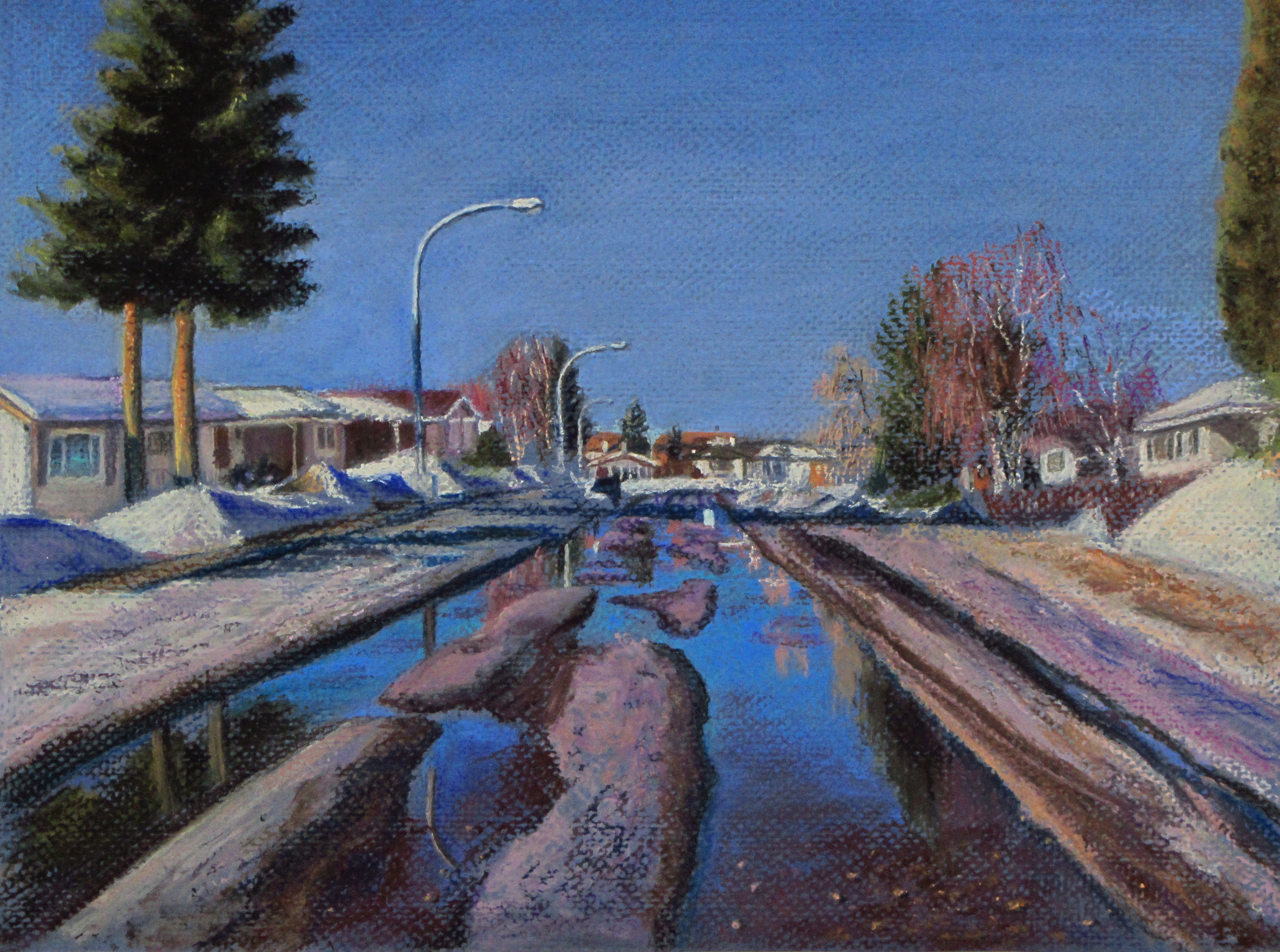
Next finished pastel learning challenge/step for me is landscape.Hard, soft and pencil pastels on blue Canson Mi Teintes paper.
Spring is almost thinking of coming to Alberta now... maybe even to my street. (AAANY DAY now...)
My first time working on a "proper" pastel paper. Don't think I'll be using Canson Mi Teintes much - its honeycomb relief is a bit too "pitty" for my liking... Hoping that once my order of sanded papers finally arrives from Dick Blick it'll be much easier for me to work on.
Related content


Comments: 16

~Congratulations!
This piece of artwork has been selected to be in our Daily Artwork Competition # 27
at Artisan-Guild -> [link]
Kind Regards
Ayumu-Haruto
Elite Moderator of Artisan-Guild


👍: 0 ⏩: 1

Wow, thank you kindly, I am very flattered!
👍: 0 ⏩: 0
Thank you! [jumping up and down]
👍: 0 ⏩: 1


You did a great job, landscapes are not my favourite paintings but i love the way you've used the colours.
I'm not very fond of Mi Teintes either, so that makes 3 of us

👍: 0 ⏩: 1
Thank you, Sarah dear! Ok, now I don't feel like the odd weirdo who is not crazy about this paper :-D
👍: 0 ⏩: 1
Very welcome and I like that.... your comment about the paper
👍: 0 ⏩: 0

Lovely Landscape painting! You'll really enjoy the sanded surface  (Smile)")
Very well executed, considering you're learning pastels
👍: 0 ⏩: 1
Thank you for thoughtful feedback and tips, dear! I share your view of this paper's texture - I can see how it can add a certain painterly texture to larger pieces, perhaps, landscapes... But I seem to be leaning toward a finer textured surface in the hopes of finding ones that would allow me a greater degree of control and flexibility in terms of level of detail... This painting is barely over a square foot in size, so, I was able to make the paper texture work for the subject, but just barely...
👍: 0 ⏩: 1
Yes, I don't use it anymore, I use the Art Spectrum Colorfix sanded surface almost exclusively...but I hear Velour is a nice paper to use also...I get the sanded paper in sheets and cut it down to size...you can also get them in pads as well
I still like what you've done with it, its a lovely painting!
👍: 0 ⏩: 1
Thank you!
I have a pad of velour paper waiting for me to get enough skill and a suitable subject to use it. I hear velour doesn't take a lot of abuse and is quite unforgiving. Wonder what kind of work it is best suited for...
Btw, ran into a puzzling problem: found out that none of the pastel brands I love (Schmincke, Sennelier, NuPastel) seem to have much in terms of very deep, near-black colours. Tried to draw a still nature with some very deep berry colours, but found it next to impossible to render them with anything from those spectrums. How do you get deeper colours in pastels, do you just add some black and blend?
👍: 0 ⏩: 1
Velour I've heard (I belong to PANZ (Pastel Association of NZ), and Wetcanvas.com) is good for rendering animals because it gives a softened look to the fur etc.
uses Velour on his animal paintings, if you want to check it out
Unison make some lovely dark values (1-18 series) are lovely darks...purples, greens etc. also...
I have Sennelier half sticks, with lovely darks and also Schmincke with a midnight black and dark browns, and greens.
Great American Art Works are on the top list of pastel artists brand as well as those you mention...and they produce some lovely darks as well, but Unison would have to be my choice for the range of darks.
Check out Dickblick online at the choice of darks you can get with those brands
👍: 0 ⏩: 1