HOME | DD
 lynnet — Matthew and Morpheus
Published: 2005-01-17 02:49:46 +0000 UTC; Views: 2438; Favourites: 33; Downloads: 196
Redirect to original
Description
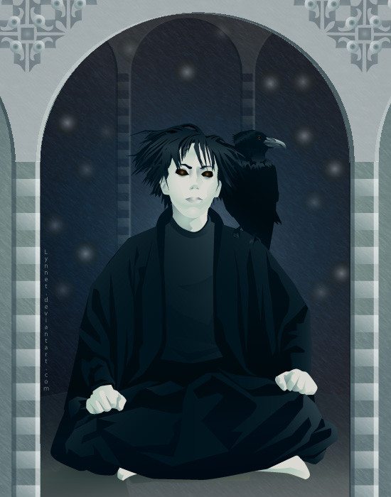
The Dream King and his loyal raven, Matthew, from Neil Gaiman's Sandman.Fiddled with the shirt and the castle some more, but I'm not sure it made much of a difference.
Related content


Comments: 36

um.. hi!
this is really nice. I like the computerised but 3 dimensional look this has. what do you call it? vector or something? I think you have just the right amount of subtle shading and light effects. his eyes are nicely lit too! This is a good quality that I didn't see all of the time in the comics but wish I did! Mathew looks really cool too! :>
he looks so calm and inquisitive like something is good and interesting. I like his face a lot. Very cool!
👍: 0 ⏩: 1

Yeah, it's a vector. Done in Adobe Illustrator.
Yeah, the comics were a little iffy in places...I want to see the cleaned up re-release, but $100 is a lot of money
...and thanks so much! I really appreciate the feedback.
")
👍: 0 ⏩: 1
ooh, yes. i want to get photoshop but costs soooooooooo much...
yeah totally! you keep making great art k?

👍: 0 ⏩: 0

Hi There!
You have just earned yourself an O.D.D. feature ! congrats!
Today's theme was titled " ODD Deviant's Suggestions", which in short means that someone on dA really loves your artwork
ODDS (oibyrd's daily deviations) are to honor the sometimes overlooked artists of dA that I personally think deserve some exposure (and ALSO, to show off people who I think are undeniably talented in their own genre of art, REGARDLESS of their #'s of fav's or pageviews. I like what I like and sometimes artwork isn't featured in the regular DDs because it's popular all on it's own It's a shame, but the admins are only trying to be fair! ). Please click the link below to see your work featured and to view other featured artists (and also see who suggested you for featuring!). If you prefer not to be a featured artist, just send me a note and I will remove you from the list. Cheers! xoxo Sandi oxo
[link]
👍: 0 ⏩: 0

Thanks. I just love Neil to pieces.
👍: 0 ⏩: 0

Great characterisation! I always found the Dream King's face difficult to draw, probably because I'd seen so many artist's interpretations of the character (this is also why none of my attempts ended up in my gallery), You've got it spot-on.
👍: 0 ⏩: 0
Great characterisation! I always found the Dream King's face difficult to draw, probably because I'd seen so many artist's interpretations of the character (this is also why none of my attempts ended up in my gallery), You've got it spot-on.
👍: 0 ⏩: 0
Great characterisation! I always found the Dream King's face difficult to draw, probably because I'd seen so many artist's interpretations of the character (this is also why none of my attempts ended up in my gallery), You've got it spot-on.
👍: 0 ⏩: 0

I'd just like to say, I really like this piece.
👍: 0 ⏩: 0

this is awesome
he looks a tad too young for my tastes but its got great style
i may vote for ya
 (Wink)")
👍: 0 ⏩: 0


love the confident in your lines its refreshing and tidy comparing to my work
👍: 0 ⏩: 0

Oooooh... Nice pic! I've always loved the Sandman series...
As for the pic, I'm not sure I agree with some of the other recommendations about making the background darker. I think the main figure would be lost if the background is darkened. I like the contrast that the current background provides. However, the tip on making the top part of the background a little darker may indeed help to improve the depth.
I really like the way the eyes stand out. And his expression is perfect. Aloof, yet very penetrating -- like he's really assessing the viewer's intentions. With his lips slightly parted, he seems about ready to tell you something. I wonder what that might be?
Great work!

👍: 0 ⏩: 0

I'll admit, I still haven't made it past the halfway mark of the first Sandman book.. I keep trying, but it just hasn't held my interest so far. I'll give it another go after I finish the pile of stuff I'm still trying to finish.
I can't stop staring at his face. His expression is young and old at the same time, as if he's been thinking about something for a while and maybe just now come to a conclusion about it. I really like that you've used so many dark colors here, but there's still a good sense of shadows and highlight. I think it's a very beautiful piece.
👍: 0 ⏩: 1
Honestly, me neither.
Volume one is pretty nasty, the print job is cheap, and the writing isn't as sharp as the later books...I've never gotten any farther than skimming. Dream isn't even particularly likeable, since he spends the whole book in revenge mode.
As long as you already have it, I'd personally skip ahead to the last story in the book "The Sound of Her Wings"...you meet his older sister, and the dialogue starts to be interesting.
Volume two is a significant improvement, though still not top-shelf. I highly recommend picking up "The Dream Hunters" to see what he's capable of, especially as it's illustrated by Yoshitaka Amano.
👍: 0 ⏩: 0

this is really cool! i love the technique, and of course, i love morpheus! he looks very sombre here, very nice indeed
👍: 0 ⏩: 0

i like the depth you've given to the central most pillars. nice work
i dont know though if its the laptop i'm on or what but his shirt seems more pixelated than it used to.
👍: 0 ⏩: 1
darn it.
...it looks ok on mine...I don't really know what to do about that other than check on my PC at work.
👍: 0 ⏩: 2
ok, i just looked. it IS my crappy laptop.... yay me
👍: 0 ⏩: 1
Thanks for checking! *sighs in relief*
👍: 0 ⏩: 0

Wow.. very nice vector work. I'm curious about his clothing... his shirt doesn't have quite the depth that the other parts of his body do.
Regarding the comment about the background being 'flat' -- I think some color variation foreground to background would help create the appearance of depth. Also, there should be some slight hint of shadow from Morpheus.
(BTW what a great series!)
👍: 0 ⏩: 1
I know...it's not right. His t-shirt almost never has any textural detail, which seemed to make sense considering how rail-skinny he is and the dark color. You're right, it needs more, but nothing I've tried to far has really helped.
Thanks very much for the comment on the background, it was very helpful. (Though I may have gone overboard with this draft)
👍: 0 ⏩: 1
It's tough, because I almost want to see something in that shirt... but I also don't know what kind of shirt it is!
Well as always, Lynnet, you know I love your work and your original approaches to characters. I look forward to seeing the next part.
(And oh! Congrats on the BigO win. I went back to see the results. I figured that if you had the time to complete the number of works that you'd be a shoo-in, quite honestly.)
👍: 0 ⏩: 1
It's just a T-shirt, really...i've added a few wrinkes...I don't know.
(...Thanks  (Smile)")
👍: 0 ⏩: 1
Yeah. I don't always know that I like being put into a category that to me doesn't seem to interest me artistically. Like WAFF? ehhhh. (Well, me in particular not being a Roger/Dorothy fan it's like killing me. hehehe.)
BTW, make sure you check out hakubaikou.com for the new contest. I remind you!!!! (BECUASE I LOVE YOUR WORK!!!)
👍: 0 ⏩: 1
Heh...I can relate.
Has Paradigm had any more contests?
I've seen the Hakoubaikou one...really interesting theme.
Unfortunately my job has been pretty much my life for the past few months...I don't know if that will change in time to submit anything.
")
👍: 0 ⏩: 1
yikes. I haven't been back to paradigm in ages... so I'm not sure.
As for HB, well, I hope you still can. Love your stuff as always
👍: 0 ⏩: 0

The crow is really stunning. Sorry I can't really offer a more useful comment than that.
👍: 0 ⏩: 1
His eyes really creep me out.... and his palace is kinda weak for being a king and all
nice textures and colors. i really dig the raven
👍: 0 ⏩: 1
He can't help the way he was born
👍: 0 ⏩: 0

looks awsome, yeah, try some shadowing in the background.
👍: 0 ⏩: 0

what a strange picture !?
good work
I like character but background seems too flat
nevertheless the result is beautifull
👍: 0 ⏩: 1