HOME | DD
 M0AI — Knight of Dissolution
Published: 2010-04-11 21:03:40 +0000 UTC; Views: 5172; Favourites: 92; Downloads: 182
Redirect to original
Description
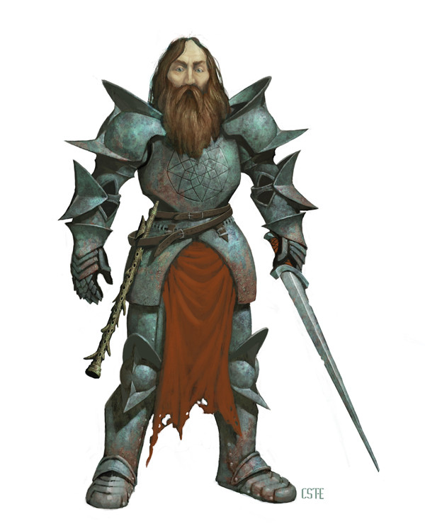
Here is a character I did for my last freelance job. They appear in Kobold Quarterly 13, which is out now! They are members of the cults of various gods from the Lovecraft mythos, but they must also function as possible player characters, so they couldn't be totally nasty and occult.This guy is a Knight of Dissolution, a member of the cult of Azathoth. Cultists of Azathoth believe that the universe is meant to decay into entropy, and the Knights of Dissolution try to hasten that demise. So, I made his armor rusted and pitted, his blade jagged, his cloth tattered, and his hair unkempt. The symbol on his breastplate is a 2D representation of some sort of hypercube (the four dimensional equivalent of a regular cube), which ties in well with the bizarre geometry and other dimensions of the Lovecraft mythos. It can also represent Azathoth's position at the nucleus of the universe. He carries a Flute of Dissolution, a lesser version of the flutes that the gods play at the center of the universe in order to keep Azathoth asleep. This was the most time-consuming of these characters. I made the sword in sketchup.
Related content


Comments: 19
Couldn't be totally nasty or occultic, and yet you chose a follower of Azathoth!?
👍: 0 ⏩: 0

Oh! Man! just notice. It is a pipe?  (Smile)")
👍: 0 ⏩: 1

It's an instrument called a Chaos Flute or something like that.
👍: 0 ⏩: 1

This one, for me, strikes the best balance between "insane Cthulhu cultist" and "relatable player character." The figure's physical features and expression can be read either as "grim and stoic" or "glazed and fanatical" depending on role and relation, as can the complex "hypergeomtrical" symbol on his breastplate. The stroke of genius on that one, I think, is in its radial symmetry: there is something balanced, mandala-like, about it, and yet it remains disturbingly ornate and ambiguous. I feel the same way about the burnished plate mail: it strikes the perfect balance between soothing curvilinearity and spiky, angular aggression. Who's side is this guy on? It's almost impossible to tell from the way he's depicted here. I'm reminded of the terms in which Clive Barker's sadomasochistic Cenobites describe themselves in "The Hellbound Heart": "Angels to some, demons to others."
👍: 0 ⏩: 1
Thanks, Tom! I'm glad you respond so well to this guy. You're even spotting some symbolism in his design (the spiky/roundness of his armor) of which I was not even consciously aware.
I was actually planning on going full on degenerate maniac with this guy--stringy hair hanging limply from a bare, peeling scalp, soulless eyes, etc.--when Wolfgang, the art director, reminded me that these would also have to function as possible player characters.
👍: 0 ⏩: 0

Fantastic textures, the armour is nicely spikey and the knight himself looks great. I have a small problem with the sword (now I sound like a twerp telling you all your mistakes!) it doesn't look like it's at quite the right angle with the hand. It could just be me though.
👍: 0 ⏩: 1
Thanks, salamander! You could very well be right about the sword. I just guestimated about its angle and position. And you know I don't mind critiques.
👍: 0 ⏩: 1
All good then ")
👍: 0 ⏩: 0

Were these prestige classes? (Yeah, I'm the guy who contributed to the issue but has yet to get it in the mail.)
👍: 0 ⏩: 1
No, the article really isn't about specific classes. It's more about the cults of various Lovecraftian deities and how they could be incorporated into a campaign.
Where you a writer for the issue?
👍: 0 ⏩: 1
Still, cool stuff.
I wrote the piece on the firearms-based base class. I don't know what the actual title ended up being.
👍: 0 ⏩: 1
That article sounds cool! I like firearms in a fantasy setting. I haven't seen the issue yet either, though.
👍: 0 ⏩: 0

I love the armor and the pattern on the middle of it! The rust looks great too. Why so many cults trying to destroy the world, they live on it too hahah. I like this design the best
👍: 0 ⏩: 1
