HOME | DD
 m0rptr1x —
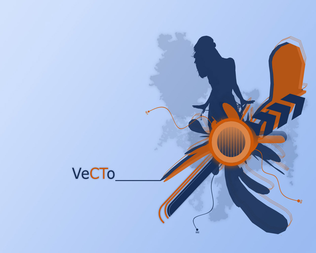
VeCTo_
m0rptr1x —
VeCTo_
Published: 2004-05-25 20:39:19 +0000 UTC; Views: 4208; Favourites: 43; Downloads: 3507
Redirect to original
Description
______ Michael Jensen - 2004
A little expiriment to make something simple yet complex.
-
Zip contains some different resolutions and two other color-schemes.
EnJoi..
Update:
Thanx to ^sycho for the DDF!

And the blue girl was made from [link] by *janina
Related content


Comments: 29

This is so awesome dude
*clicks and switches her wallpaper to this* Indeed

")
👍: 0 ⏩: 1

I always love when peolple say that..
")
👍: 0 ⏩: 0


Yeah, I agree with everyone, awesome job. Am I the only one who see's the chick untying her swimsuit or what?
👍: 0 ⏩: 0

Really a rather smooth piece. I like the contrasts of the blues. Rather nice
 (Smile)")
👍: 0 ⏩: 0


nice colors and composition and everything. Ops, did I just repeat what everyone is saying?
👍: 0 ⏩: 1
Well, maybe you did..
But then again, that also seems to be what most people like about it.
👍: 0 ⏩: 0

Great work man. I love the colors and the composition. But I think you can do better with the typo.
Congrats on the DD by the way. ^_^
 (Wink)")
👍: 0 ⏩: 0

Awesome piece. I look forward to setting this piece as my desktop, its that good.
Just plain pretty to look at. Relazing too.
👍: 0 ⏩: 0


usually dont favorite abstract works but i think this one deserves an exception...+fav
👍: 0 ⏩: 1
w00t! i deserve an exception.
Thanx..
👍: 0 ⏩: 0

Nice, I love the colours. Great contrast. 10/10
👍: 0 ⏩: 0

the colors are great
and the girl is just sexy
very good, quality work
👍: 0 ⏩: 0


Awsome, I love the color harmony. Alot of Vector work is just abstract and does not make sense and I hate that. But, I have to admit that this one strikes my fancy. Nice color choice, orange and blue together are the best!
👍: 0 ⏩: 1
Thanx..
Im glad you liked it..
👍: 0 ⏩: 0

Is that blue silhouette the near-famous stock of *janina ?
👍: 0 ⏩: 1
Oh yeah, i think it is.. Totally forgot about that.. (its an old silhouette)
gotta give her credit..
👍: 0 ⏩: 0

Hooooooly momma!
I so love the retro style of this. The gradients are so smooth, and the colors so incredibly sexy!
👍: 0 ⏩: 1
Wee!! DDF!!
Thanx so dahm much!
Hehe, retro.. Maybe a little.. And yeah, i think the colors came out great.


👍: 0 ⏩: 0

this looks very good, being on of youre first vector-looking pieces i think this is a VERY good start,
did you vectorize that girl yourself?
well anyway, nice colour combination and great composition 
👍: 0 ⏩: 1
I should continue doing vectors. Its fun.
👍: 0 ⏩: 0