HOME | DD
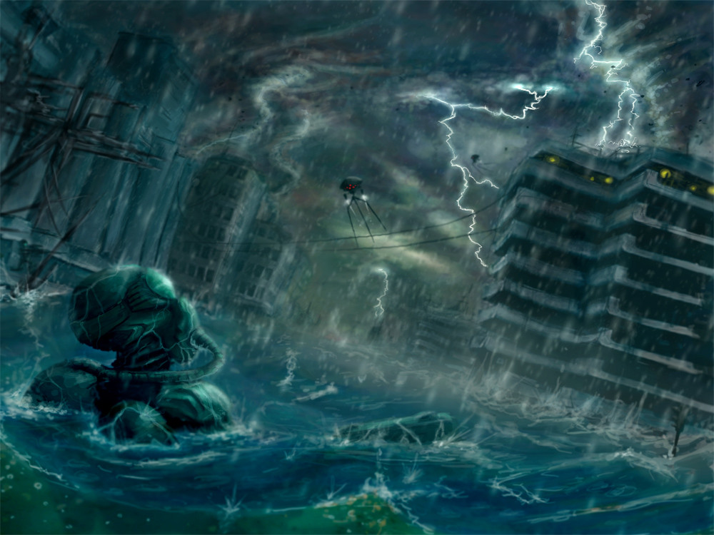
 Malach — Surfacing
Published: 2005-11-28 17:55:59 +0000 UTC; Views: 1599; Favourites: 22; Downloads: 123
Redirect to original
Description
Concept art for a danish made computer game, Ascension.[edit] changed some minor details in the picture.. improvement to lightning, color spectrum, depth and details in general.
Related content


Comments: 11

 (Smile)")


Hey dude! This is very nice! Looks pretty realistic but i think that the lightning would make a little more light than that... like... the builting infront should be in shadow because of the lightning behind it...
By the way.. How did you do them??
Overall its a pretty nice painting!

👍: 0 ⏩: 2

There are many cases of lightening that are strictly "fork", before they really create any kind of light at all. I think it's pretty accurate.
👍: 0 ⏩: 0

thanks Dekus.. yeah.. you're propably right about the reflection. I'm getting back to this picture when I'm finished with some more drawings..
How I did the lightnings.. quite easy.. I drew a jagged line as I wanted them to look.. dodged a little bit when I flattened the layer and added a thin layer of white and a little blue to them.
👍: 0 ⏩: 0


Ah great.
The only point is that in full view, there is a blur feeling.
The same with buildings in the background that are smoother than the lightning near.
Perhaps the red lights needs to have a "flare" around too.
I like it better in a smaller size. But this renders quite well and it is good to see.
👍: 0 ⏩: 1
good idea with flaring the red lights..
I'm getting back to this picture in the weekend.. have some more work to draw first.. the blur is kinda intended but could be polished off a bit.
that's for the comments mate :]
👍: 0 ⏩: 0
