HOME | DD
 malikanas — Colored Curves
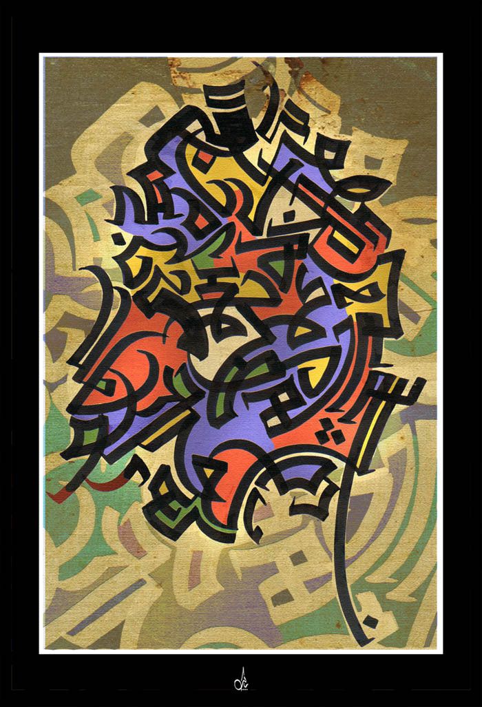
Published: 2006-07-07 14:21:03 +0000 UTC; Views: 2654; Favourites: 26; Downloads: 84
Redirect to original
Description
----Related content


Comments: 20

This is fabulous! I have a feeling that I should be able to read it but cannot. I love the colours, the intense composition here. It might also make a good print!
Liam
👍: 0 ⏩: 1

Thanks Liam...Long time no C ! so glad to hear from you my friend.
 (Smile)")
👍: 0 ⏩: 1
Yes, I only go through my deviantwatch every month or two I'm afraid. It gets so large I am frightened to look!
Congratulations on your daily deviation -- it is truly, truly well deserved!
Liam
")
👍: 0 ⏩: 1


Gorgeous movement displayed here. the colors remind me of fine stained glass. lovely work, Malik.
👍: 0 ⏩: 0


Ohhh what a wonderful work.
Full of beauty & meanings.
👍: 0 ⏩: 0

Wow what a bountiful way to bring a variety of color's into perspective. I admire how you conceptualize your composition and the draftsmanship just shows how your ability to bring out the mastery form is never ending. Incredible!

👍: 0 ⏩: 0


Nicely colored and stylized. I really like the pattern and structure.
👍: 0 ⏩: 1

nice ^^ a modern touch with a maze like structure clean and nicely coloured yep :fav: ^^
👍: 0 ⏩: 0

Absolutely stunning, it looks like a graffiiti, but the kind of graffiti I would love to see on my walls!
It's so dynamic and lively. There's a lot a energy in this one, a raw energy. And the colours! It's so original.
Very very good work. Congrats.
👍: 0 ⏩: 0

something about the colors here doesn't work for me
in my eyes the combination you chose doesn't reflect
on your style... i've never seen that type of combination
on eastern type work [not that i'm an expert]
i'm thinking maybe maybe try replacing the blue with solid white... maybe
btw.. congrats on the bold coloring
mm.. maybe also replave the backgound with solid white
... just suggesting ideas from my own perspective.. feel free to ignore

👍: 0 ⏩: 1
btw the calligraphy is excellent as allways
reminds me of a spiralling staircase
👍: 0 ⏩: 0

very nice bro.. mashallah..
im gonna try doing some arabic calligraphy with illustrator.. got some arab fonts to mess around with...
i envy ur skills
keep up the good work bro..
")
👍: 0 ⏩: 0
