HOME | DD
 mallaard — Sonic Sample Page
Published: 2007-06-18 21:57:07 +0000 UTC; Views: 2205; Favourites: 31; Downloads: 26
Redirect to original
Description
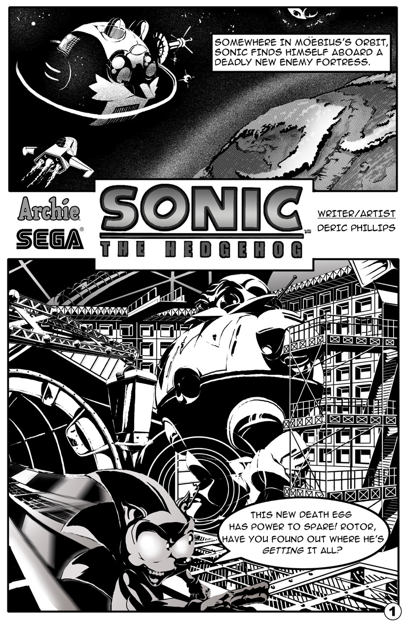
For the last few weeks I'd been hinting here and there about a "big" project I've been working on. Well, this is it, or at least part of it. I'd been trying to work up five sample pages to submit to Archie to try out for one of their Sonic comics. This is the only one I've finished so far. I'm super quick, obviously.Over the weekend I went to the HeroesCon in Charlotte and spoke with STH writer Ian Flynn and artist Tracy Yeardley. They were both extremely nice and helpful folks who gave me advice toward what to submit and how to do it.
After chatting with them I'm thinking that this heavy black look won't do for my official submission, so I'll probably start over with a more open clean line look. Still, I'm very happy with this page, which is the first comic page I've ever gone all-out on. It was inked digitally with the tablet over looser sketches of the panels. The Sonic logo I scanned from two of the covers and pieced back together into a whole one (Sonic's head obscured pieces of both), then cleaned up and re-toned in Photoshop.
Related content


Comments: 27

👍: 1 ⏩: 0

Pish! I love the heavy black look. But I'm not the target demographic either.
👍: 0 ⏩: 0

Sonic looks freaky, but I've noticed it's just your style. Anyway, with art like this I couldn't care less what the characters look like while there's so much awesome details to look at. Kick out someone from Archie and take their place dangit!
👍: 0 ⏩: 1

Well I decided that my style really doesn't fit what Archie's doing with Sonic, so I'll leave it to the Sonic pros. Like I've said before, I have a hard time drawing a Sonic I really like, no idea exactly why.
👍: 0 ⏩: 0

Now this is truelly amazing! The linework, the shadows, the buildings, the structures everything looks great! You have a real nack with backgrounds.
My onley critique though is that Sonic looks a bit on the "scarry/evil" side.  (Wink)")
And you also mispelled "Mobius."
Anyways good luck with getting a job at Archie Comics, dude. (Or any comic book company for that matter.) Your work looks quite professional to me, and you could do this kind of work if you want to.
Y'know, I've acctually gone to Ian's "Bumbleking" forum. (Ever been there?) He does seem like a nice guy.
👍: 0 ⏩: 1
Yeah, I'm not crazy over how I did Sonic in this either. Thanks for the comps though, much appreciated.
👍: 0 ⏩: 0

Very nice. I love what you did in the background.this amount of quality I've only seen in the UK comics.
👍: 0 ⏩: 1
Thank you very much! I love UK black and white comic art, so I take that as a great compliment!
👍: 0 ⏩: 0


Ho snap what's been happening since I've been on hiatus! Awesome, and of course good luck!
👍: 0 ⏩: 0


Wow, top notch stuff.
I don't really mind the blacks on this page. They really give the panels depth, and would probably be knocked back by the colorist when he went over the page. The only thing I felt was off was the motion blur but even that was really stretching it.
I can't wait to see the other four pages.
👍: 0 ⏩: 0

DUDE. So very cool!
It has a really dark edge to it; totally you, and unlike any Sonic artwork I've seen before. Great mix of gray, tone areas and those ultra-contrasty pieces, and I'm really interested in how you've done Sonic. The detail in the machinery is just mind blowing. Goddamn!
I think this has been mentioned already, but the only thing that seems a little confusing is how Sonic isn't quite the centre of the focus, because he's a bit too dark. Still, this is absolutely gorgeous
 (Smile)")
👍: 0 ⏩: 1
Yeah, Sonic is a little too out of the way on this panel. I'll handle future pages in a different way to make sure all the elements are properly emphasized. I'll still be working with this contrasty style probably for a while, but I doubt I'll use it on my next pages for this.
👍: 0 ⏩: 0

That looks pretty awesome, I think you knocked this one out of the park, I especially like the background in the second pannel; it's hard to take it all in. I think Sonic can be a little brighter, but I like everything else.
👍: 0 ⏩: 1
At first I had Sonic bathed in a lot more shadow, but Eric suggested brightening him up a bit, which brought us to where it is now. As I said, this heavy shading look is probably all wrong for this comic, but it felt good to get it out of my system.
👍: 0 ⏩: 1
Hmm. I like the liberal use of black shadows personally -- I think they look pretty cool. On Sonic I think the grey tones are what look too dark. You kind of lose him in the foreground.
👍: 0 ⏩: 1
That's probably true. Unfortunately I was losing him to the background before adding the tones, so maybe there's a balance to be struck.
👍: 0 ⏩: 1
Maybe so. Sometimes with line art it's tough to separate forground and background things.
👍: 0 ⏩: 0

Oh I've done the test page thing too. They're kind of picky so no the black look won't go over well. The layout is nice but Sonic is off model and they get very picky over that for test pages. I know they told me I drew Sonic too old school and this was before all the rush of the 3d games. Also watch the speech balloon. The text doesn't flow naturally and the words are too close to the edges. I hope this helps.
👍: 0 ⏩: 1
That's good advice, thanks for the message. I didn't put too much thought into how the words looked, which is something I'll watch out for next time.
👍: 0 ⏩: 0

I use to read that series all the time until vol. 60 something. Good artwork!
👍: 0 ⏩: 0

This is so friggin' cool! I have no idea what they're judging but I'm sold on that first panel alone. I think if you maintain the harsh black for some aspects and lighten it up in other areas it's completely set, but that first panel- change nothing. It's perfect.
Moving on to the second panel- your background is perfect here. I'm not sure if it's perfect for what they're looking for but again, I have no idea what they want so I'm gonna say that I love it beyond anything. Sonic looks great too, nice and devious, but the motion blur isn't doing much for me. Maybe because his body is completely crisp and it isn't? I'm not sure. It could be because he fits in so well with the world you're creating and that blur doesn't so much.
Anyway. This is fantastic beyond belief. I love how you're putting every ounce of effort you have in, and it is really showing that you know what you're doing and are pushing as hard as you can. I'm just rambling now, so I'm gonna close off with a "brilliant!".
Brilliant!
👍: 0 ⏩: 1
Thanks!
Although the guys said this style probably wouldn't float at Archie, they liked the page. Tracy Yeardley's only real critique was to make sure my perspective was correct, as there are a couple of spots on the second panel that are off. He liked the first panel too.
The speed blur doesn't really work for whatever reason. I feel it looks too artificial, like too much of a Photoshop filter (which it is). I'm still not entirely happy with my handling of Sonic, I'll have to work on it. I forgot to mention that I bought a page of comic art from Tracy's table, it was one of his Sonic X pages inked by Terry Austin, very nice looking. It'll probably serve as a strong guideline for how I should try handling a comic like this.
👍: 0 ⏩: 0

Very nice!
I like the darkness of it (if that makes sense) - it has a nice edgy feel.
Good luck with your submission.
👍: 0 ⏩: 0