HOME | DD
 ManamiHanatsuki — Anime Prince
#anime #animedrawing #manga #prince #animeprince #mangadrawing #anime_manga #anime_prince #anime_cosplay
Published: 2016-10-30 19:10:22 +0000 UTC; Views: 428; Favourites: 19; Downloads: 0
Redirect to original
Description
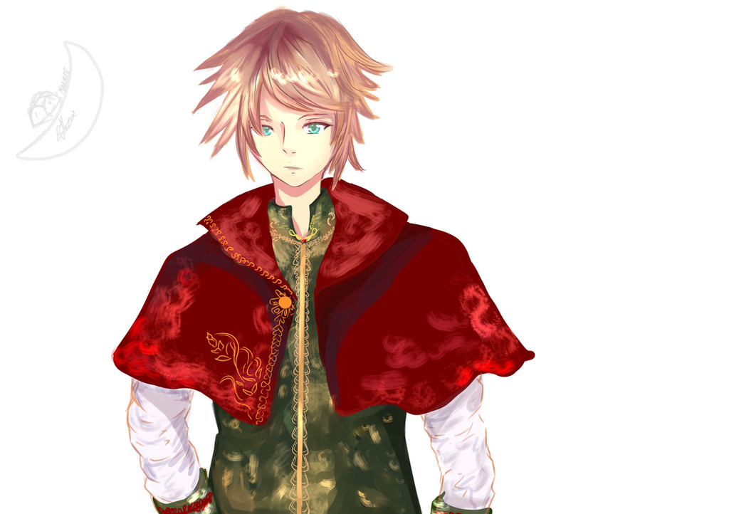
Honestly I made a bg , but i felt that it ruined the drawing so i removed and made a no bg version ....The character was drawn on the spur of the moment ( wll, i know listening and watching too much of Versaille's SERENADE defenitely affected and inspired this !)
Related content


Comments: 21

This is really pretty! I love the lighting on his clothes, and aside from a little awkwardness in the arms, you did a great job with the anatomy.
👍: 0 ⏩: 1
You're so welcome!
👍: 0 ⏩: 0

This is so cool' ")
👍: 0 ⏩: 1

Thanks for the advice ^^
👍: 0 ⏩: 1

not sure what bg is, but I'm going to comment anyways xp.
This is really nice, your get the texture you want in there and the patters are really nice too.
here are a few small tips and comments:
his head is too big above the eyes. Before you start drawing, I suggest that you draw a circle base for his head so that you are able to keep his proportions under control.
Try making the shading near the top of his head more defined, like the rest of the hair, instead of a smudgy blur.
His nose needs to be just a little bit lower on his face, closer to his mouth and farther from his forehead.
his shoulders are just a little bit too wide. For his face type and hair style, as well as his softer outfit, I would go even slender than you would expect most guys to be, accenting his feminine facial features. This will also make the green-clothed part of his body less wide and awkward.
As for the little patterns on his clothes, I would suggest blurring the edges so that they don't pop off the softer materials. This will help unite the overall image and blend the elements together better. another thing you could do for this is make his white sleeves smoother. The super-crumpled look doesn't really go with the delicate royalty of the rest of the outfit.
Other than that, this a really nice drawing with some solid coloring skills showcased. Good job! looking forward to your next work!!
👍: 0 ⏩: 1
Thank you for the advice , i will definitely take them int conieration the next drawings
👍: 0 ⏩: 1
You're welcome
👍: 0 ⏩: 0

Heya! I come from ProjectComment
First of all, I love the softer tones and the textures of this piece. You definitely put a lot of detail and effort into the fabric and it shows through the intricacies of the sleeve folds. I also really love the little detail of the gold embroidery of the cloak and vest.
The hair looks very fluid and soft, which is great but it would also be lovely if some of that fluidity could be transferred to the character. The pose you have is very stiff and forced. I recommend looking at a tutorial on dynamic posing or lines of action to mould your characters into more interesting shapes.
A bit of advice for backgrounds that seem to ruin or consume your foreground, try to centre the background around your character so that they remain the focus of the image, avoid too much clutter behind the character and a very good technique is to put your character in the most lit up section of the background (For a great example of this, look at the background art for Steven Universe)
👍: 0 ⏩: 1
Thanks for the feedback , I always have problems about poses , it's more like , usually when I get requested a certain pose ; I know how to draw it ( I went through a lot of tutorials and books for this ) , but when i draw I suddenly can't think of any pose ... I wish I could I know it would help my drawings look way better ...
👍: 0 ⏩: 1
Have you ever tried using references in your art? Try looking at and loosely shaping your pose around a stock image or even just a picture of yourself in the pose you want, and then adapt it to fit your character design and anything else you wanted.
👍: 0 ⏩: 1
Thanks for the tip , I did try that a few times years ago , i think I should be back to this
Honestly when I draw something with a storyboard ( like manga of fanfiction ) it is way easier for me because I have a clear idea on what to draw ..
but , and especially recently , i just hold the pen and look at the ceiling or the ground and then get nothing , so i end up with the stiffness...
anyways I really appreciate your feedback , and I gess back to reference ")
👍: 0 ⏩: 0


you are very welcome.
👍: 0 ⏩: 0

welcome keep up the amazing work
👍: 0 ⏩: 0