HOME | DD
 manapul — Iron and the Maiden Book 1

Published: 2008-05-02 04:33:37 +0000 UTC; Views: 6060; Favourites: 68; Downloads: 151
Redirect to original
Description
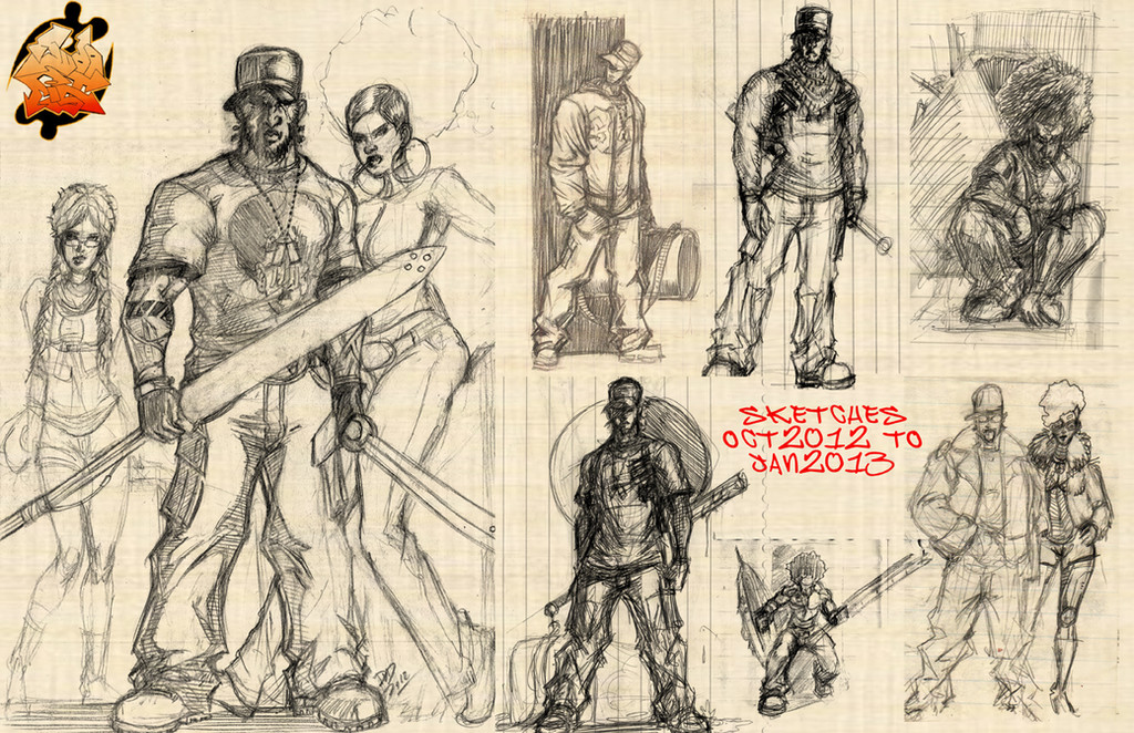
So after some requests here's some of the stuff from Iron and the Maiden. Here are the layouts to the cover of issue 1. You can sorta see the progression of where it was heading. There were two different ideas that was thrown at me. Jason wanted a more iconic single image of just Iron and Angel, but Aspen felt that for an issue one a movie type collage showing the other characters would be best. I thought C represents that the best since the single focus is on Iron but within his shadows you see the story unfold and characters revealed but still retaining that iconic single image. Ultimately they wanted a combination of A and D and Frank from Aspen also liked C but he felt it was better for issue 0. So we all win! I got to draw C which was my favorite and what we ended up with was E for issue 1 cover!Related content


Comments: 13

I think B and D are the best
I love how for every cover you draw several variations to see which would look better
Tried it myself and it really helped put my ideas on the paper
Your work really inspires me
 (Smile)")
👍: 0 ⏩: 0


Man your thumbnail sketches are super detailed. That is crazy, looks awesome.
👍: 0 ⏩: 0

The C and D were awesome !
hope you will do something with it ^^
👍: 0 ⏩: 0

Yep. You can really tell the discipline and the talent by someone's sketches, I think. The are beautiful and I'm happy that you got to do C. That was my fav as well.
Good choices all around, and I'm loving what you're doing.
👍: 0 ⏩: 0

Its amazing how simple yet resourceful your linework is even for your sketches Francis. Your economy of line is fantastic. Huge fan, beautiful work.
👍: 0 ⏩: 2

thanks josh! and jason wants to do a sequel, but I'm with DC until summer of 09. so if he and the readers are willing to wait I'm there!
👍: 0 ⏩: 1
Oh man, what a bummer of a wait but I'll be there. I doubt anyone could step in to fill your shoes so I will be waiting like the rest of your fans.
👍: 0 ⏩: 0
You hit it right on the head. Nicely put.
👍: 0 ⏩: 0

Dude I loved cover "C" so much when it came out that I actually kindof ripped off the idea for a contest on the seven deadly sins. Your so friggin creative and great at drawing I just can't help but envy you. Keep up the good work and check out the piece I was just talking about. Hopefully I did you justice.
[link]
👍: 0 ⏩: 0

Love all the layouts, though my personal favourite would have to be C. Definitely in the finished stage.
👍: 0 ⏩: 0

good stuff, I am glad to see you got what you wanted as well as the client=] This is a perfect scenario=]
👍: 0 ⏩: 0

I'm also glad you went with C; subtlety will always remain the best choice.
👍: 0 ⏩: 0