HOME | DD
 manapul — Red Robin 2 Final

Published: 2009-04-09 04:56:19 +0000 UTC; Views: 12166; Favourites: 328; Downloads: 0
Redirect to original
Description
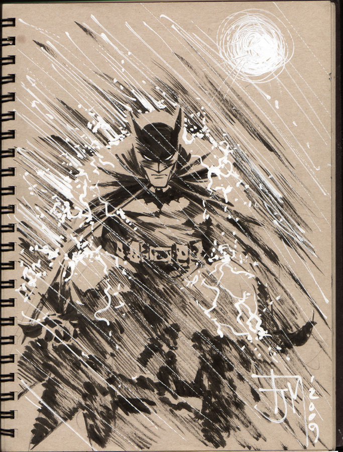
I saw this on the back of the DC books today so I figured it's ok to post it. Here's the finished cover with washes and all. I used water color and ink wash for the tones and white liquidtex acrylics.Related content


Comments: 29

 (Wink)")

Heh everyone keeps asking but is that Tim and Tim, or Damian and Tim, or...maybe I should just go look it up on DC heh. Either way it's very cool.
I like how it kind of makes Red Robin look more reckless, not using the rope, and also more vicious, actually getting the hit across the face. If it is Tim and Tim then shows how he's changing kind of. No idea if that was the intention or not, but yeah...ok I'm done heh.
👍: 0 ⏩: 0


great prespectif......great work!!!!....cool action!
👍: 0 ⏩: 0


Robin and Red Robin cool. Is that Jason under the mask?
👍: 0 ⏩: 0


wow they're actually making tim drake age now huh.... interesting. He looks like Dick Grayson here
👍: 0 ⏩: 0

 (Smile)")


This cover is awesome...it's jumpin' off...literally!!
👍: 0 ⏩: 0


i was soo thinkin it wuz a Batty & robin pic until i read Heart-of-the-sun 's comment
👍: 0 ⏩: 0


Very cool. Not sure if this is a before and after pic or if Red Robin has a side kick. I'd assume the former. Aside from that it's very cool indeed.
👍: 0 ⏩: 0

very nice
i like the ninjas
havent read red robin but looks kool
from this picture
good work keep it up ")
👍: 0 ⏩: 0


Took me a while to realize that it wasn't Batman and Robin. Heh.
👍: 0 ⏩: 0

Very dynamic. Reminds me a lot of Joe Kubert's work crossed with Rick Leonardi's. I think the anatomy could use a little more work when I compare it to the setting. For example, your roof specifically and the building in general have a lot of great detail, but by contrast the legs of your characters look somewhat iconic (like the difference between a realistic eye and the iconic "circle in an almond" eye found in early Egyptian art).
Good stuff overall. This would look great inked and colored too.
👍: 0 ⏩: 0

i like the parallels. the inks and wash style is really kicking it up a notch.
👍: 0 ⏩: 0