HOME | DD
 manapul — Superman Batman 61 cvr final
Published: 2009-03-20 16:32:41 +0000 UTC; Views: 10415; Favourites: 269; Downloads: 577
Redirect to original
Description
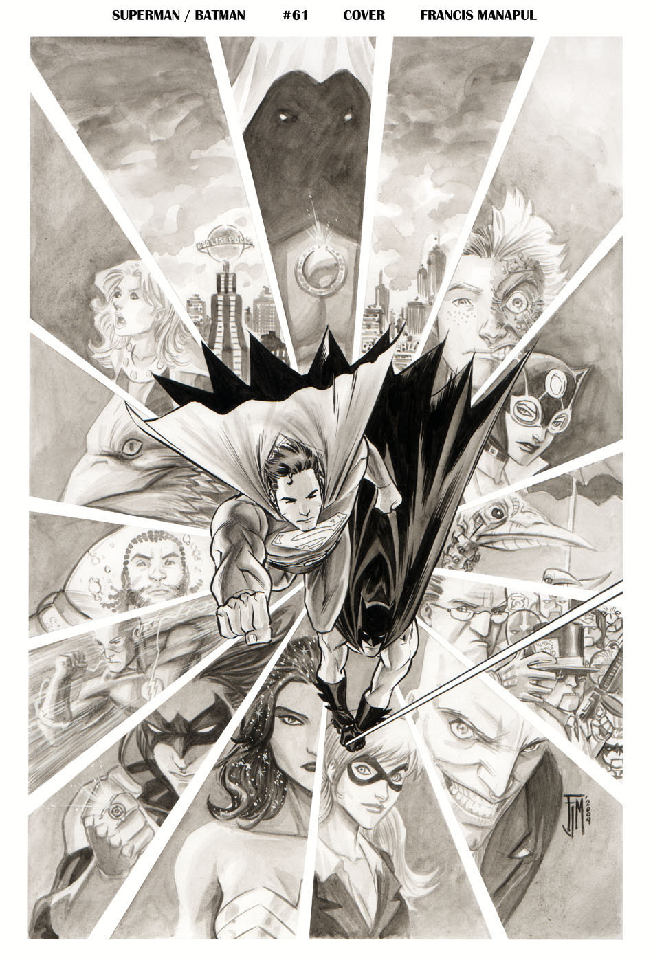
Here is the final inks and washes for Superman Batman #61 [link] . Inked with a #2 brush and gouache for the tonal work.Related content


Comments: 38

")


Oooh I just read the first issue of this I think! I loved it! ^_^
👍: 0 ⏩: 0

Excellent. I like that each slice is full of details to study.
👍: 0 ⏩: 0

 (Smile)")

Must be hard not mix the inks of Bats with the washed form from the background.
👍: 0 ⏩: 0


")

Lovely stuff!
Man -- everyone is doing inks and tones -- maybe I should give it a try. . . .
~R
👍: 0 ⏩: 1

thanks!
hmm.yeah I guess it's all the rage now..
👍: 0 ⏩: 0

Very nice. I am still tripping over Nightwing wearing a green lantern ring on the cover
👍: 0 ⏩: 1

I am glad to see I am not the only one ^^
👍: 0 ⏩: 0


this looks sweet! im so glad u decided to use the long haired nightwing. i always thought that version of him, from the animated series, was the dopest. im pumped!
👍: 0 ⏩: 0

 (Wink)")

I think they should've printed this black and white version. I'm not a fan of the colored version.
👍: 0 ⏩: 0

Always nice to see the tonal work Francis, excellent job using just tones on the background figures. I'm really drawn to the atmosphere in the two cityscape cuts at the top.
👍: 0 ⏩: 0


Gaah...too beautiful. Tell me you worked on an A3 format (at least!).
Bravo!
👍: 0 ⏩: 1


One question on an amazing cover:
Is that Jimmy Olsen as Two Face?
👍: 0 ⏩: 1
Either this story is just the elseworlds I need or it will make my brain melt through my ears.
Can't wait to see the art, you've really been ramping up your game lately! This stuff looks great.
👍: 0 ⏩: 0

after looking at both images, i will always love this more than the colors, in a medium where color reigns, some black and white stands out more.....
👍: 0 ⏩: 0

I like the layout -- looks like the facets of a jewel. The central figures aren't as noticable to me-- perhaps the background should have been lighter. I didn't even notice Batman until my second or third look.
👍: 0 ⏩: 0

This is great! I like the b/w version better than the color version... I think the colors are a bit too saturated (for my tastes at least).
👍: 0 ⏩: 1
thanks! that's kind of what I like about it. I don't like it when things are too colorful, they tend to feel overbearing.
👍: 0 ⏩: 0

Thank you for showing the WIP, always fascinating, sometimes even more than the end result!
Except this time the end result is absolutely not disappointing. Beautiful!
")
👍: 0 ⏩: 1
thanks! I enjoy seeing artits' WIP so I thought I'd continue to do the same!
👍: 0 ⏩: 1
I don't think you'll hear people complaining about that!
And it's great you give explanations, not just post the pic. Useful!
👍: 0 ⏩: 0

Wow, and I thought I loved the pencil version. This looks great. I think what I like best is Wonder Woman. I love the effect of her hair, and she just looks so exotic!
👍: 0 ⏩: 1
thanks! I made a conscious effort not only to make her look more exotic but also to make her look more mature specially since i have a tendency to make everyone look too young.
👍: 0 ⏩: 1
You really pulled it off nice. I was never a fan of Wonder Women, but the look you gave her in this pic is amazing. Really gives it that whole Amazon type feel. Two thumbs up!
👍: 0 ⏩: 0
oh, cool. so this way we can see every step. very nice indeed.
👍: 0 ⏩: 0