HOME | DD
 ManjiCyberNinja —
The Contract
ManjiCyberNinja —
The Contract

Published: 2011-05-28 17:00:03 +0000 UTC; Views: 14066; Favourites: 523; Downloads: 177
Redirect to original
Description
FULL VIEW RECOMMENDED**if your brower has cached the image, HIT F5 key for reduced paw size**
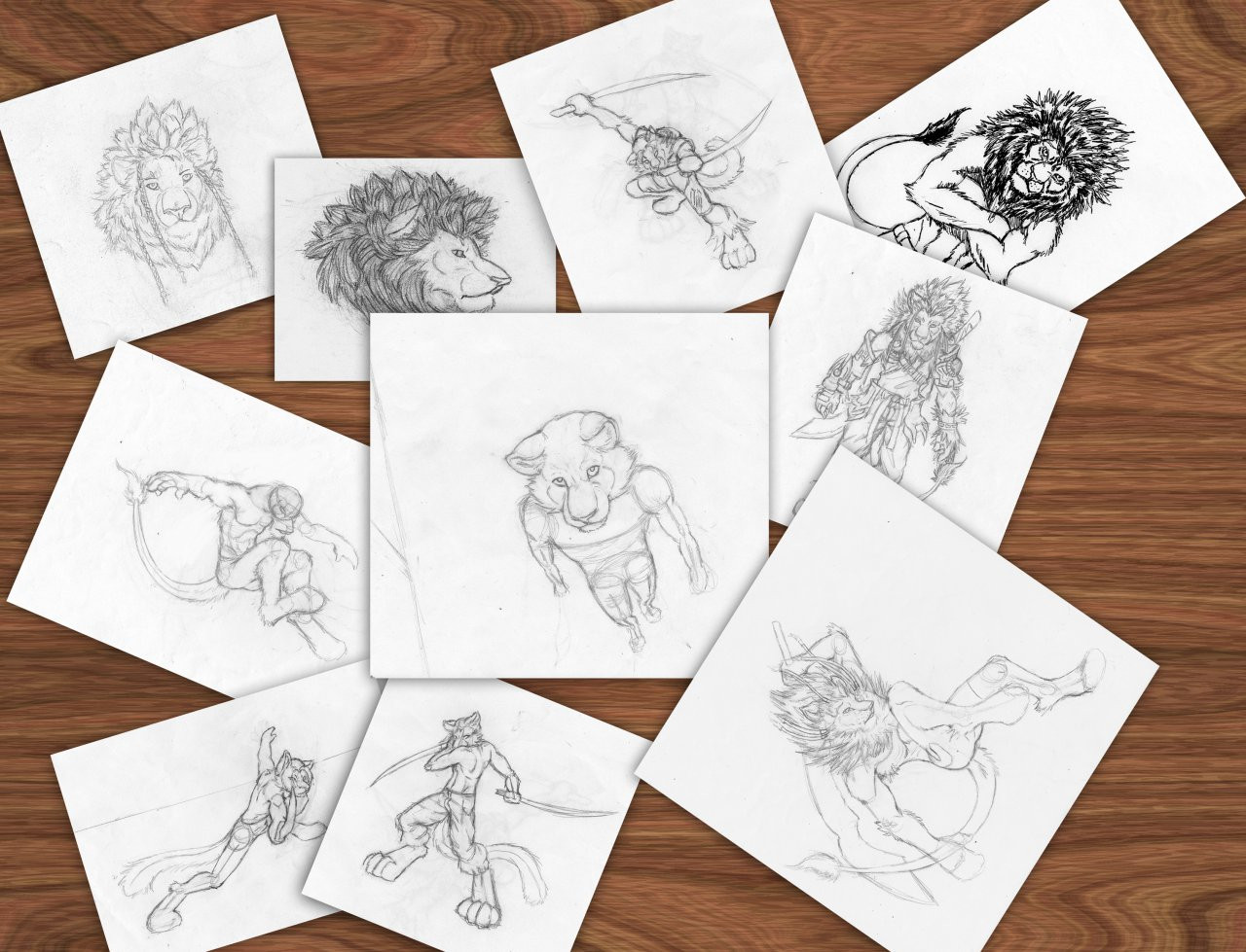
Whew... this shit wore me the fuck out! DX *face-desk* I'm extremely relieved it's finally over and done with.
My celebratory song listen [link]
Back when this was commissioned It was kind of an overwhelming task that was beyond my skills, but with pieces like this one I stepped up to the challenge, and said I'd make it may best work of art yet, and I made it so.
I've learned tons form working on this. probably the most I've ever learned form working on a single piece. There were so many things I didn't know how to render well in this, like the textured walls and metallic luster on the armor and swords. This is a colossal artistic accomplishment for me.
Related content


Comments: 162

I don't understand, please elaborate.
👍: 0 ⏩: 2

And the foliage textures seemed to not respond to lighting, and they all seems to share the same uniform values.
👍: 0 ⏩: 1
If this was a personal work ALL the of the foliage would have been hand drawn, and seeing as this was an extremely underpaid commission ( nearly free ), that would've been far too much trouble than it was worth. I endeavored to make this commission a test of my artistic ability. I was unsure whether or not I was good enough to take commissions which is part of the reason it's cost was so low.
👍: 0 ⏩: 1
I think there's a sense of conflicting style to this.
Your character's are shaded/valued in a very Manga esque tone, meant for serials etc, and that's replicated/repeated by a large portion of the "animal people" art work on this website.
This contrasts against a background that seems to teeter more on a heavily textured, attempted realism. The lighting on the right is very strange. It's almost as if a Glow Brush [painter] or a Airbrush [PS] was just dabbed one from the central location of that lamp. There's a zig zag formation from the stairs, but the light does no reflect the staggered shape. It almost makes a perfect circle on the left curve of that glow.
There's a lot of confused style, and I don't see cool colors anywhere that should be coming from the deep dark blue sky and moon on the rooftops of the building. That and I'm seeing WAY too much Assassin's Creed, which I think could be connected do to the commission demands.
👍: 0 ⏩: 3
And yes Assassin's Creed was the commissioner's requested theme.
👍: 0 ⏩: 0
I don't practice or study manga style, the lighting and shading is just a product of everything I knew about lighting and shading at the time of this piece's composition.
Also I NEEDED TO TRYING TEXTURING THE BACKGROUND! This piece was my first time around dealing with texturing, with a bit more knowledge of texturing the style would have been more consistent with the background. Manga is certainly not the style I'm going for. You'll see that when I post one of my newest completed works, there is still some editing I need to do on it for it to be suitable post on DA, so it probably won't be posted till next week. I strive for realism, if I don't make any attempts at realism I WILL NOT achieve it.
I originally planned on using cool colors in this piece, a "double light source". But I couldn't figure out how to render it due to the placement of the lamps. Can you give me advice on where the cool colors should have been and their intensity?
👍: 0 ⏩: 0

I get what you're saying. The folliage doesn't seem to receed into the shadows, and the colors are too warm and bright in the background and mid-ground. I would have used deeper blue-purple tones in the background to give the impression of darkened alleyways. It's still a good piece overall. The only other thing that bothers me is the proportion of the assassin's right leg in the foreground. It seems too big to me.
All in all, it's still a piece you should be proud of. Very nice work.
👍: 0 ⏩: 2
And also thanks for the feedback!
 (Smile)")
👍: 0 ⏩: 0
There are previous comments that address the size of the legs and feet, please refer to those not to be redundant.
👍: 0 ⏩: 1
Sorry. Not one to tend to read through miles of comments just to give a critique and compliment.
👍: 0 ⏩: 0

Great job! I honestly would not have been able to draw that o-e
👍: 0 ⏩: 1
It was all about will and perseverance.
Thanks for the complement! ^^
👍: 0 ⏩: 0

This is innovative, beautiful, artistic, everything! Well done this is perfect! How long did this take?
👍: 0 ⏩: 1
Much appreciated complements!
This piece took more than 38hours total.
👍: 0 ⏩: 1
Haha yw!
Wow, so awesome! And to think you didn't try that hard cause it was a comission and you still did this masterpiece! :'D
👍: 0 ⏩: 0

The lighting on this is absolutely gorgeous! <3
And the picture has a sort of Assassin's Creed feel to it
👍: 0 ⏩: 1
Thanks, Assassin's Creed was the commissioner's requested theme.
👍: 0 ⏩: 0

Congratulations! A beautiful piece of artwork and a DD well deserved.
👍: 0 ⏩: 1
I honestly never thought I'd get one so soon.
Thanks for the complements! ^^
👍: 0 ⏩: 0

nice work buddy!  (Wink)")
👍: 0 ⏩: 1

Great to hear you pushed yourself outside of your comfort zone for this one. The efforts were well worth it. You should feel really proud to have pulled off such a massive undertaking as this. The background and perspectives are great as is the lighting. The things you've learned in this piece will certainly serve you well for future projects which I look forward to seeing! Keep up the great work.
👍: 0 ⏩: 1
Much appreciated complements!
And I'll do my best to keep the gold coming.
👍: 0 ⏩: 0

Thanks! I did all I could with it. ^^
👍: 0 ⏩: 0

I'm not sure how someone can be sneaky with feet that big XD
That thought certainly doesn't detract from the awesomeness of this piece.
👍: 0 ⏩: 2
I've finally decided to reduce the feet size, hit F5 and view the image. ^^
👍: 0 ⏩: 0
Yeah, I starting to consider going back and fixing them now. X3
Anyways thanka the complements!
👍: 0 ⏩: 1
Nothings broken, there's no need to "fix" it... the mere fact that this has anthropomorphic animals (let alone ones that are both digitigrade and bipedal) kind of establishes a level of surrealism... Besides, plenty of people draw feet on their digitigrade characters so small they'd have trouble standing up. It's excellent the way it is.
👍: 0 ⏩: 0

They've got big feet... But still a cool pic.
👍: 0 ⏩: 2
I've finally decided to reduce the feet size, hit F5 and view the image. ^^
👍: 0 ⏩: 0
Yup, big feet indeed. I may edit them smaller soon.
Thanks for the comment! ^^
👍: 0 ⏩: 1

I love it.. The tygers outfit reminds me od Assassins Creed!
👍: 0 ⏩: 1
Thanks! Assassins Creed was the theme the commissioner requested. ^^
👍: 0 ⏩: 1
I love that game..Own them all.. Hmmm wonder what Camander Shepered would look like as a wolf furry.... Im kind of a game whore.. lol
👍: 0 ⏩: 0

This is great, love the assassin's creed theme! Fav'd!
👍: 0 ⏩: 1
"love the assassin's creed theme!" X2! XD
Thanks!
👍: 0 ⏩: 0
This is great, love the assassin's creed theme! Fav'd!
👍: 0 ⏩: 1

Beautiful work. Can really feel the intensity of the moment and I like the style of your characters. Nice work.
👍: 0 ⏩: 1
Thanks! ^^
there needed to be some tension before the kill! >
👍: 0 ⏩: 0

Nice Textures, good shading and i believe it turned out great.
👍: 0 ⏩: 1
It did indeed turn out great ^^
Thanks!
👍: 0 ⏩: 0


")
| Next =>