HOME | DD
 ManjiCyberNinja —
The Contract
ManjiCyberNinja —
The Contract

Published: 2011-05-28 17:00:03 +0000 UTC; Views: 14065; Favourites: 523; Downloads: 177
Redirect to original
Description
FULL VIEW RECOMMENDED**if your brower has cached the image, HIT F5 key for reduced paw size**
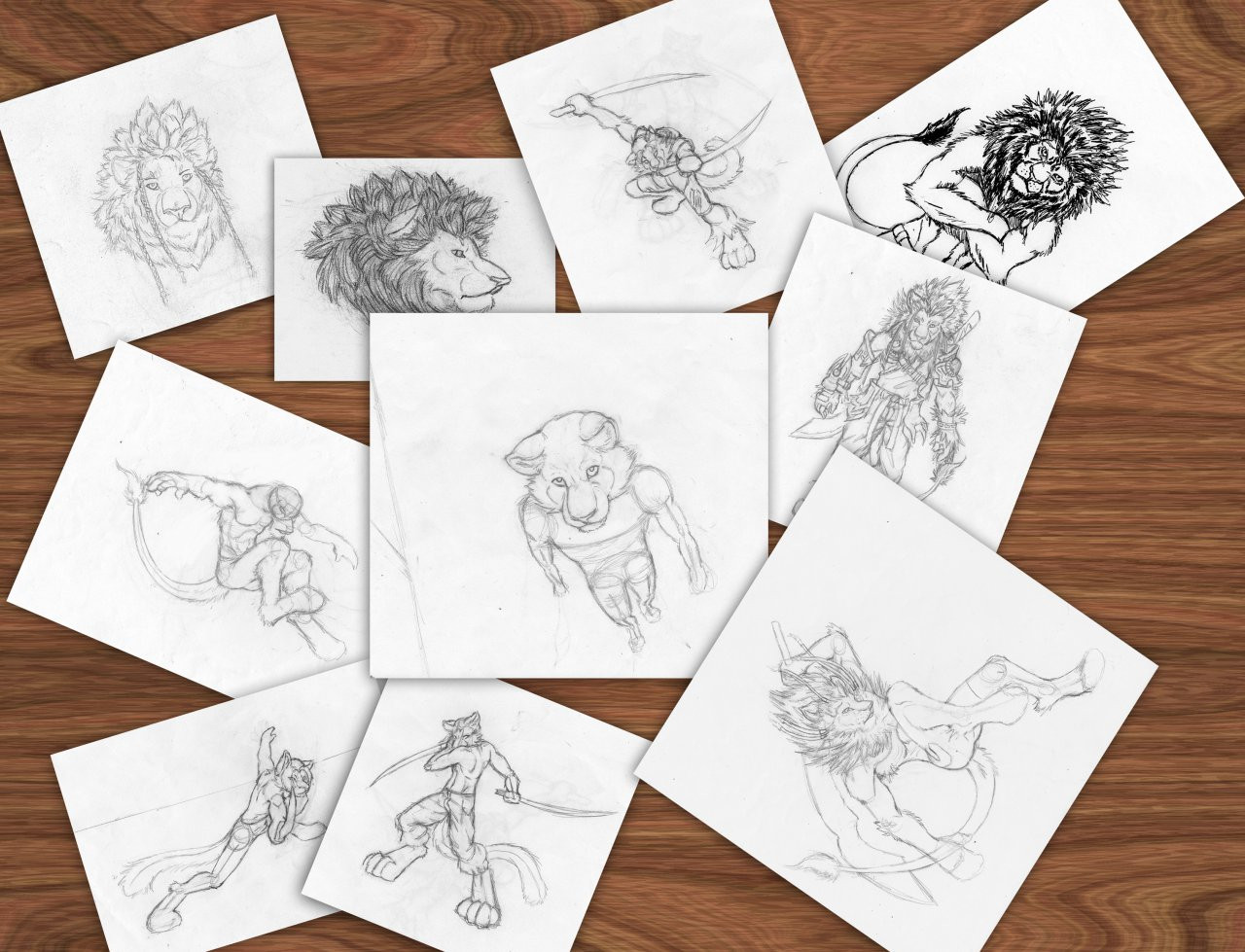
Whew... this shit wore me the fuck out! DX *face-desk* I'm extremely relieved it's finally over and done with.
My celebratory song listen [link]
Back when this was commissioned It was kind of an overwhelming task that was beyond my skills, but with pieces like this one I stepped up to the challenge, and said I'd make it may best work of art yet, and I made it so.
I've learned tons form working on this. probably the most I've ever learned form working on a single piece. There were so many things I didn't know how to render well in this, like the textured walls and metallic luster on the armor and swords. This is a colossal artistic accomplishment for me.
Related content


Comments: 162

Great piece of work.
Thanks for sharing...
Featured in Inspirations at www.hangaroundtheweb.com
👍: 0 ⏩: 1

Wow thanks for the feature! I never thought I'd be good enough for the next 5 years for something like that to happen.
")
👍: 0 ⏩: 1

It's ... just amazing! I'm at a major loss of words for this. It's one of the best pieces of art I've ever seen, maybe even THE best!
👍: 0 ⏩: 1
Wow that's really flattering. ^^
Thanks!
👍: 0 ⏩: 0

Excellent lighting and detail, especially of the background. Good colors, the piece looks quite natural. I like the armor design of the characters, again, impressive detail. It's obvious a lot of time and effort was put in this work.
Like said, I believe the paws are a bit TOO large, especially on the character on the back. I assume it is part of your style, but it looks a bit unnatural.
I feel like the opacity of the leaf brush should have been higher on the arcs. You could always change the color of the brush to keep the lighting/shading right, but right now it looks a bit transparent and bugs me a little.
Overall, this is a good work, and I congratulate you for the DD!
👍: 0 ⏩: 2
I've finally decided to reduce the feet size, hit F5 and view the image. ^^
👍: 0 ⏩: 0
Much appreciated feedback!
Speaking the foliage I do think the transparency of the arch leaves looks a bit odd now. But nearing the completion of this piece I was at my wit's end with it. It was really starting to test my patience, so little flaws like the slight transparency on the arch leaves were overlooked. I even started to feel anxiety sitting for such long intervals working to complete this.
As for the paws refer to my reply on 's comment.
👍: 0 ⏩: 1
Yeah, I know the feeling  (Wink)")
It's a small flaw though, you should be proud of yourself for your dedication.
👍: 0 ⏩: 0
Wooooooooooooooooooooooooooooooooow so amazing !!!!!!
👍: 0 ⏩: 1

First thing I thought here was "furry assassin's creed," but that was mostly because of the armor and the Mediterranean-looking architecture. I guess I don't know much about the idea from the commissioner, but still, it came out looking very nice. Good job with the armor and outfit designs.
I'm still not sure how I'm still not sure how i feel about the accentuated paws though. At first I thought you were doing something with foreshortening and just over did it a little, but then I noticed how all the feet are large, so I figured that's just the way you did them. It looks kind of cool and stylized, but you might've overdone it a tad? Maybe if they were just a little smaller they would be as distracting as they are (though at this point I'm sure you don't have any plans on changing anything, and I wouldn't expect you to. Just something to think about for the future, and even then, that's just me saying...)
I think where your hard work shows the most here is in the detail put into the environment of the picture. Yeah, the characters are very well done, with plenty of attention to detail and design; however, the effort you put into the buildings and lighting is just, like... wow. Everything from the vanishing point, to the textures, to the soft lighting, to the night sky... It looks really good.
Great work, and congrats on the DD!
👍: 0 ⏩: 2
I've finally decided to reduce the feet size, hit F5 and view the image. ^^
👍: 0 ⏩: 1
Wow, thanks for the in-depth feedback! Especially the critique!
And as you've mentioned. Yes agree, I did indeed know the paws are large. They aren't actually a part of my style. They were the result of an intended "worm's eye" perspective that I wasn't able to pull off given my limited knowledge of the perspectives at the start of the composition of this piece. I even needed to use a book on perspective to help me better understand them. I made all the paws of the characters around the general size of the assassin's paws in an attempt to balance them out.
I would go back and fix the paws if I could, but the PSD file I created this piece on was accidentally overwritten in the flattened state. Although I could try to over-paint them smaller, it would likely create inconsistencies in the area around the paws.
👍: 0 ⏩: 1
You're welcome  (Smile)")
Eh, I don't think you have to go back and fix anything with this. It's just a suggestion for future reference. Keep up the great work!
👍: 0 ⏩: 0

... I want to draw like that...
Maybe I should start commissions, as I can see it's why you did a so beautiful piece. But, heh, I don't think people will like my art, so it's hard to choose, and as I see your gallery, you draw hundred times better than me.
That's a really an amazing piece, there are fantastic details everywhere I can see, and the expression of the fox guard at the right is very realistic, like a "I heard something... >")
👍: 0 ⏩: 1
Thanks for the complements!
I had to give the guard's face a sort of uneasy expression for added realism.
And if you keep wanting draw as well as I, you will be eventually. Just remember, practice and study will help you progress much faster. ^^
👍: 0 ⏩: 1

I can see you worked very hard on this. The detail is magnificent and the lighting is certainly perfect for the scene. This art is certainly memorable, as well. I enjoy art staged exactly like this; it is hard for me to find something to like about it.
Congratulations on achieving a Daily Deviation!
👍: 0 ⏩: 1
Much appreciated feedback! I used all my knowing of lighting and detail and then some for this. I also had to create some tension before the assassin moved in on his target.
👍: 0 ⏩: 1
I can see the tension in it, it seems that the target knows of the assassin, but what next happens must be where that tension is. It reminds me I have to work on my lighting in sketches, as well.
👍: 0 ⏩: 0

Excellent paint job! Love the lighting and textures.
👍: 0 ⏩: 1
Thanks, much appreciated comment.
👍: 0 ⏩: 0

Thanks! Much appreciated complements! ^^
👍: 0 ⏩: 0
Hmmm...Redwall plus world of warcraft. Dashes of anime style and the city a little more middle eastern/mediterranian based than european?
👍: 0 ⏩: 2
But thanks for the fav nonetheless.
👍: 0 ⏩: 1
No problem. Give people benefit of the doubt, though, ok?
👍: 0 ⏩: 0
Calling my artwork anime-ish and comparing it as a derivative of Redwall and World of Warcaft is not how you congratulate my hard work in creating it...
👍: 0 ⏩: 1
Woah, well I'm sorry dude. Hey, I'm just saying that's what the setting kind of reminds me of, and yes I see that it is much more detailed than the illustrations from said book or game or what not. No, I think it's really good, and I read your description. Congrats on achieving one of the aspects that usually give you trouble.
But I didn't come to critically analyze it's quality so much as make a quirky comment on themes that I kind of like being put togethor. So it's not about either of us, but the idea of art and making people happy in general.
Derivative? I didn't say you stole those ideas or anything. I was being happy.
...Pardon me, but are you expecting me to bow down and praise your work?...Well bud, praise comes on the other person's terms, not yours.
Now looking at in hindsight, I see how you might have gotten the wrong idea from my comment. Of course I'm sorry that it happenned-I don't wanna ruin your day. I was out to have fun and tell people what I like, or try to understand what they might be getting at in their drawings...But you know, maybe you should have given me the benefit of the doubt. Just sayin'.
---We are but stewards. Our talents are on loan.
👍: 0 ⏩: 1
"Well bud, praise comes on the other person's terms, not yours."
My terms where? I just don't like art being compared with other things are popular. Originality is what I strive for.
👍: 0 ⏩: 2

people are going to make associations regardless of how 'original' something might be, bro! To get offended by it when they person was clearly trying to compliment is kind of silly, imo.
👍: 0 ⏩: 1
Dislikingand being offended are different things.
👍: 0 ⏩: 1
you presented yourself as though offended :9
👍: 0 ⏩: 1
offended or dislike, it's a silly thing to get upset and chastise a 'fan' over regardless of semantics.
👍: 0 ⏩: 1
It's not necessary to dwell on things that have past.
"That's text for ya" meaning that's not how I actually felt...
An understanding has already been made.
👍: 0 ⏩: 0
....mmmm. OK.
It is pretty original. Pardon me, it's just a habit to try and explain something new to something I don't know. Like if I didn't know what a katana was called and tried to explain it to other people that it's like an edgier sabre. I think a lot of people like that, and some people have done it to me when I explain a story idea. So I know what you're saying, but just me personally it doesn't necessarily frustrate me as it is just a hiccup. Although if something is very near and dear to me and they try to compare it to something I hate, yeah, then I can be like you were.
Like if I was trying to make an insightful story and they compared it to jersy shore, or if they took my story and compared it to the stereo typical over simplified popular examples from that genre that I may have a disliking for.
👍: 0 ⏩: 0

I've finally decided to reduce the feet size, hit F5 and view the image. ^^
👍: 0 ⏩: 0
Yeah it was meant to be a semi-worm's eye view but I failed at it... But still I succeeded in alot of other things here.
👍: 0 ⏩: 1


I LOVE the detail in this picture!! Very beautiful and very well done!!! ^^
👍: 0 ⏩: 1
Thanks, I really appreciate the complements!
Paintng this really took alot out of me.
👍: 0 ⏩: 1
You are most certainly welcome ^^
👍: 0 ⏩: 0

OMG! an assassin! D: hehehe X3 
👍: 0 ⏩: 1
Wow thanks, I was aiming for a somewhat sinister atmosphere, It was a painstaking piece to render. ^^
👍: 0 ⏩: 0

oh wow. I... Ho..... I have no words to describe this awesomeness.
*head implodes*
👍: 0 ⏩: 1
<= Prev | | Next =>