HOME | DD
 Manon-Ghiurco — Deep blue 01

Published: 2012-06-02 17:54:00 +0000 UTC; Views: 299; Favourites: 17; Downloads: 6
Redirect to original
Description
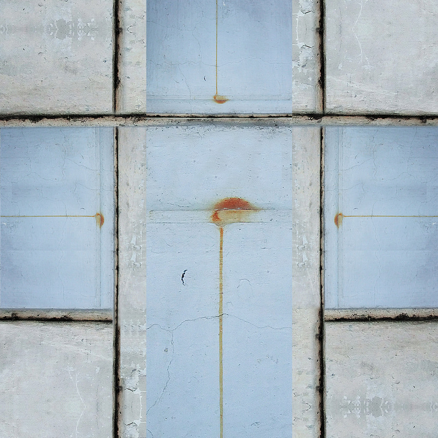
good while ago, I had stopped over a work of[link]
It was a work in a deep blue. I always have problems with blue color, years in a row clients dream their cover or everything in blue, and always I have trouble with... It looks maybe simple but sometimes blue with blue doesn't work. But never gives up. If someone look in my gallery blue, is not an option. Maybe that's why in front of blue I stay much longer than usual. I try to see how can be done with it. Blue (for me) is a challenge.
When I saw Ilil work, I asked her if she let me play with the deep blue work. She was agree. What came up... I upload next in a small series.
thank you iram...
 (Smile)")
Related content


Comments: 6


from this study color - this one is my favorite too
👍: 0 ⏩: 0

You say Pollock, I say Rothko. His paintings are mesmerizing, addicting, mind-blowing, eternal... Honestly, I couldn't say why they actually make me look at them for hours, forgetting the time passing. They're like a journey towards a different timespace, a world within the world, a separate entity. Something similar seems to be happening here.
👍: 0 ⏩: 1
Interesting comment dear Bohoomil
yee I like Pollock (how do you know!>!, it's my secret  (Wink)")
Do you know what I like the most at Rothko - the preference for warm colors. His work is under Red color - with yellow, orange, pink (curious choice sometimes). Blue scarcely presence, and green - I think he not love green at all ")
Next Journal I will post something with dedication - just because it's around at what you wrote here.
👍: 0 ⏩: 0


