HOME | DD
 manujg — University Website

Published: 2010-05-19 14:03:59 +0000 UTC; Views: 9098; Favourites: 79; Downloads: 321
Redirect to original
Description
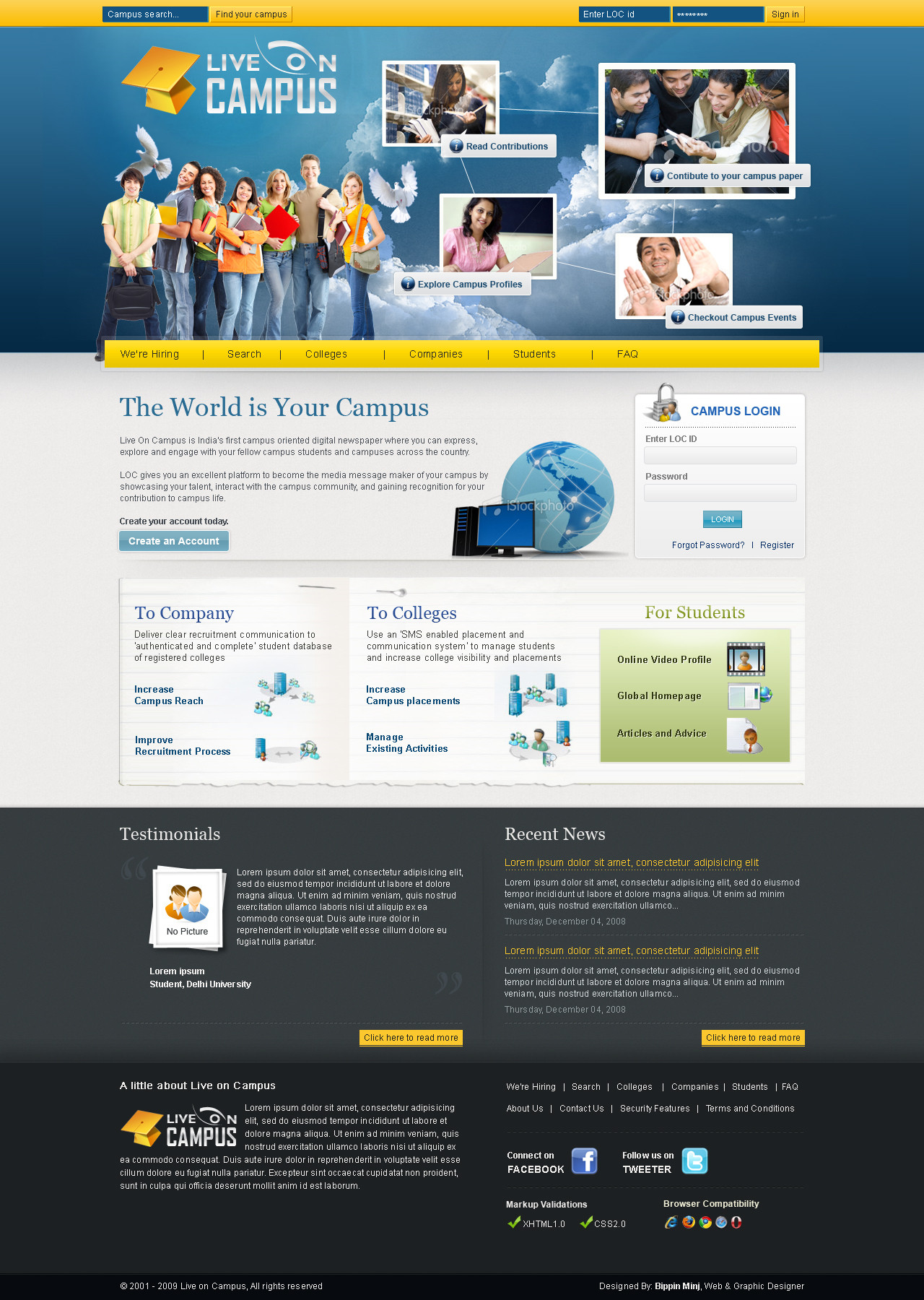
..... tadaaFellow deviants I am looking for ways to web 2.0 this design, so suggestions are welcome.
Revision: gradients and noise.
Revision: color scheme upgrade.
Related content


Comments: 27


nice work but i don't like your social icon.
I think it don't fits
")
👍: 0 ⏩: 1

haha the wire frame as per the client requires me to have social icons.
👍: 0 ⏩: 0

")
yea i should work on fixing that
")
👍: 0 ⏩: 0


Decent. I like the clean style and this is definetely one of the better examples.
👍: 0 ⏩: 1


Really nice, clean and effective design! But is this a university about web or computers? If not, i'm not sure about the utility of the mac icon on the header..
👍: 0 ⏩: 1
thankyou.
yea the university is focused on computing, information systems and mathematics.
👍: 0 ⏩: 1
oh, in this case the icon is perfect! congrats again
👍: 0 ⏩: 1
ty. any other critique welcome too
👍: 0 ⏩: 0
 (Wink)")
oh thanks bro  (Smile)")
👍: 0 ⏩: 1

I really cant find anything that would missing there.
Im not sure about the logo, is it like that, there could be some colors or something with it too..
👍: 0 ⏩: 1
your right. logo could be worked on, but its company stock
👍: 0 ⏩: 0