HOME | DD
 Marc-F-Huizinga — Wonder Woman/Superman Coloring Steps
Published: 2013-10-02 02:04:48 +0000 UTC; Views: 5634; Favourites: 67; Downloads: 114
Redirect to original
Description
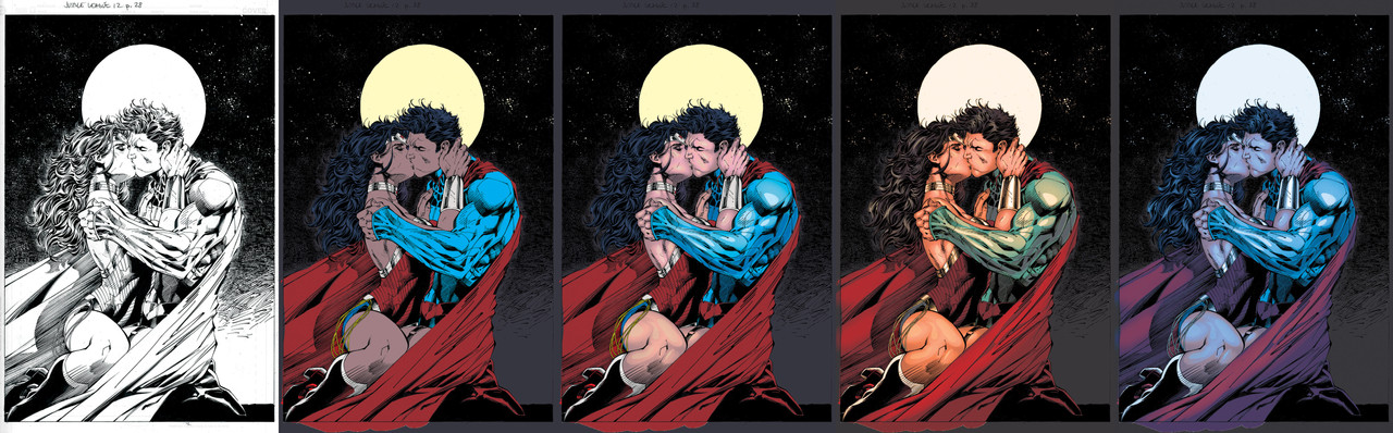
Received a couple requests on how I colored the superman piece, so I decided to make a little step by step with basic explanations to give insight. Bear in mind this is not an in-depth Photoshop tutorial. Heck, I think if you're interested in this sort of thing you'd probably already have some photoshop experience under your belt. This is just to show you guys an insight in my thought process. So without further ado:Step 1:
Here I made sure I set up the lineart prior to coloring. If you're new to coloring then this is pretty basic. Lineart on it's own layer on multiply. Make sure the channels are set up right, Have a copy of your lines just in case.
Step 2:
Flats! The procedure where you fill in all the spaces with a flat color. Choosing the colors can be tricky but one of the nice things about digital coloring is that you can change it on the fly. Mainly done with the tablet and pen tool as well as the lasso tool to select areas and give them a nice fill. MAKE SURE you work with all the anti-aliasing tools switched off and also make sure it's the PENCIL tool and not the brush (hold down the brush tool and you will find it and as soon as you do, I will send you cookies for Christmas).
Step 3:
Here I started rendering out the skintones and the suits. I do this mainly with the lasso tool and the standard airbrush tool. Nothing fancy really! Just make sure to do it on low opacity if you try this out yourself! The idea is to work with a general lightsource in mind and then accentuate the shapes and really make them into forms. (Trivia: A shape is a flat 2D object and a form is a 3D object with light and everything attached to it)
Step 4:
Here I fleshed out some more of the things on the page, like the metallic parts on Wonder Woman's costume, Supes's cape, and the hair too. At this point most of the work is done for me and I can have fun with certain effects/layers and photofilters to catch the mood I was going for. Originally this is the step I took and uploaded here on DA because it spoke to me more as a piece of art, I suppose!
Step 5:
In this step you see the final version of the image. Not too different from Step 4, just different choices really. It's a nighttime scene so obviously the colors needed to be cooler. There's various ways of doing this. The way I did it was playing with layers that had a dark somewhat unsaturated blue fill in them and cool photofilters. Again, this is just the icing on the cake for me.
I hope this has given insight on how I do my work, well, for now. I keep growing and my methods change all the time. I might be doing things very differently starting tomorrow, who knows!
Related content


Comments: 2


I'm glad it was helpful!
👍: 1 ⏩: 0